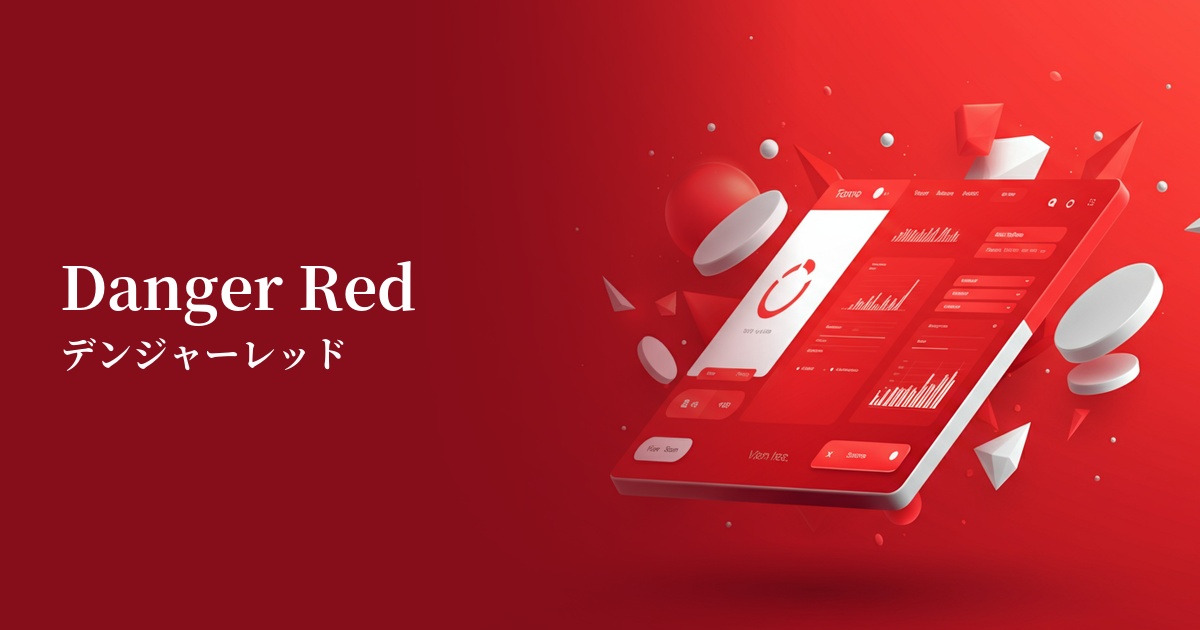
| English name | Dark Danger |
|---|---|
| Katakana | Dark Danger |
| HEX | #B91C1C |
| RGB | 185, 28, 28 |
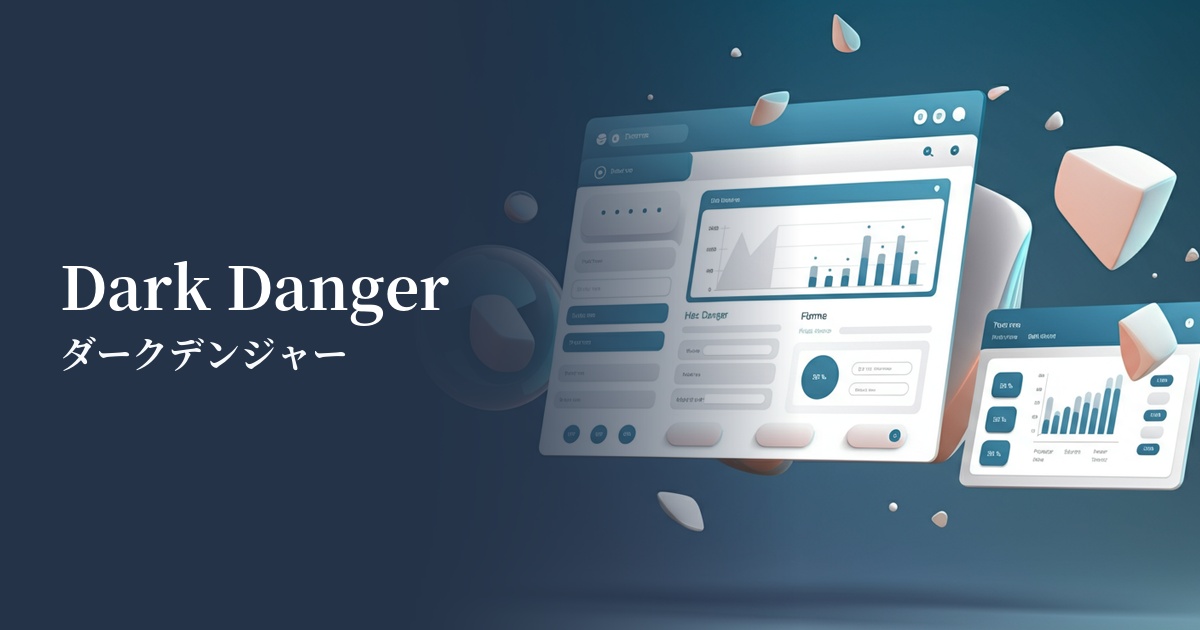
| Design Theme | UI System & Alert Colors |
Why is it a trend? (Background and reasons)
In recent UI design, alert colors are required not only to be eye-catching but also to convey a sophisticated impression. While bright reds tend to cause excessive stress to users, deep reds like "dark danger" are increasingly being adopted in many modern websites and apps because they maintain a calm impression while ensuring visibility.
The widespread adoption of dark mode, in particular, has fueled this color trend. Against a dark background, the #B91C1C creates a subtle contrast that is easy on the eyes without compromising a premium feel. This allows for clear communication of error and warning messages while enhancing the user experience.
In today's information-saturated digital environment, effectively capturing a user's attention is crucial. "Dark Danger" stands out from other UI elements and intuitively conveys urgency and importance, making it a valuable strategic choice for delivering the information you truly want users to see.
The psychological effects of design and UX
The most powerful psychological effect of "Dark Danger" is the communication of "urgency" and "importance." Red has long been recognized as a danger signal, and using this color in error messages or deletion confirmations allows users to intuitively understand the seriousness of the action and act cautiously.
This color also carries strong negative connotations such as "danger" and "prohibition." Therefore, it is very effective in situations where you want to prevent accidental operations or discourage users from taking specific actions. In UI/UX design, it plays an important role in protecting users from unintended mistakes.
Compared to the common warning color red (#FF0000), the slightly darker, deeper "Dark Danger" color can calmly convey importance without overly alarming or alarming users. This has the advantage of being easily integrated into the UI of financial services and business tools where trustworthiness is paramount.
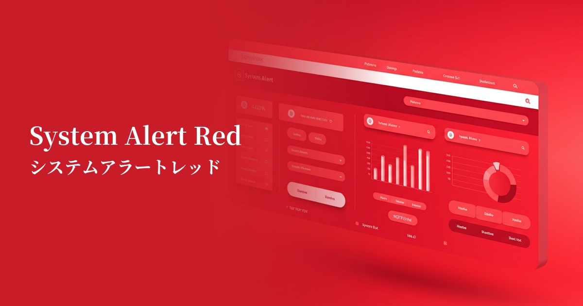
Visibility testing (UI component example)
Practical usage (best practices)
This is ideal for validation messages that indicate form input errors. It allows users to see at a glance what needs to be corrected, supporting a smooth input experience.
This button is used for confirmation of important, irreversible actions such as "delete account" or "permanently erase data." It prompts the user for final confirmation and prevents problems caused by unintended actions.
It's effective when used for icons and badges of notifications that users absolutely cannot miss, such as security alerts or unpaid bill notices. It helps differentiate them from other general notifications.
This is used in business dashboards to highlight KPIs that are significantly below targets, or to highlight figures or parts of graphs that indicate system anomalies. It allows for immediate visualization of problems and facilitates quick responses.
Recommended color scheme suggestions
Gainsboro (#DCDCDC)
The bright gray softens the strong warning color of Dark Danger, creating a clean and trustworthy impression. When used as a background color or separator in the UI, error messages stand out while the overall design maintains a calm tone.
Charcoal (#36454F)
This is the perfect combination for a dark mode UI. By placing dark danger on a charcoal gray background, the warning color is easy on the eyes and stands out without sacrificing a sense of sophistication. It's ideal when you want to balance visibility with a refined atmosphere.
Antique White (#FAEBD7)
By combining it with warm antique white, the cold warning impression of Dark Danger is softened somewhat. It is recommended for designing friendly services that want to convey an important message while still providing users with a sense of security.