
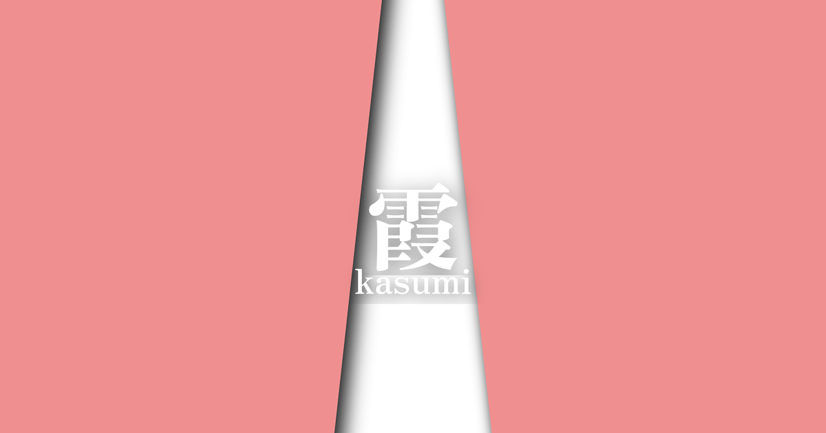
| Japanese color name | 霞 |
|---|---|
| reading | Kasumi |
| season | 春 |
| Color of the table | Light red (usubeni) |
| Back color | White (shiro) |
What is Kasumi? Origin and Etymology
"Kasumi" is a color combination that represents the thin mist or haze that hangs over the spring sky. Its origin is said to be derived from "Harugasumi," which symbolizes the tranquil scenery of spring. The pale pink on the outside is thought to represent the color of the sky dyed in the morning or evening glow, while the white on the inside represents the color of the mist itself. This combination of two colors beautifully captures a fantastical and soft spring landscape in which distant mountains and cherry blossoms are faintly visible.
Through the use of color, we can glimpse the aesthetic sensibilities of the Heian aristocracy, who delicately perceived the changing seasons and the beauty of nature.
Furthermore, mist is often closely associated with cherry blossoms. The sight of cherry blossoms in full bloom appearing like mist, or the scenery of cherry blossoms blooming beyond the mist, has been a subject of waka poetry and paintings since ancient times. For this reason, this color is said to embody the splendor of the season when cherry blossoms are in full bloom, as well as the exhilarating feeling unique to spring. It is a color that not merely reproduces a natural phenomenon, but richly expresses the emotions of the season and poetic imagery, and is a color that embodies a uniquely Japanese sense of color.
Historical background of Kasumi
The interwoven color schemes developed within the Heian period's national culture as a crystallization of the aesthetic sensibilities of the aristocracy. In particular, delicate color combinations appropriate to the season and occasion were enjoyed in women's attire such as the twelve-layered kimono (junihitoe). "Kasumi" (mist) is said to have been a favorite color of the ladies of the imperial court, representing spring. It was worn at spring banquets and ceremonies, bringing splendor and a sense of the season to the occasion. While specific records of its use are limited, its name can be found in historical texts concerning the attire of the time.
For Heian aristocrats, the colors of their attire were not merely decorative, but an important element that demonstrated their education and sensibilities. Sensitively perceiving the changing seasons and expressing them through the colors of their clothing was considered a mark of a refined cultured person. The "mist" color scheme, linked to the spring scenes depicted in waka poetry and tales, is thought to have also symbolized the wearer's intelligence and refined sensibilities.
Even as time passed, this elegant color scheme was passed down to the samurai class and the townspeople's culture, and it became established as a traditional Japanese color.
Related literature, waka poetry, and seasonal words
Although the color name "Kasumi" (meaning mist or haze) does not appear directly in many works, numerous descriptions of spring scenes and clothing that evoke this color scheme can be found in Heian period literature. In "The Tale of Genji," the colors of the clothing worn by Hikaru Genji and the ladies in spring scenes are described in detail, and expressions such as "crimson thin robe" and "white robe" suggest the existence of clothing reminiscent of the color Kasumi. These descriptions play an important role in conveying the feelings of the characters and the sense of the season to the reader.
Furthermore, "kasumi" (mist) has been a frequently used seasonal word in Japanese poetry as a spring kigo (seasonal word). The Kokin Wakashū and Shin Kokin Wakashū contain numerous poems that celebrate the beauty of landscapes shrouded in spring mist, and the longing for a lover separated by the mist. The worldview of these poems became the source of the poetic imagery associated with the layered color combination "kasumi." The close connection between color and literature, and how they enriched each other's worlds, is a major characteristic of Heian culture.
Even though I gaze upon the cherry blossoms on the mountain shrouded in spring mist, I still find myself unable to tire of them, you too.
Season and scenery of mist
"Kasumi" (meaning "mist") is a color combination that, as its name suggests, symbolizes spring. The most appropriate time to wear it is from around February, when you can feel the arrival of spring, until around April, when the cherry blossoms are in full bloom. In early spring, when the chill still lingers, it evokes a sense of anticipation for the coming season, and in the height of spring, it expresses a peaceful and gentle atmosphere. The hazy and soft colors give an elegant impression, as if they are melting into the spring light.
This color scheme perfectly captures the dreamy, hazy scenery of spring. The scene of distant mountain ranges faintly colored and cherry blossoms blooming and fragrant beyond the mist has been depicted in countless waka poems and stories. Wearing this at festive occasions such as cherry blossom viewing parties or spring celebrations will further enhance the atmosphere. It embodies the refined sensibility of Heian-era aristocrats who enjoyed capturing the beauty of nature in their clothing and becoming one with the seasons.
Kasumi's color scheme proposal
Light green (#A5C944)
By combining it with the fresh green of young grass sprouting in spring, the vibrant scenery of spring can be expressed even more vividly. The soft hues of the mist are accented by the youthful green of the fresh green, creating a lively and invigorating color scheme.
Wisteria color (#BB99BB)
This color scheme expresses the transition from cherry blossom season to late spring, when wisteria begins to bloom. The combination of light pink and wisteria purple gives an elegant and refined impression. The gradation of similar colors creates a sense of vibrancy while maintaining a calm atmosphere.
Yamabuki-iro (golden yellow) (#F8B400)
Like the mist, the Japanese kerria (Yamabuki) is a flower that blooms in spring, and its vibrant yellow color is reminiscent of the spring sunshine. Adding the yellow of the Japanese kerria to the pale pink and white tones makes the whole arrangement bright and cheerful, creating a color scheme that expresses the joy of the full bloom of spring.
Practical Scenes
The "Kasumi" (mist) color scheme, a traditional layered color combination, remains popular in modern Japanese clothing as a spring attire. This color scheme is particularly often incorporated into furisode (long-sleeved kimono), houmongi (formal visiting kimono), and graduation hakama (traditional Japanese trousers), creating an elegant look suitable for celebratory occasions. Furthermore, using it in accessories such as obi-jime (kimono sash cord), obi-age (kimono sash scarf), and han-eri (collar insert) can subtly express a sense of the season.
Beyond traditional Japanese clothing, this combination of light pink and white is used in a variety of fields. For example, it's often used in website and advertising design as the image color for spring campaigns or women's products. Its gentle, feminine impression makes it suitable for cosmetic and confectionery packaging designs. In interior design, incorporating it into curtains or cushion covers can bring a bright and calming atmosphere to the entire room.