
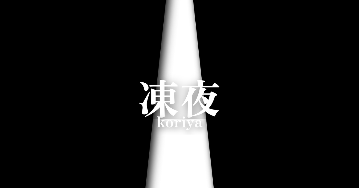
| Japanese color name | frozen night |
|---|---|
| reading | koriya |
| season | 冬 |
| Color of the table | Black (kuro) |
| Back color | Light white (shiro) |
What is a frozen night? Origin and etymology
Kooriyo (Frozen Night), as its name suggests, is a color combination that reflects the scene of a winter night when everything is frozen solid. The black on the outside represents the deep, quiet darkness of the night, while the pale white (white) on the inside is said to symbolize the ice that shines brightly in that darkness, the fallen snow, or the cold moonlight. This contrast between black and white beautifully expresses the solemnity and dignified, serene beauty of winter nature.
In a world of kimono color combinations that often feature vibrant colors, this color scheme, composed solely of achromatic colors, can be seen as a manifestation of a refined aesthetic that has stripped away all unnecessary elements.
The name's etymology directly expresses "freezing night," and it strongly reflects the culture of Heian period aristocrats who, with keen sensibilities, captured natural scenes and translated them into the colors of their clothing. Rather than being a simple combination of colors, the characteristic of layered color schemes is that they encompass a single scene or poetic worldview, and "Frozen Night" is one of the prime examples. As a color scheme that evokes a clear and solitary beauty found in the harsh cold of winter, it has appealed to people's sensibilities.
Historical background of the frozen night
The layered color scheme was refined among the aristocracy during the Heian period, when Japanese culture flourished. They incorporated the changing seasons and natural scenery into the color combinations of their clothing, using it as a means of expressing their education and aesthetic sense. "Frozen Night" is thought to be one of the winter color schemes that emerged in this context. The exact time of its creation is uncertain, but it is presumed to have been worn as winter attire in daily life at the imperial court and in private settings.
The simple color scheme of black and white sets it apart from other more flamboyant colors, and may have had the effect of highlighting the wearer's intelligence and inner depth. In particular, it may have been favored as a sophisticated attire that harmonized with the atmosphere of elegant winter scenes such as snowscapes or moonlit banquets. This color scheme is a valuable cultural heritage that speaks to the delicate sense of color of the Heian aristocracy and their spirituality of wanting to become one with nature.
Related literature, waka poetry, and seasonal words
While no specific classical literary work directly uses the color name "frozen night," the scene is depicted in many waka poems and stories. For example, the famous passage from "The Pillow Book," "In winter, it is early morning. The falling snow is beyond description, and the frost is so white, and even without it, it is so cold..." beautifully describes the crisp air and whiteness of a winter morning, which resonates with the worldview expressed by "frozen night."
Furthermore, there are numerous waka poems that describe the silence of winter nights and the coldness of moonlight, and these poems overlap with the images evoked by the colors of a "frozen night." For example, poems describing the bright moon reflected on ice are a world of beauty woven from the contrast of black and white. Through these literary works, we can catch a glimpse of the poetic scenes that people of that time associated with the color scheme of a "frozen night."
The moon of dawn on a winter night is lonely, its shadow cast upon the ice.
The season and scenery of a frozen night
"Frozen Night" is considered a color scheme appropriate for winter, especially the coldest period from December to February in the old lunar calendar. This color scheme expresses the stillness of a winter night when plants wither and signs of life are scarce. It evokes an image of a frosty moon shining in the clear air, its light illuminating the ice on the ground and the thin layer of snow—a harsh yet beautiful scene.
This color is suitable for occasions such as winter evening gatherings or snow-viewing parties. It is more appropriate for occasions that value a quiet and intellectual atmosphere rather than flashiness. Wearing this color is said to have had a deeper meaning, not only expressing the feeling of the season, but also understanding the dignified spirit of winter nature and the beauty found in silence.
Color scheme proposal for Frozen Night
Silver-gray (#AFAFAF)
A light gray reminiscent of the shimmering ice and frost. Adding it between black and white enriches the monochrome palette, creating a more sophisticated and urban impression. The metallic sheen also harmonizes with the cold winter air.
Crimson (#D7003A)
A vibrant red reminiscent of a single winter camellia or sasanqua blooming amidst a harsh winter landscape. It adds a touch of life and vibrancy to a world of achromatic colors, leaving a strong impression. It makes an effective accent color when used in accessories such as obi sashes.
Lapis Lazuli (#1F4788)
A deep blue reminiscent of a clear winter night sky. It pairs well with black, further enhancing a quiet and intellectual impression. When combined with white, it creates a clean and dignified color scheme, making it suitable for formal occasions.
Practical Scenes
In traditional Japanese clothing, the "Frozen Night" color scheme is used for kimono and obi combinations worn during the winter season. For example, a black kimono with a white obi, or vice versa, is a classic combination that expresses the world of this color scheme. By using black and white contrasts in accessories such as obi ties and collars, you can enjoy a stylish and modern look. Nowadays, it is also applied to monochrome coordination for formal occasions regardless of the season.
In contemporary design, the "Frozen Night" color scheme is ideal for expressing minimalism and a refined style. In websites and graphic design, a black and white base creates a sharp and intellectual impression. In interior design, it helps create a calm and tranquil atmosphere. In fashion, it's a timeless and universally loved color scheme, appealing for its versatility across formal and casual styles.