
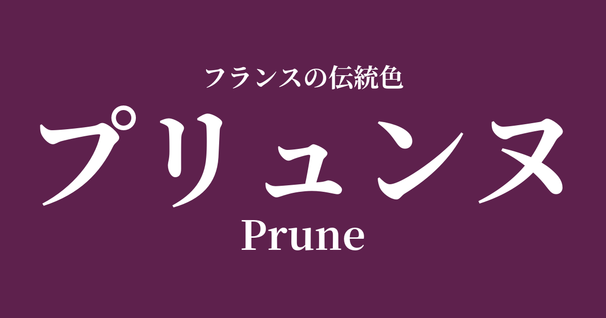
| French | Prune |
|---|---|
| Katakana | Prune |
| HEX | #5E214D |
| RGB | 94, 33, 77 |
What is Prune? Origin and Etymology
The name Prune means "plum" in French.
The name originates from the deep, reddish-purple color seen in the skin of ripe plums. In particular, it is said to have been named as a color that symbolizes richness and mature beauty, reminiscent of the intense color of dried plums, or prunes.
This color, which combines the freshness of fruit with the depth of maturity, is full of profound charm born from the bounty of nature.
Historical background of Prune
Historically, purple was a rare and expensive dye, making it a noble color that only a select few, such as royalty and clergy, were permitted to wear.
A deep, reddish-purple like brune, in addition to the traditional authority of purple, evokes a more refined, mature calmness and sensual allure. Such deep colors were particularly fashionable during the Belle Époque period from the late 19th to the early 20th century, and were favored as the color of Parisian haute couture and the dresses of sophisticated ladies.
In an era of extravagant luxury, prune was highly valued as a color that expressed chic and intellectual elegance.
Prunes in the world of art and fashion
Prune's mystical and profound color palette is believed to have inspired Symbolist painters of the late 19th century. Works by artists such as Odilon Redon, who depicted dreams and inner worlds, often feature mysterious colors reminiscent of Prune's.
In the world of fashion, prune is an elegant color that has been loved for generations. Its depth and rich texture are especially enhanced when paired with lustrous fabrics such as velvet and silk satin. Appearing in autumn/winter collections as a color for coats, dresses, or lipstick, it's an essential color for creating a sophisticated and mature look.
Color scheme preview
This is to check the readability of the text when this color is used as the background.
Prune's color scheme proposal
Gris de Lignan (#DCD7D1)
The deep hues of Prune are complemented by the bright, soft flaxen gray. This color scheme highlights the best in each element, creating a sophisticated, calm, and classic impression.
Rose Pompadour (#ED86A3)
The mysterious aura of Prune, combined with the elegant and bright rose, creates a dramatic and feminine impression. It's perfect for special occasions or as a gift.
Jaune de Naples (#F7DC6F)
The deep brune and the bright, calming Neapolitan yellow create a beautiful contrast that complements each other perfectly. This color scheme gives off an intelligent and modern feel.
Practical Scenes
In interior design, prune adds depth and a sense of luxury to a space. It's recommended to use it as an accent wall, or incorporate it into fabrics such as sofas, cushions, and curtains. Combining it with gold or brass metals creates an even more elegant and sophisticated atmosphere.
In fashion, prune gives a very chic and noble impression. Whether you boldly incorporate it into dresses and coats, or use it as an accent color in accessories like bags, shoes, and scarves, it intelligently elevates your usual outfits. It also pairs exceptionally well with basic colors like black, gray, and beige.