
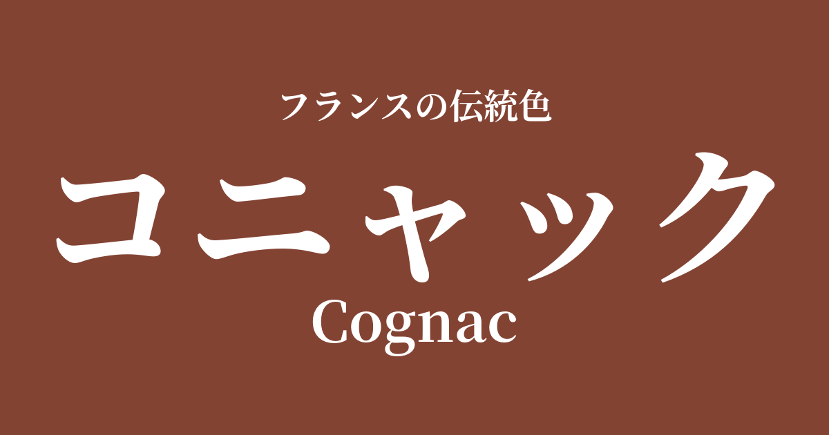
| French | Cognac |
|---|---|
| Katakana | cognac |
| HEX | #834333 |
| RGB | 131, 67, 51 |
What is Cognac? Origin and Etymology
The color name "Cognac" originates from the world-famous brandy produced in Cognac, a city in the Charente department of southwestern France.
This brandy, through long-term aging in oak barrels, deepens in color from a beautiful amber to a rich reddish-brown. The rich and warm color, cultivated over many years, has become recognized and established as the color's name itself.
The place name "Cognac" is said to originate from the Gallic personal name "Connius." The sophisticated and mature atmosphere of this color seems to tell the story of the history woven by aged brandy and its undeniable quality.
Historical background of Cognac
The history of cognac dates back to the 16th century when wine production flourished in this region. At that time, it was difficult to transport the wine while maintaining its quality over long distances, and the distillation method was developed as a solution. This became the prototype for brandy.
In the 17th century, Cognac brandy spread throughout Europe, particularly through trade with Dutch merchants. During this process, the crucial method of aging in oak barrels, which continues to this day, was established, resulting in its distinctive deep color and rich aroma.
During the "Belle Époque" (the golden age) of the late 19th and early 20th centuries, cognac became a symbolic drink of the upper class, beloved in Parisian cafes and social circles. Against this historical backdrop, the color of cognac became more than just brown; it became etched in people's minds as a special hue symbolizing luxury, maturity, and cultural richness.
Cognac in the world of art and fashion
The color cognac, with its warmth and depth, has been loved across generations, especially in the world of fashion. When used in high-quality leather goods such as handbags, dress shoes, belts, and gloves, this color creates a sophisticated elegance that is classic yet timeless.
Cognac is a very popular color in the field of interior design. Incorporating this color into leather sofas, armchairs, or wooden furniture brings a sense of calm, solidity, and cozy warmth to a space. It harmonizes particularly well with mid-century modern designs and industrial styles.
Turning our attention to the world of art, although there is no direct connection, we can find deep, cognac-like brown hues in the chiaroscuro technique used by Baroque painters, exemplified by Rembrandt van Rijn. In the dramatic contrast of light and shadow, these warm browns added depth to the expressions of figures and the textures of their clothing, creating a powerful emotional impact on the viewer.
Color scheme preview
This is to check the readability of the text when this color is used as the background.
Cognac color scheme proposal
Blue Nuit (#0F2540)
When paired with a deep, night-sky-like blue nuit, the warmth of the cognac is highlighted, creating an intelligent and masculine impression. It's recommended for study decor or for business attire where you want to project an image of trustworthiness.
Ecru (#F5F3E6)
The soft, natural ecru hue gently complements the depth of the cognac, creating a natural and comfortable atmosphere. It's perfect for living room decor or relaxed, casual fashion.
Vert Forset (#004025)
When combined with Vert Forset, which evokes a deep forest, the depth and richness of each color are enhanced. This color scheme gives a classic and dignified impression, reminiscent of a traditional English study.
Practical Scenes
In the world of fashion, cognac has established itself as a staple color, especially for leather items. Simply incorporating it into bags, boots, or jackets adds a touch of sophistication and warmth to the entire outfit. It also pairs well with basic items such as denim and trench coats, creating a timeless style that transcends trends.
In interior design, cognac is very effective when used as an accent color in a space. For example, simply placing a cognac-colored leather sofa in the living room can tighten up the entire room and create a sophisticated and calming atmosphere. Incorporating it partially with cushions, rugs, or art frames is also a great idea.
In the world of web and graphic design, it is well-suited to conveying brand images that emphasize reliability, tradition, and craftsmanship. Rather than using it as the main color, using it in key elements such as headings, buttons, and icons can effectively add visual weight and a sense of luxury.