
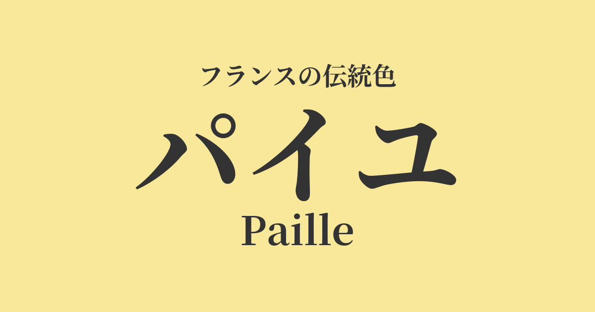
| French | Paille |
|---|---|
| Katakana | Paille |
| HEX | #F9E899 |
| RGB | 249, 232, 153 |
What is Paille? Origin and etymology
"Paille" is a French word meaning "straw." As the name suggests, it derives from the color of dry bundles of wheat that shine golden in the summer sun.
This color, reminiscent of the rich French countryside, particularly the vast wheat fields of Provence and Burgundy, is a natural color that has been an integral part of people's lives. It symbolizes abundance, fertility, and simple warmth, giving a calm and comforting impression.
Paille's historical background
Paille is a color that has been deeply associated with the lives of ordinary French people and the rural landscape, rather than being a color favored by specific royalty or nobility.
However, in the late 18th century, at "Amaux de la Reine" (The Queen's Hamlet), a rural village built on the grounds of the Palace of Versailles by Marie Antoinette, she wore simple dresses and enjoyed country life. During this period, partly due to the intellectual influence of Jean-Jacques Rousseau, a trend emerged in court culture of longing for nature and a return to simplicity. The gentle, nature-derived colors of Paille can be said to reflect the atmosphere of this era.
Furthermore, in the 19th century, Impressionist painters frequently used this color in their outdoor (pleinaire) paintings, as they pursued the effects of light. Wheat fields and haystacks bathed in sunlight were ideal motifs for them, and Paille's color was essential in expressing that brilliance.
Paille in the world of art and fashion
In the world of art, the possibilities of expression for straw were particularly expanded by 19th-century Impressionist painters. Claude Monet's series of "Haystacks" captured the changing light depending on the time of day and season, depicting how the same motif takes on a variety of expressions. In these works, various shades of yellow straw take center stage, from the pale straw illuminated by the morning sun to the fiery straw bathed in the setting sun.
Vincent van Gogh, who created his art in Arles in southern France, was also captivated by this color. His depictions of wheat fields are filled with a powerful yellow that seems to swirl with life itself, brilliantly expressing the energy and passion inherent in the color Paille.
In fashion, the "chapeau de paille" (straw hat) is an eternal summer staple. Originally a practical hat for farm work, it eventually became a symbol of resort fashion, and Coco Chanel also incorporated its lightness and natural charm into her own style.
What a beautiful yellow!
Color scheme preview
This is to check the readability of the text when this color is used as the background.
Paille's color scheme proposal
Blue Lapis Lazuli (#26619C)
This color scheme evokes the contrast between the clear blue skies of southern France and the golden wheat fields. It's a classic and striking combination that is vibrant, full of life, and beautifully complements each other's colors.
Veil Olive (#58542C)
This combination of olive trees and wheat fields is symbolic of the Provençal landscape. The earthy color scheme, reminiscent of nature's bounty, creates a calm, peaceful, and natural impression.
Blanc de Ran (#F4E9D9)
The combination of off-white, reminiscent of linen fabric, and straw yellow creates a very gentle and sophisticated atmosphere. It's a perfect color scheme for a simple yet elegant French country style.
Practical Scenes
In interior design, paille brings warmth and brightness to a space. Incorporating it into one wall in the living room or dining room, or into fabrics such as curtains and cushions, can create a comfortable space that feels like sunlight is streaming in. It pairs particularly well with natural wooden furniture such as light-colored wood and pine, as well as natural materials such as linen and cotton.
In fashion, it's perfect for summer dresses, blouses, and skirts. It brightens the face and gives a healthy, light impression. When incorporated into relaxed items such as linen shirts and cotton pants, the simple charm of paille is further enhanced.
In web and graphic design, using it as a background or accent color can create an organic and approachable atmosphere. It's a good fit for brands related to natural cosmetics, food, and lifestyle products.