
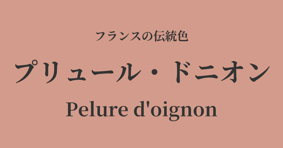
| French | Pelure d'oignon |
|---|---|
| Katakana | Prieur Denion |
| HEX | #d39b8b |
| RGB | 211, 155, 139 |
What is Prussius von Nion? Origin and etymology
Pelure d'oignon is a color with a very poetic and beautiful name, meaning "onion skin" in French.
As the name suggests, it has complex and nuanced colors, such as a reddish-brown or a slightly muted rose pink, reminiscent of dyeing with the thin skin of a red onion. Its charm lies in its delicate intermediate colors that cannot be fully described in a single word, and it gives off a warmth and depth that is unique to naturally derived dyes.
Historical background of Prussius d'Union
This elegant color was particularly beloved in 18th-century France during the Rococo period. This was the era when Madame de Pompadour, the mistress of King Louis XV, and Marie Antoinette, who would later become queen, were fashion leaders who spearheaded court culture.
Ladies of that era preferred sophisticated, muted colors to bright, primary colors. Pruir Donion became popular as one of the fashionable colors that adorned their silk dresses. In an era when plant dyes were prevalent, the delicate colors derived from nature richly stimulated people's aesthetic sensibilities.
After the French Revolution and the Napoleonic Empire, the advent of chemical dyes in the 19th century led to a trend towards brighter and more vibrant colors. However, the gentle and profound hues of artists like Pruelle Denion have continued to live on in the French sense of color across generations.
Pruelle Denion in the world of art and fashion
Prue Denion's color palette is deeply intertwined with the sweet and elegant world of Rococo art. These delicate intermediate colors frequently appear in the dresses worn by ladies in paintings by François Boucher and Jean-Honoré Fragonard. When these colors are used on lustrous silk or satin fabrics, the way light hits them creates shadows and highlights their beauty even further.
Furthermore, this color is not unrelated to Lyon's renowned silk weaving industry. At the time, Lyon was the center of European textiles, and artisans competed to create new colors and designs to meet the fashion trends of the royal court. Pruir Denion can be said to be one of the colors that flourished within this vibrant fashion culture.
Color scheme preview
This is to check the readability of the text when this color is used as the background.
Pruelle Donion's color scheme proposal
Veil Nir (#b9d7d4)
It evokes the elegant and refined impression of Rococo paintings. The sweetness of Prue Denion and the freshness of Vert Nil complement each other, creating a sophisticated atmosphere.
Blanc de Lis (#f3e9d6)
This gentle and comforting color scheme evokes the warmth of natural materials. It beautifully complements relaxed, natural spaces and effortless fashion styles.
Gris de Tourturelle (#8b827b)
The feminine impression of Pruelle Denion is toned down by the calm gray, giving it a sophisticated and chic urban feel. It's recommended for when you want to create a modern and intellectual adult atmosphere.
Practical Scenes
In the field of interior design, incorporating it into fabrics such as wallpaper, curtains, and cushions brings warmth and sophistication to a space. It pairs particularly well with antique wooden furniture and metal accessories such as gold and brass.
In fashion, incorporating this color with high-quality materials such as silk blouses or cashmere knits makes the skin look beautiful and gives an elegant impression. It also looks great as an accent color in accessories such as bags and scarves.
In web and graphic design, using this color as a background or accent color can give the entire site a warm, trustworthy, and slightly nostalgic feel. It is suitable for lifestyle brands and beauty-related websites.