
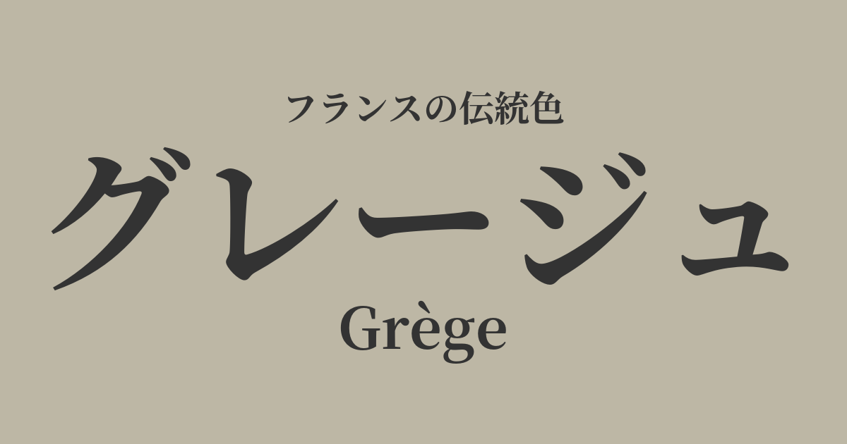
| French | Grège |
|---|---|
| Katakana | Greige |
| HEX | #bdb7a5 |
| RGB | 189, 183, 165 |
What is greige? Origin and etymology
The word "Grège" originates from a French word meaning "raw" or "unprocessed." In particular, its etymology is deeply rooted in "soie grège," which refers to "raw silk" or "raw thread."
Silk thread, spun directly from silkworm cocoons before scouring or dyeing, is not pure white, but rather a slightly grayish yellowish-brown. This natural, unadulterated color is the origin of greige.
Greige combines the urban and sophisticated impression of gray with the warmth and gentleness of beige. Known for its ambiguous yet exquisitely balanced and profoundly appealing qualities, greige is a color that embodies both.
Historical background of greige
Unlike the vibrant colors that symbolize royal crests or specific social classes, greige can be said to be a color that has been more closely intertwined with people's lives and daily routines.
This aesthetic may have gained particular attention in late 18th-century France. Just as Marie Antoinette escaped the hustle and bustle of the Palace of Versailles and embraced a more natural lifestyle in the countryside of the Petit Trianon, simplicity and a return to nature became a trend in aristocratic society at the time. Stepping away from extravagant ornamentation, the natural colors of linen and cotton, and gentle, naturally derived hues like greige, came to be appreciated as refined taste.
In the 20th century, innovative designers such as Coco Chanel liberated women from corsets and proposed simple, functional fashion. In this context, neutral colors like greige played an extremely important role, alongside black, white, and navy. Greige, which doesn't overly assert itself and enhances the wearer's individuality and the quality of the materials, is one of the colors that laid the foundation for modern French elegance.
Greige in the world of art and fashion
The greige color has particularly shown its true value in the world of fashion and textiles. Haute couture houses frequently use greige as a color that maximizes the inherent beauty of high-quality natural materials such as wool, cashmere, and silk. It delicately expresses the drape and texture of the fabric, highlighting the essence of the design.
Furthermore, greige is an indispensable base color in French interior design culture. In the style known as "French chic," a calm and elegant space is created by combining greige furniture and fabrics with a base of white or off-white. While not flashy, this nuanced color, which changes its appearance depending on the light, brings peace and tranquility to the hearts of those who live there.
Color scheme preview
This is to check the readability of the text when this color is used as the background.
Greige color scheme suggestion
Rose Pompadour (#EDADC7)
The calming greige is complemented by the elegant pink beloved by Madame de Pompadour, adding a refined sweetness and glamour. This color scheme evokes the refined elegance of the Rococo era.
Blue Nuit (#0F2540)
The combination with a deep navy blue reminiscent of the night sky gives an intelligent and modern impression. The beautiful contrast makes it perfect for creating a sophisticated and chic urban style.
Blanc de Roi (#F2EFE6)
By combining it with a warm off-white, a natural and very elegant tone-on-tone color scheme is created. It is recommended for creating a minimalist and high-quality space.
Practical Scenes
In the world of fashion, greige is beloved as the ultimate basic color. Having just one item in your wardrobe—such as a trench coat, high-quality knitwear, or trousers—greatly expands your styling options. It harmonizes easily with any color, and its elegance is especially enhanced when paired with basic colors like white, black, and navy. A monochrome outfit using varying shades of greige is a classic, sophisticated adult style.
In interior design, using it on large areas such as walls, curtains, and sofas brings a calm and peaceful atmosphere to the entire space. It pairs exceptionally well with natural materials such as wood, stone, and linen, and because it softly reflects light, it can also be expected to make a room appear brighter and more spacious.
In web design and graphic design, using it as a background color can subtly enhance content without being overpowering, conveying a sense of reliability and sophistication. It is effectively used by luxury brands, lifestyle media, and minimalist websites.