
| Japanese color name | purple dull |
|---|---|
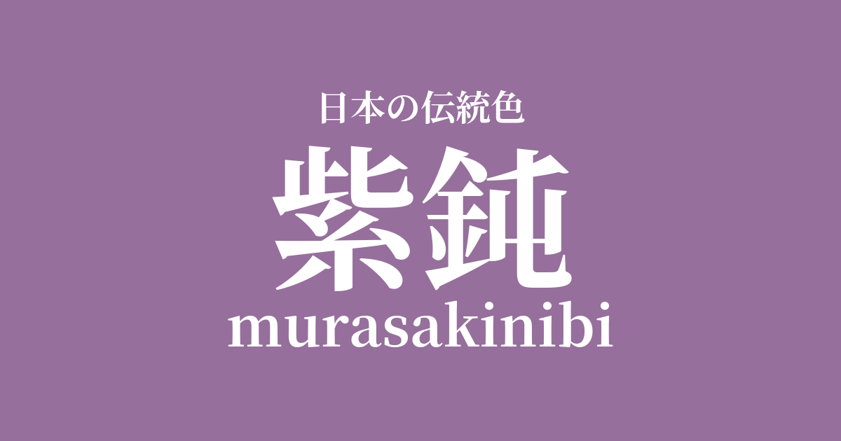
| reading | murasakinibi |
| HEX | #966F9C |
| RGB | 150, 111, 156 |
What is "purple dull"? Origin and etymology
Murasaki-nibi is a color name that, as the name suggests, combines "purple" and "dull." "Nibi-iro" refers to a dark gray color dyed with the fruit of the beech tree (Tsurubami), and was historically used as a color of mourning. Murasaki-nibi is this dull gray with a purplish tint added, and in contrast to vibrant purple, it is characterized by a subdued and calm hue.
It is believed that this color is achieved by combining purple dye made from the roots of the gromwell plant (shikon) with acorn dye, or by using a special mordant.
Historical background of purple dull
The Engishiki, a collection of laws from the Heian period, contains a description of the color purple-gray. According to it, purple-gray was designated as the color of the robes worn by retired emperors, crown princes, and imperial princes during the mourning period for the emperor. This is thought to be because the noble color purple was combined with the mourning color dull gray to express deep sorrow. Thus, purple-gray was not merely a color, but a color with strong formality and meaning, used by people of certain social status on special occasions.
Related literature, waka poetry, and seasonal words
Due to its historical background, dull purple is sometimes depicted in literary works as a color symbolizing sadness and mourning. In Heian period literature such as "The Tale of Genji," the color of a character's clothing is an important element that hints at their feelings and circumstances. It is presumed that dull purple clothing was sometimes used to depict characters in mourning or those who are disillusioned with the world.
However, there are not many famous waka or haiku poems that directly mention the color name "purple dull," and it is a color whose existence is mainly discussed in the history of clothing culture.
Color scheme preview
This is to check the readability of the text when this color is used as the background.
Purple dull color scheme proposal
Dull color (#727171)
The combination with dull gray, which is also the origin of the term "purple dullness," creates a unified and calm impression. Sharing a historical background as a color used for mourning, it evokes a quiet and solemn atmosphere. A natural harmony, like a gradient, is created.
White training (#FFFFFF)
When combined with pure white, the elegance and tranquility of the muted purple stand out. The resulting contrast prevents it from becoming too dark, creating a sophisticated impression. This color scheme is suitable for formal occasions and modern Japanese designs.
Withered color (#836749)
By combining it with the withered colors of dried plants, a natural and wabi-sabi aesthetic is created. The tranquility of the dull purple and the sense of loneliness of the withered colors harmonize to express the feeling of the season from late autumn to winter. The result is a deep and calming color scheme.
Practical Scenes
Purple-gray, with its subdued hue, is a color that is easy to incorporate into modern fashion and interior design. In kimonos and obi sashes, it creates a refined yet understated look and is particularly favored in settings where a quiet atmosphere is desired, such as tea ceremonies. In interior design, using it as an accent color for wallpaper or curtains brings depth and tranquility to the space. In web design, using it as a background color or main color can create a website that conveys a sense of luxury and trustworthiness.