
| birthday | April 6 |
|---|---|
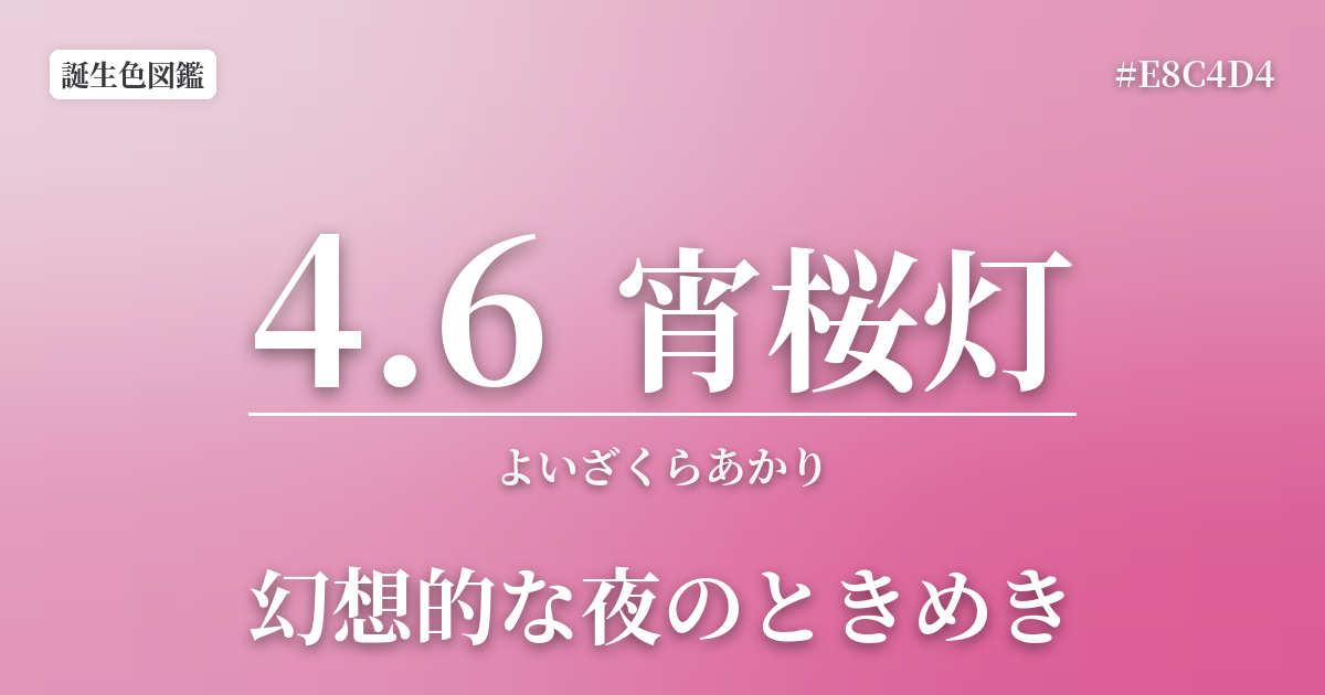
| Color name | Evening Cherry Blossom Lanterns |
| HEX | #E8C4D4 |
| RGB | 232, 196, 212 |
| Color meanings | A fantastical night of excitement |
- What is the birth color for April 6th, "Yoizakura-tou"?
- The color's meaning is "the thrill of a fantastical night" and its corresponding personality.
- Connection to the seasons — Cherry blossoms at night and cherry blossom viewing parties
- Color scheme preview
- Color scheme proposal for Yoizakura Lanterns
- FAQ
- Related traditional colors
What is the birth color for April 6th, "Yoizakura-tou"?
The birth color for April 6th is "Yoizakura Akari" (Evening Cherry Blossom Light). It's a fantastical pink color that evokes the image of cherry blossoms blooming in the twilight, illuminated by a soft light.
This pale pink with a hint of purple exudes a quiet, romantic atmosphere, quite different from the vibrancy of daytime. It's a color that expresses the subtle fluttering in the depths of the heart and the dreamy comfort felt in the stillness of night.
The color's meaning is "the thrill of a fantastical night" and its corresponding personality.
People who prefer this color tend to be highly sensitive and have a romantic side. They possess a delicate heart that can perceive not only the surface of things but also the emotions and beauty beneath, and are often drawn to fantastical worlds.
They give off a calm and gentle impression to those around them, but inwardly they harbor a unique sensibility and quiet passion. They cherish their own worldview and cultivate inner richness through creative activities and time spent in contemplation.
Connection to the seasons — Cherry blossoms at night and cherry blossom viewing parties
Around April 6th, cherry blossoms reach their peak in many areas, and the streets become bustling with people enjoying the nighttime blossoms. Unlike the cherry blossoms seen in the bright daylight, those that emerge from the darkness of night, illuminated by the light of paper lanterns and paper lamps, present a fantastical and ethereal beauty.
The colors of "Yoizakura Tou" perfectly capture the light illuminating the cherry blossoms at night and the hues of the petals bathed in that light. It's a picturesque scene unique to spring nights, symbolizing the transience of cherry blossoms blooming in the quiet night and the extraordinary exhilaration brought about by the lively atmosphere of the festivities.
Color scheme preview
This is to check the readability of the text when this color is used as the background.
Color scheme proposal for Yoizakura Lanterns
Misty Rose (#FFE4E1)
This color scheme further enhances the gentle and romantic atmosphere of the Yoizakura Lantern. It creates a gradient reminiscent of the shades of cherry blossom petals, giving a feminine and tranquil impression.
Midnight Blue (#191970)
This combination with midnight blue evokes the night sky where cherry blossoms bloom. The pale pink of the evening cherry blossom lanterns stands out against the deep blue, creating a fantastical, sophisticated, and mature impression.
Saddle Brown (#8B4513)
The combination with brown tones reminiscent of cherry tree trunks and branches creates a natural and calming impression. It subtly balances the sweetness of the evening cherry blossom lanterns, creating a warm and natural atmosphere.