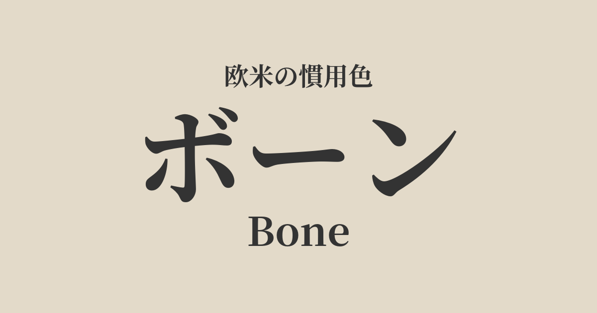
| Original English name | Bone |
|---|---|
| Japanese notation | Bone |
| HEX | #E3DAC9 |
| RGB | 227, 218, 201 |
What is a bone? Origin and etymology
The color "Bone" is derived from the English word for "bone." It's a color name that describes the natural, slightly yellowish or grayish-white color of animal bones.
This refers to the natural color of bones that have been exposed to the elements and the passage of time, rather than bleached, pure white bones. Therefore, it has a warmth, depth, and a somewhat organic feel that sets it apart from pure white.
Derived from the word "bone," which supports the basic structure of life, this color also carries symbolic meanings of strength, permanence, and the origin of things.
Bourne's historical background and culture
Throughout human history, bones have been used for tools, weapons, and ornaments since ancient times. Therefore, the color of bone can be considered one of the most primitive and familiar colors to humankind. Ancient artists created black pigment (bone black) from burnt bones, but the natural color of bone itself also existed as a part of simple artistic expression.
In modern times, particularly in 19th-century Europe and America, sophisticated neutral colors became popular. Off-white with a nuanced tone, such as bone, was adopted for interiors and dresses as a color that could express elegance without being overly flashy.
From the 20th century onward, within the context of modernism, functional and minimalist designs came to be valued. Bourne established its position in various fields, including architecture, interiors, and industrial products, with its clean yet not overly cold, neutral colors.
Bone in design and art
In the world of fashion, bone is a color that symbolizes effortless and sophisticated style. It pairs exceptionally well with high-quality natural materials such as linen, cotton, and cashmere, giving a calm and intelligent impression. It also has the advantage of being more flattering to the skin than pure white, making it suitable for many people.
Bone is a very popular base color in interior design. Incorporating it into walls, ceilings, and large furniture brings brightness and warmth to a space, enhancing the beauty of other colors and materials. It's an essential color for Scandinavian, Japanese, and minimalist interior design.
Furthermore, bone china, a high-quality porcelain originating in England, is made from cow bone ash, as its name suggests, and is characterized by its unique milky white color and translucency. This beautiful whiteness is also one of the elements that shape the image of the color bone.
Feel it in my bones.
Color scheme preview
This is to check the readability of the text when this color is used as the background.
Bone color scheme proposal
Terracotta (#E2725B)
This combination of earthy colors evokes the feeling of the earth. The gentleness of bone and the warmth of terracotta harmonize to create a simple, cozy, and relaxed atmosphere.
Slate Gray (#708090)
This color scheme gives a modern and urban impression. The soft warmth of bone tones down the cool and rigid image of slate gray, creating a sophisticated space.
Sage Green (#B2AC88)
This combination evokes the natural beauty of plants, creating a calming and organic atmosphere. Its soothing, natural feel provides a sense of relaxation to those who see it, making it ideal for creating a comfortable space.
Practical Scenes
In interior design, incorporating bone into large areas such as walls, curtains, and sofas creates a brighter and calmer impression throughout the space. It pairs well with natural materials such as wood, stone, and plants, creating a warm, natural modern atmosphere. Because it blends well with any color, it is also excellent as a background color to highlight accent colors.
In fashion, a monochrome outfit using bone tones creates an elegant and sophisticated style. It's a versatile color that's easy to incorporate into various items, such as jackets, knits, and pants. Adding leather bags or shoes in bone tones can elevate the look and give it a touch of luxury.
In web design, using white as a background color creates a page that is easier on the eyes than pure white and gives a calm impression. It is suitable for lifestyle and wellness-related sites where you want to give the content a warm and trustworthy feel without compromising text readability.