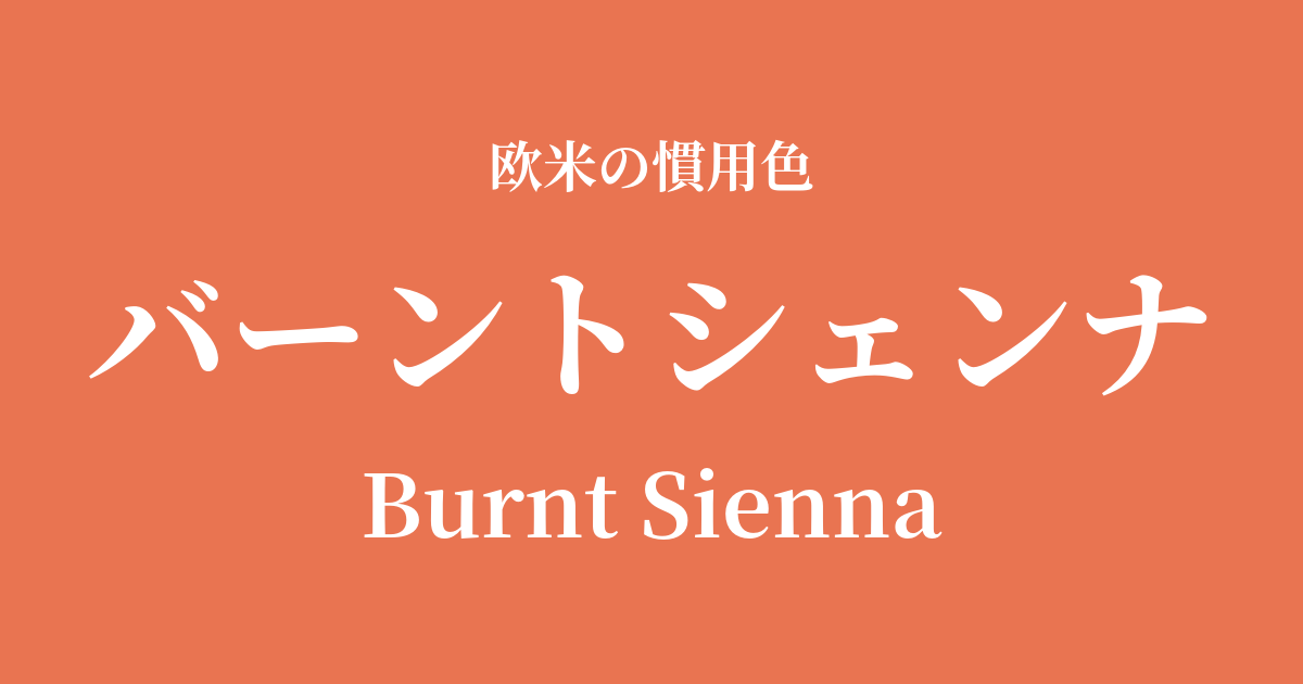
| Original English name | Burnt Sienna |
|---|---|
| Japanese notation | Burnt Sienna |
| HEX | #E97451 |
| RGB | 233, 116, 81 |
What is burnt sienna? Origin and etymology
Burnt Sienna, as its name suggests, is a warm reddish-brown clay derived from "burnt (Burnt) soil of Siena." It is made from iron hydroxide-rich clay (limonite) mined around Siena, a city in the Tuscany region of Italy.
When this soil is simply dried and used as a pigment, it is called "raw sienna" and has an ochre color. Burnt sienna, on the other hand, is made by heating (firing) raw sienna in a furnace. In this process, the iron hydroxide is dehydrated and changes into a more reddish iron oxide (hematite), resulting in a unique, deep, rich reddish-brown color. It is a color that can truly be called art of the earth, completed through the bounty of nature and the touch of human hands.
Historical background and culture of burnt sienna
Burnt sienna has a long history and is considered one of the earliest pigments used by humankind. Pigments from this color family have also been found in prehistoric cave paintings.
Its value particularly increased during the Italian Renaissance. Early Renaissance masters such as Giotto and Duccio frequently used this color in frescoes and tempera paintings to depict the shading of skin, clothing, and architecture. For artists of that time, burnt sienna, being readily available and highly durable, was an indispensable basic pigment.
In 17th-century Dutch painting, artists like Rembrandt utilized its warm tones to depict dramatic contrasts of light and shadow. Even in modern times, it continues to be a favorite color for many painters, used to depict earth, brick, and autumn trees in landscapes.
Burnt Sienna in Design and Art
In the art world, burnt sienna is one of the most basic paints, and is included in the palettes of all art materials, including oil paints, watercolors, acrylics, and pastels. It is widely used, in particular, for depicting skin in portraits and for creating natural shading in landscapes.
In interior design, terracotta is a popular color for simple, warm materials such as terracotta flowerpots and brick walls. Incorporating it into accent walls, cushions, and rugs adds a sense of calm and depth to a space.
In the world of fashion, earth tones are a quintessential choice and are particularly popular in autumn and winter collections. Incorporating these colors into coats, knitwear, and suede boots creates a natural, sophisticated, and seasonally appropriate look. In the cosmetics field, they are also used in blushes, eyeshadows, and lipsticks to create a healthy, rosy complexion that blends well with the skin.
Color scheme preview
This is to check the readability of the text when this color is used as the background.
Burnt Sienna color scheme suggestion
Turquoise Blue (1TP5 T40E0D0)
The warm tones of burnt sienna and the cool tones of turquoise blue are almost complementary colors, and they enhance each other beautifully. This creates an exotic and energetic impression reminiscent of the nature and crafts of the American Southwest.
Olive Green (#808000)
Both are earth tones found in nature, making them a very compatible combination. They create a calm, deep, natural, and organic atmosphere, resulting in a comfortable and relaxing space.
Ivory (#FFFFF0)
When combined with a warm off-white ivory, the reddish hue of burnt sienna stands out, creating a sophisticated and elegant impression. It exudes a soft, graceful, and classic atmosphere.
Practical Scenes
In interior design, using burnt sienna as an accent wall brings warmth and tranquility to the entire room. It can also be easily incorporated into textiles such as cushions, blankets, and curtains to create a seasonal feel. It pairs particularly well with natural, rustic, and bohemian styles.
In fashion, this color is a key element in autumn and winter outfits. Incorporating it into items like wool coats, cashmere sweaters, and corduroy pants creates a sophisticated and warm style. It also pairs exceptionally well with basic colors such as denim, white, black, and gray.
In web design, this color is suitable for sites that want to convey a sense of trustworthiness, handcrafted feel, and an organic atmosphere. When used as a hover color for buttons, headings, and links, it attracts the user's attention while maintaining a calm and understated impression.