| English name | Light Mocha |
|---|---|
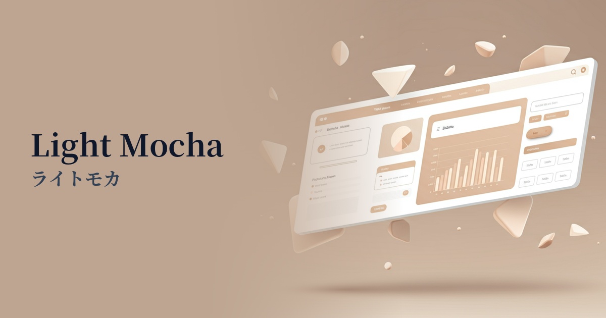
| Katakana | Light Mocha |
| HEX | #EBE3DB |
| RGB | 235, 227, 219 |
| Design Theme | Neutral & Minimal Background Colors |
Why is it a trend? (Background and reasons)
In recent years, web design has seen a shift from flashy, information-heavy designs to a return to quiet, calming experiences that allow users to feel comfortable. Light mocha is a color that perfectly embodies this "Quiet Design." Its subtle warmth sets it apart from pure white or gray, creating a sophisticated, minimalist space and an environment where users can naturally focus on the content.
With increasing screen time, the concept of "digital wellness," which prioritizes user visual comfort, is gaining importance. Earth tones like light mocha are easy on the eyes, reducing fatigue even during prolonged viewing and providing users with a sense of security. They also pair well with natural materials and organic concepts, making them ideal colors for expressing the worldview of brands with sustainable values.
The psychological effects of design and UX
The warm, beige tone of Light Mocha creates a calming and reassuring psychological effect on users. This color instills a sense of stability and trust in a space, and is particularly effective in the UI/UX of services where trust with users is crucial, such as wellness, finance, and consulting.
The bright, soft colors naturally create an elegant and sophisticated impression. While luxurious, they are not overpowering, making them ideal for use on fashion, interior design, and cosmetics brand websites. They enhance the appeal of the products while elevating the overall brand image.
Light mocha, a neutral color with minimal visual stimulation, does not distract users. Therefore, it is highly effective as a background color for long-form content such as blog posts or for data-heavy SaaS dashboards. It enhances content readability without obscuring key information or calls to action (CTAs).
Visibility testing (UI component example)
Practical usage (best practices)
By using light mocha as the background color for the entire site, you can easily create a unified and calm atmosphere. In particular, it serves as a canvas that maximizes the appeal of minimalist layouts that feature beautiful photographs and typography.
Placing card UIs and section backgrounds in light mocha against a white background gently groups information. This allows you to visually indicate content boundaries without using strong borders, resulting in a softer and more natural interface.
Light mocha also works well as a supporting color that enhances other colors. For example, when using vibrant coral pink or deep forest green as accent colors, placing light mocha in the background makes the accent colors stand out more and draws attention.
It's also effective to use it on interactive elements such as buttons and links. For example, by making the default button a dark color and changing it to light mocha when the mouse hovers over it, you can provide users with elegant and pleasant feedback and a sophisticated user experience.
Recommended color scheme suggestions
Slate Gray (#708090)
The combination of warm light mocha and cool, sophisticated slate gray creates a modern and trustworthy impression. It's ideal for creating a refined and professional atmosphere on business websites and portfolio sites.
Sage Green (#9DC183)
The combination with sage green, reminiscent of nature, creates an organic and comfortable space. It's ideal for wellness, cosmetics, and lifestyle brand websites, giving users a sense of security and relaxation.
Rosy Brown (#BC8F8F)
Adding a reddish-brown color, rosy brown, as an accent adds a subtle warmth and femininity to an elegant look. It creates a graceful and captivating world view on fashion and beauty e-commerce sites.