
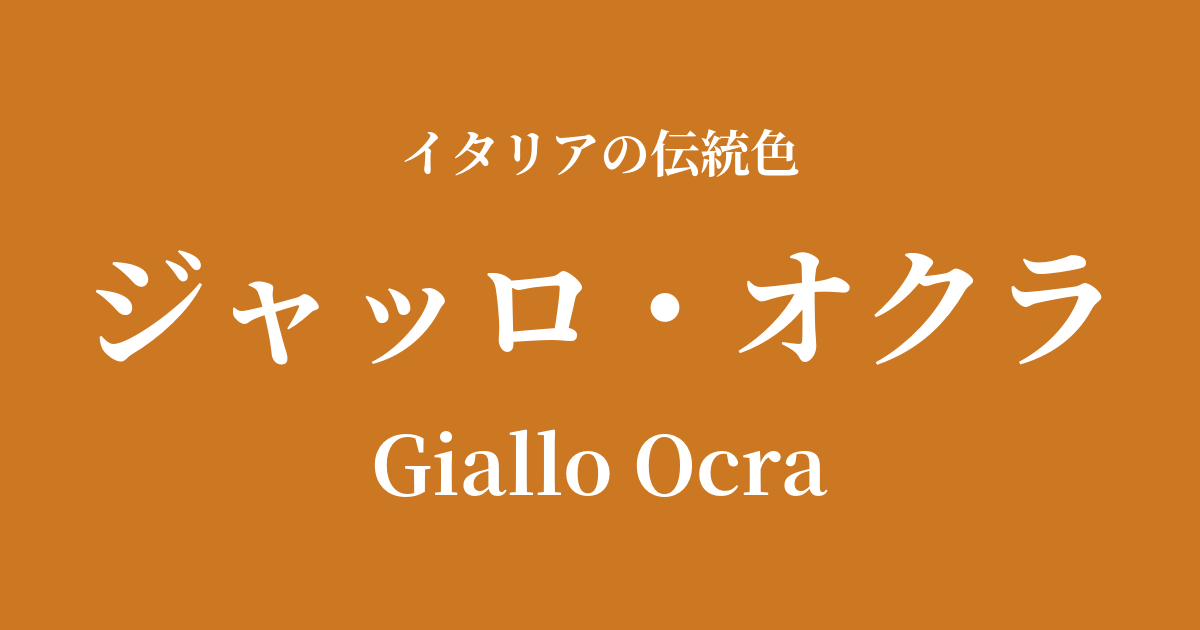
| Italian original name | Giallo Ocra |
|---|---|
| Japanese notation | Giallo Okra |
| HEX | #CC7722 |
| RGB | 204, 119, 34 |
What is giallo okra? Origin and etymology
Giallo Ocra is a simple and warm color, meaning "yellow ochre" in Italian. "Giallo" means yellow, and "Ocra" refers to ochre, a pigment derived from natural soil.
This color originates from one of the oldest pigments used by humankind. Made from clay minerals containing hydrated iron oxide, ochre was a universal and fundamental colorant, even appearing in Paleolithic cave paintings. In Italy, particularly in the Tuscany region, high-quality ochre is produced and has been cherished as an indispensable color in art and architecture since ancient times.
The colors evoke the image of dry earth bathed in sunlight. As colors found in nature, they bring a sense of peace and familiarity to people's hearts, and as fundamental colors that blend seamlessly into the Italian landscape, they have been loved across generations.
Historical background of Giallo Oclat
The history of giallo ocla dates back to ancient Roman times. Frescoes discovered in the ruins of Pompeii and Herculaneum show the rich use of this color in the backgrounds of murals, the clothing of figures, and the depiction of architecture. At the time, it was one of the most readily available and inexpensive pigments, yet its warm hues brightened the lives of the citizens.
Furthermore, there is a theory that some of the famous "Pompeii Red" was originally giallo ocella, which underwent a chemical change due to the heat from the eruption of Mount Vesuvius, resulting in its red color.
From the Middle Ages to the Renaissance, giallo ochre played an important role in religious painting and manuscript illumination. Artists such as Giotto and Cennino Cennini, in particular, skillfully used this pigment for underpainting to depict the shading of skin and for coloring clothing. Leonardo da Vinci is also known to have frequently used ochre-based pigments in his drawings and paintings. Highly stable and easily mixed with other colors, this pigment was a fundamental coloring material that supported the creativity of artists.
Giallo Ocra in Italian Culture and Art
Giallo ocla is deeply intertwined with Italian art, particularly fresco and tempera painting. It was used as a fundamental color for depicting the sky, earth, and architecture in the magnificent frescoes adorning the walls and ceilings of churches. Especially when combined with the gold background seen in Sienese paintings, it created a unique aesthetic that conveyed both sanctity and human warmth.
As a pigment, giallo okra had a wide range of uses, not only as a simple yellow color, but also by mixing it with other colors such as green and blue to create complex intermediate colors, and as a base color for depicting shading.
Giallo ochre is an iconic color not only in the world of art but also in Italian architectural culture. Walking through the streets of ancient cities like Rome, Florence, and Siena, you'll notice that the stucco walls of buildings are adorned with this warm ochre. It harmonizes beautifully with the colors of terracotta roof tiles and cobblestone streets, giving the entire city a sense of unity and historical depth. This color is an indispensable element that constitutes the very urban landscape of Italy.
This ochre, along with sinopia, is a pigment used in frescoes to depict all parts of the body, including faces, hands, and nudes.
Color scheme preview
This is to check the readability of the text when this color is used as the background.
Giallo Okra's color scheme proposal
Testa di Moro (#4F2F2F)
This rich and classic color scheme is reminiscent of ancient Roman frescoes and Renaissance paintings. It evokes a sense of calm and intellectual depth, creating a dignified and refined space.
Verde Oliva (#556B2F)
It evokes the natural and tranquil atmosphere of the Italian countryside. Earth tones harmonize beautifully, creating a peaceful and relaxing ambiance.
Azzurro (#007FFF)
This creates a vibrant and beautiful contrast, reminiscent of the blue skies and sun-drenched land of Tuscany. It's a sophisticated color scheme that brings brightness and vitality to any space.
Practical Scenes
In interior design, giallo ocla is a very popular color for bringing warmth and tranquility to a space. When used as the wall color in living rooms and dining rooms, it fills the space where the family gathers with a comfortable and cozy atmosphere. It is also effective when used on just one wall as an accent wall.
In particular, it pairs exceptionally well with natural materials such as solid wood furniture, terracotta planters, and linen and cotton fabrics, creating a simple yet sophisticated space.
In the world of fashion, giallo okra is particularly popular for autumn and winter outfits. Incorporating it into coats, knits, and leather jackets adds depth and warmth to your look. As an earth tone, it pairs well with basic colors such as navy, gray, brown, and olive green, giving an elegant and sophisticated impression.
In web and graphic design, using it as a background or accent color can bring a sense of reliability, historical depth, and an organic feel to the entire site. It is suitable for websites dealing with traditional crafts, natural foods, and history-related content.