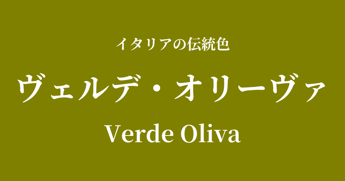
| Italian original name | Verde Oliva |
|---|---|
| Japanese notation | Verde Oliva |
| HEX | #808000 |
| RGB | 128, 128, 0 |
What is Verde Oliva? Origin and Etymology
Verde Oliva is a name that combines the Italian words "Verde," meaning "green," and "Oliva," meaning "olive," and as the name suggests, it represents the deep, slightly yellowish-green color of an olive.
This color is inspired by the Italian landscape, particularly the vast olive groves that cover Tuscany, Umbria, and the southern hills. Olive trees and their fruits, ripening in the sunlight, are an essential part of Italian food culture and life, and this color symbolizes Italy's rich natural environment itself.
Culturally, the olive tree has long held special significance. In the Old Testament story of Noah's Ark, the olive branch brought back by the dove was seen as a sign announcing the end of the flood and reconciliation with God, making it a symbol of peace and hope.
This color is not merely the color of a plant; it embodies vitality, fertility, and a wish for peaceful tranquility.
Historical background of Verde Oliva
The history of verde oliva dates back to ancient Roman times. For the Romans, the olive tree was sacred, and its oil was used not only for cooking but also for lighting, medicine, and sacred rituals. Olive branches were given to victors as crowns of victory and peace, and this color was believed to be recognized as a hue symbolizing social stability and prosperity.
The frescoes discovered in the ruins of Pompeii also depict vibrant olive trees, suggesting how deeply connected the people of that time were to this plant.
During the Renaissance, this color scheme played a crucial role in the world of painting. In particular, a pigment called "terra verde" (green earth) had a similar hue to verde oliva, and many painters used it as a base color (verdaccio technique) when depicting landscapes or skin tones. This technique gave depth and realism to skin tones.
Even in modern times, verde oliva has continued to be cherished as a color used in paintings depicting the Italian countryside and as a way to express regional identity.
Verde Oliva in Italian Culture and Art
Verde oliva is deeply ingrained in various aspects of Italian art and culture. In painting, as mentioned earlier, Renaissance painters used it for landscapes and underpaintings, and painters who emphasized chiaroscuro, such as Caravaggio, also effectively utilized this deep green in contrasts of light and shadow.
In architecture, it is sometimes used as the color of window frames and doors in traditional Tuscan houses. When combined with rustic stone walls and terracotta roofs, it creates a beautiful landscape that harmonizes with the surrounding nature.
In Italian culinary culture, Verde Oliva is the color of high-quality extra virgin olive oil itself. The golden-green hue of freshly pressed olive oil is a testament to its freshness and rich flavor, and is an essential element in the color and taste of Italian cuisine.
In the fashion world, earth tones are popular for their sophisticated look. These natural and calming colors pair well with high-quality wool and linen materials, creating a chic and elegant Italian style.
Color scheme preview
This is to check the readability of the text when this color is used as the background.
Verde Oliva's color scheme proposal
Terracotta (#E2725B)
This combination of warm, earthy colors evokes the landscapes of Tuscany. It creates a natural and rustic yet sophisticated and calming space, providing a comfortable and relaxing atmosphere.
Giallo Napoli (#FADA5E)
This bright and vibrant color scheme evokes the sun and olive groves of Southern Italy. It adds a touch of elegance to a natural atmosphere, creating a positive and lively impression.
Bianco Travertino (#F5F5DC)
This elegant and classic combination evokes the architecture of ancient Rome. It enhances the depth of Verde Oliva while adding a bright and clean impression, creating a sophisticated space.
Practical Scenes
In interior design, Verde Oliva brings a sense of calm and tranquility to a space. When used as an accent wall in a living room or study, it creates a sophisticated and intellectual atmosphere. It pairs exceptionally well with natural materials such as solid wood furniture, linen, and cotton, and adding houseplants can further enhance the relaxing atmosphere.
In fashion, this color is used to create an intelligent and sophisticated impression. Incorporating it into coats, jackets, and pants instantly refines the entire outfit. As an earth tone, it pairs well with other natural colors such as beige, brown, and cream, and adding gold accessories adds an elegant touch of glamour.
In web and graphic design, it is effective when you want to convey a sense of trust and an organic image. When used as a key color on websites for natural cosmetics or food brands, or on content related to environmental issues, it can give users an impression of sincerity and reliability.