
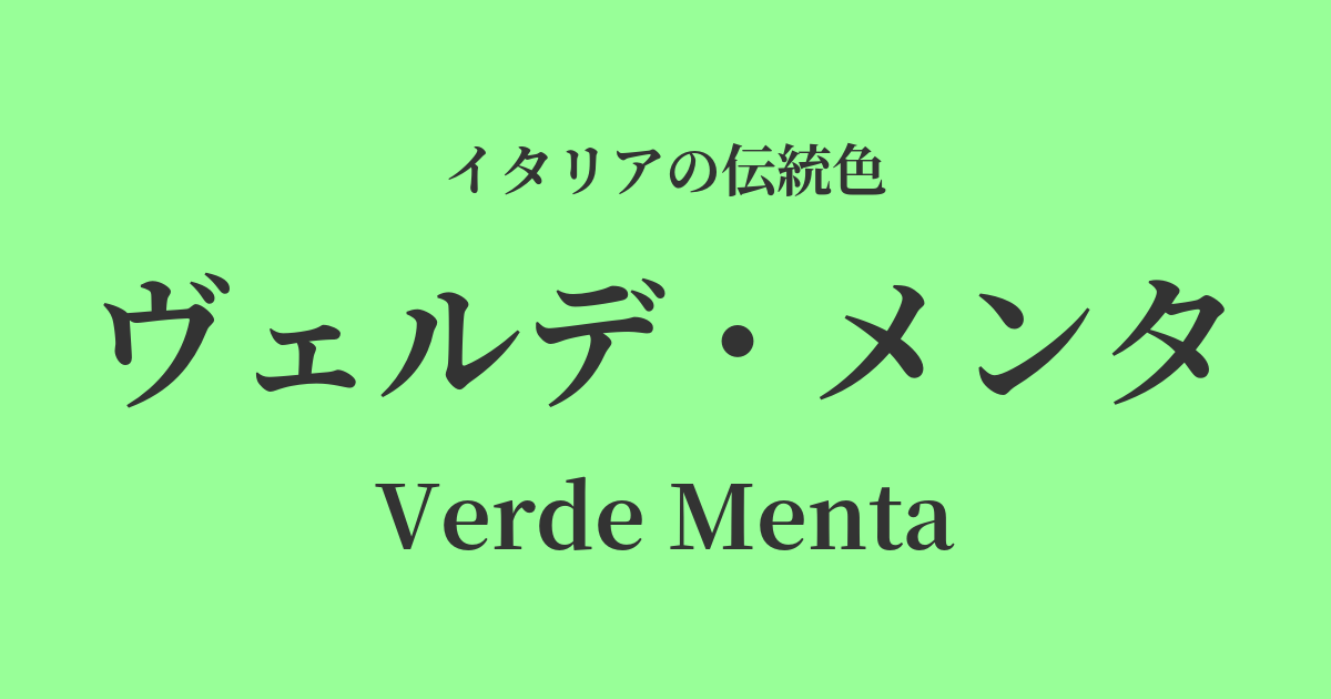
| Italian original name | Verde Menta |
|---|---|
| Japanese notation | Verde Menta |
| HEX | #98FF98 |
| RGB | 152, 255, 152 |
What is Verde Menta? Origin and Etymology
Verde Menta, meaning "mint green" in Italian, is a refreshing, bright green color. As the name suggests, it is derived from the color of mint leaves, a herb that has been popular along the Mediterranean coast for centuries.
The refreshing scent and taste of mint have long brought people a sense of refreshment and healing. This color reflects the vitality, youthfulness, and gentle tranquility that mint embodies. It can be described as a positive color born from the blessings of nature, promoting health for both mind and body.
Historical background of Verde Menta
The history of mint itself is ancient; as far back as ancient Rome, it was deeply rooted in daily life, used as a medicinal herb and spice, and even scattered on the floor during festivals to enjoy its fragrance. You can also find vibrant greenery reminiscent of Verde Menta in the garden scenes depicted in the frescoes of Pompeii.
With the advent of the Renaissance, pigment technology advanced, allowing artists to create a wider range of greens. Pale, bright greens like verde menta were created by mixing white with pigments such as verdigris, and they were used to color clothing and natural landscapes in paintings.
In the modern era, particularly during the Art Deco and Mid-Century periods of the 20th century, these pastel colors were favored as symbols of modern design. Verde Menta was widely adopted in everything from interiors and fashion to industrial products, and became established as a color that expressed refined lightness.
Verde Menta in Italian Culture and Art
The Verde Menta color has adorned various aspects of Italian art and culture. In Renaissance painting, it was used to express the freshness of nature, as seen in the vegetation depicted in Botticelli's "Primavera." It also symbolized sanctity and hope, as the color of the garments worn by the Virgin Mary and angels.
In the fields of architecture and interior design, this color is particularly beloved for its beautiful contrast with the bright sunshine of Southern Italy. When used on the walls, window frames, and tiles of villas and mansions, it brings a cool and open atmosphere to the space.
Verde menta is a familiar color in Italian food culture. The vibrant color of mint-flavored gelato, "gelato alla menta," visually conveys its refreshing taste. It is also used in liqueurs and syrups, adding color and enjoyment to the dining table.
Color scheme preview
This is to check the readability of the text when this color is used as the background.
Verde Menta's color scheme proposal
Bianco (#FFFFFF)
This is the most classic combination, bringing out the freshness and cleanliness of Verde Menta to the fullest. It's perfect for minimalist and modern spaces, and for clean-looking fashion, giving off a bright and open atmosphere.
Rosa Quarzo (#F7CAC9)
This color scheme gives a gentle and romantic impression. It has a softness and vibrancy that evokes the arrival of spring, creating a pleasant feeling of happiness. It's recommended for fashion and cosmetic packaging designs.
Grigio Perla (#E0E0E0)
When combined with a light pearl gray, it creates a sophisticated, urban atmosphere. It tones down the sweetness of Verde Menta, giving an intelligent and calm impression, making it suitable for office spaces and modern web design.
Practical Scenes
In interior design, Verde Menta brings brightness and tranquility to a space. Incorporating it as an accent wall in the living room or bedroom creates a relaxing and refreshing atmosphere. It's especially ideal for creating a clean and fresh feel in kitchens and bathrooms. Even using it in small items like cushions, rugs, or artwork can subtly change the impression of a room.
In the fashion world, this color is particularly popular in spring and summer collections. Verde Menta dresses and blouses give a youthful and fresh impression on their own. When paired with neutral colors such as white, beige, and gray, an elegant and sophisticated outfit is created. It is also effective to use it as an accent color in bags and shoes.
In web and graphic design, this color can be used to convey a sense of security and trust to users. It is also a very good fit for healthcare, organic product, and environmental websites, as well as for brands with minimalist designs.