
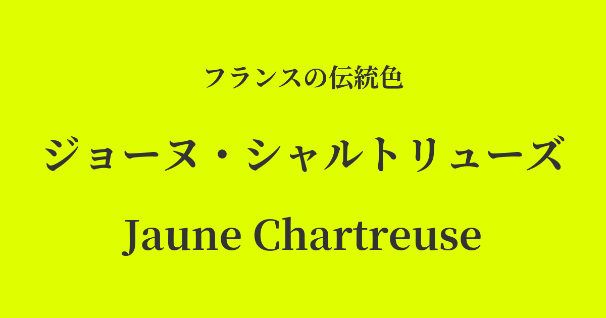
| French | Jaune Chartreuse |
|---|---|
| Katakana | Jaune Chartreuse |
| HEX | #DFFF00 |
| RGB | 223, 255, 0 |
What is Jaune Chartreuse? Origin and Etymology
Jaune Chartreuse, as its name suggests, derives its color from the world-famous liqueur produced at the Chartreuse Abbey at the foot of the French Alps.
This liqueur comes in two varieties: the green "Vert" and the yellow "Jaune." Jaune Chartreuse refers to the latter, the liqueur with a brilliant yellow color. "Jaune" means "yellow" in French, and as the name suggests, it is characterized by its unique hue, a vivid mixture of yellow and green.
The liqueur itself is made from as many as 130 different herbs and plants, and its production method remains a closely guarded secret known only to a select few monks to this day. The natural colors produced by this complex recipe are the origin of many color names.
Historical background of Jaune Chartreuse
The history of this liqueur, which is the background of this color, dates back to 1605. It is said to have begun when François Annibal d'Estrées, who was then a marshal to King Henry IV of France, donated an ancient document containing the recipe for an "elixir of longevity" to the Chartreuse Abbey.
Deciphering its complex recipe took many years, but it was finally perfected as a medicine in the mid-18th century, and later improved as a more palatable liqueur. In particular, the sweeter, lower-alcohol yellow "Chartreuse Jaune" was created in 1838.
During the glamorous Belle Époque era from the late 19th to the early 20th century, this liqueur became extremely popular in Parisian cafes and cabarets, and its distinctive color became a symbol of the culture of the time. This vibrant color was also frequently used in Art Nouveau posters and other art forms, leaving a lasting impression on people's memories as a color that defined the era.
Jaune Chartreuse in the world of art and fashion
The vibrant color of the Jaune Chartreuse inspired many artists. Particularly during the Art Nouveau period at the end of the 19th century, poster artists such as Henri de Toulouse-Lautrec incorporated this kind of luminous color into their advertisements and artworks to express the vibrancy of Parisian nights.
In the world of fashion, Paul Poiret, a designer active in the early 20th century, is said to have effectively used bold colors like Jaune Chartreuse in his Oriental-inspired designs. He liberated women from corsets and proposed a freer, more colorful style.
Further down the line, in the 1960s, these surreal and provocative colors once again attracted attention in pop art and psychedelic culture, becoming one of the colors that symbolized youth culture and were widely used in the world of fashion, interior design, and graphic design.
Color scheme preview
This is to check the readability of the text when this color is used as the background.
Color scheme proposal for Jaune Chartreuse
Vert Bouteille (#093523)
The vibrant Jaune Chartreuse is balanced by the deep bottle green Vert Bouteille. This color scheme evokes the vitality of plants and gives a modern, sophisticated impression.
Violet Devec (#5D2680)
The combination of yellow and purple, which are close to complementary colors, vividly highlights each other, creating a dramatic and artistic atmosphere. This color scheme is recommended when you want to make a unique and bold impression.
Gris de Tourturelle (#B9B5A8)
The vibrant intensity of the Jaune Chartreuse is gently balanced by a calm and elegant gray, reminiscent of a turtledove's feather. The result is a modern, stylish, and comfortably balanced color scheme.
Practical Scenes
In interior design, Jaune Chartreuse is a highly effective accent color that brings energy and brightness to a space. Simply incorporating it in small items like cushions, chairs, or art panels can transform the entire room into a modern and vibrant atmosphere. It particularly complements mid-century and minimalist styles.
In fashion, it's a versatile color that can be the main focus of an outfit or used as an accent color. Boldly incorporating it into dresses or tops creates a glamorous impression, while adding it through accessories like scarves, bags, or shoes instantly elevates a dark-toned outfit into a stylish and sophisticated look.
In web and graphic design, its high visibility makes it suitable for use on buttons, headings, and icons that you want to attract attention. However, because it is a very strong color, using it over a large area can easily strain the eyes, so it is recommended to use it only as an accent.