
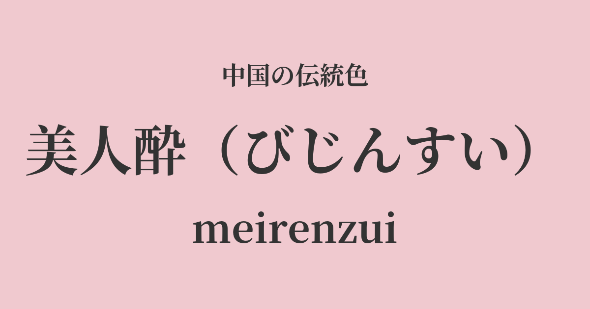
| Color name | Beautiful woman drunk |
|---|---|
| reading | Bijinsui |
| pinyin | meirenzui |
| HEX | #F0C9CF |
| RGB | 240, 201, 207 |
What is "Bijin Sui" (beautiful woman drunk)? Origin and etymology
"Bijinsui" (美人醉) is a truly poetic color name that, as the name suggests, describes "the appearance of a beautiful woman who is intoxicated by alcohol." Specifically, it captures the flushed look of cheeks that appear to emanate from within, a color that comes from within when someone is slightly tipsy.
This isn't just a cute pink; it's a shade that evokes a sense of storytelling, a blend of vibrant luster and a slightly languid allure. In ancient China, slightly rosy cheeks were considered beautiful as a symbol of healthy beauty, and there was a culture of "red makeup," where people dyed their cheeks red. This color can be said to have originated from that aesthetic sensibility.
Historical background of "Beauty and Drunkenness"
Although this color name is not recorded as the official color of any particular dynasty, the imagery it evokes has been cultivated throughout China's long history.
In particular, during the Tang Dynasty, when voluptuous and glamorous beauty was the ideal, the sight of beautiful women drinking together at court banquets, their cheeks flushed with excitement, inspired the creative spirit of many poets. Yang Guifei, known as a woman of unparalleled beauty, displayed a captivating, intoxicated appearance at a banquet with Emperor Xuanzong, a story that has been celebrated in numerous works by poets, including Li Bai, and passed down through generations.
The color "Drunken Beauty" can be described as a cultural color that has been formed in people's minds against the backdrop of such literary scenes and stories of historical beauties.
Beauty and Drunkenness in Chinese Art and Crafts
"Beauty is drunk" has long been cherished in Chinese art and fashion culture as a color that enhances the beauty of women.
In clothing, this color, when used in Hanfu (traditional Chinese clothing), especially in the light silk garments worn by women such as shan (shirts) and jukun (skirts), highlighted the wearer's loveliness and elegance. It is a vibrant color suitable for spring attire and celebratory occasions.
In the world of painting, especially in the "gongbi" style of depicting beautiful women with meticulous detail, this color was subtly applied to the cheeks and lips of the women depicted to express the transparency and vitality of their skin. It was truly an important color for breathing life into the painting. Furthermore, the pale and elegant pink glazes found in Qing dynasty fencai porcelain also show a color sensibility similar to that of "Drunken Beauty."
Beautiful Drunk Ryoharu
Color scheme preview
This is to check the readability of the text when this color is used as the background.
Beautiful drunken color scheme proposal
Moon White (#D9E3E4)
By combining it with Tsukishiro, a pale bluish-white, the sweetness of Bijinzui is subtly toned down, giving it an elegant and refined impression. It is a calm color scheme that combines cleanliness and grace.
Daihaku (#6B352C)
When paired with the deep reddish-brown of Daisha, the alluring beauty of Bijinzui is further enhanced. The colors complement each other, creating a mature, sophisticated femininity and a classic, dignified atmosphere.
Willow green (#B0CE94)
By combining it with the vibrant green of willow blossoms in spring, the delicate beauty of Bijin-sui is highlighted. It gives a fresh, bright impression full of vitality, evoking the feeling of spring's arrival.
Practical Scenes
The gentle and warm colors of "Bijin Zui" blend naturally into our modern lives.
In fashion, incorporating it into blouses, dresses, and scarves brightens the face and creates a soft impression. It pairs particularly well with glossy and sheer materials such as silk and chiffon, creating an elegant and glamorous look. As a makeup color for blush and lipstick, it blends well with the skin and is ideal for creating a natural, healthy glow.
In interior design, it's recommended to use it as an accent color in bedrooms and living rooms. Using it in cushion covers, curtains, or art panels will bring warmth and gentleness to the space. Combining it with white, light gray, or natural wood grain will create a sophisticated and relaxing space that isn't overly sweet.