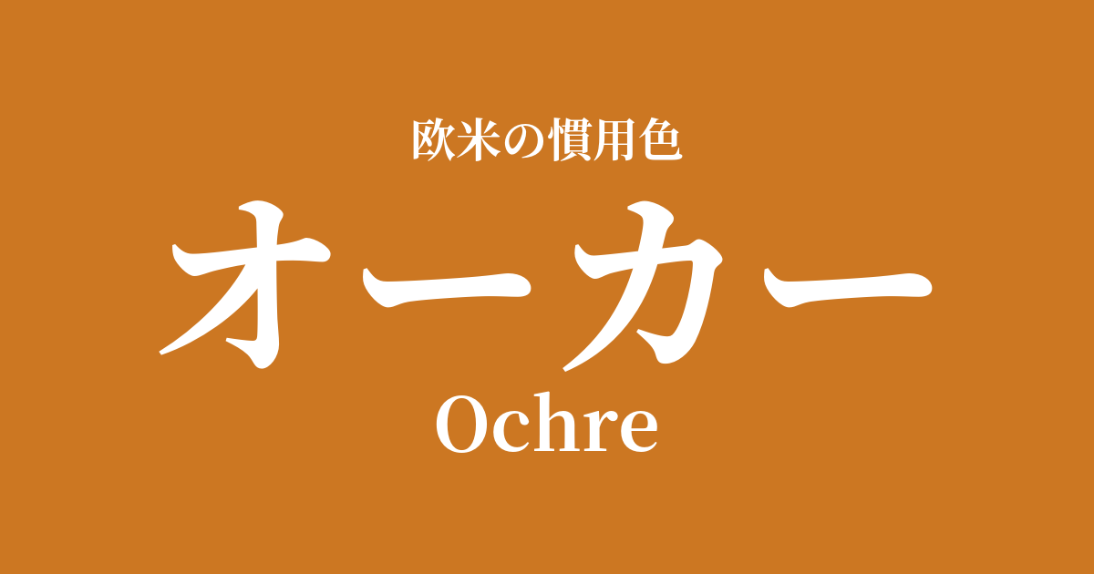
| Original English name | Ochre |
|---|---|
| Japanese notation | Ochre |
| HEX | #CC7722 |
| RGB | 204, 119, 34 |
What is ochre? Origin and etymology
Ochre is derived from the Greek word "ōkhros," which means "yellow" or "pale."
This color refers to the natural soil pigment itself, extracted from clay containing hydrated iron oxide, and has been used worldwide since ancient times as "yellow ochre." Because the composition varies depending on the region of origin, the shades range widely, from strong yellowish yellow ochre to strong reddish red ochre and brownish brown ochre.
Ochre's historical background and culture
It's no exaggeration to say that the history of ochre is intertwined with the history of humankind. Linear patterns drawn with ochre have been found in caves in South Africa dating back approximately 75,000 years, making it one of the oldest pigments used by humankind.
Ochre was also used extensively to depict animals and other subjects in famous Paleolithic cave paintings, such as those in Lascaux Cave in France and Altamira Cave in Spain.
In ancient Egypt, it was not only used to adorn tomb murals, but also as a cosmetic for women to make their skin appear brighter. It also seems to have been considered a sacred color symbolizing the sun god Ra and gold.
At the ruins of the ancient Roman city of Pompeii, you can see the extensive use of ochre in the frescoes decorating the walls of the buildings. It was an inexpensive and durable color, and therefore deeply ingrained in everyday life.
Even after the Renaissance, masters like Rembrandt and Caravaggio utilized its deep hues for shading and underpainting in their portraits, creating numerous masterpieces.
Ochre in design and art
In the art world, ochre has inspired painters across generations, from ancient cave paintings to contemporary art. It is especially an essential color when depicting the earth and nature.
In fashion, ochre is a beloved staple of earth tones. It's a color often seen in classic items that aren't affected by trends, such as trench coats, chinos, and suede jackets. It creates a natural, sophisticated, and understated look.
In interior design, it's a popular color for bringing warmth and tranquility. Incorporating it into one wall or using it as an accent in fabrics like cushions and rugs adds depth and comfort to a space. It also pairs exceptionally well with natural materials such as terracotta, wood, and linen.
Color scheme preview
This is to check the readability of the text when this color is used as the background.
Ochre color scheme suggestion
Navy Blue (#000080)
The warmth of ochre and the deep blue of navy blue complement each other, creating a classic and sophisticated color scheme. It conveys a sense of reliability and refinement, making it suitable for a wide range of applications including fashion, interior design, and web design.
Olive Green (#808000)
The combination with olive green, another earth tone, creates a calm and harmonious color scheme that evokes nature itself. It creates a relaxed and comfortable atmosphere, adding depth to a natural-style space.
Cream (#FFFDD0)
Pairing it with a bright, soft cream further enhances the warmth of ochre. Its gentle and elegant atmosphere creates a brighter, more spacious feel, making it ideal for creating a comfortable and inviting space.
Practical Scenes
In interior design, using ochre as a wall color creates a warm and cozy atmosphere throughout the room. If you're hesitant to use it all over, even incorporating it partially through accent walls, cushions, rugs, or artwork can add depth to the space. It pairs particularly well with wooden furniture and houseplants.
In fashion, earth tones are versatile and suitable for all seasons. In autumn and winter, they can add warmth with wool coats and knitwear, while in spring and summer, they can create a light and airy look with linen shirts and pants. They pair easily with basic colors like navy, white, and black, adding a sense of calm and sophistication to any outfit.
In web and graphic design, it is effective when you want to convey themes such as trustworthiness, history, or nature. When used as the main color, it creates a calm impression, and when used as an accent, it creates a warm design that attracts attention.