
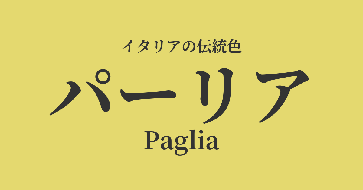
| Italian original name | Paglia |
|---|---|
| Japanese notation | Parlia |
| HEX | #E4D96F |
| RGB | 228, 217, 111 |
What is Parlia? Origin and Etymology
Paglia is an Italian word meaning "straw." As the name suggests, it represents the color of dry wheat stalks that shine golden after basking in the summer sun.
The roots of this word can be traced back to the Latin word "palea," which means "rice husk" or "straw." Straw, which has long been the most familiar material in rural Italy, is deeply rooted in people's lives, and its color has also been cherished as a natural hue that blends into everyday life.
Paria is not simply yellow; it's a color that symbolizes abundant harvests, the bounty of the earth, and the simple, peaceful rural life itself.
From a color psychology perspective, the warm yellow of Paria is said to evoke feelings of happiness, security, and friendliness. While possessing a brightness reminiscent of sunlight, its subdued saturation makes it easy on the eyes and is expected to have a calming effect on the mind.
Historical background of Paria
Since the time of ancient Rome, wheat has been one of the most important crops to sustain people's lives. After the harvest, the straw was used not only as livestock feed, bedding, and fuel, but also as a valuable resource for making everyday items. Thatching roofs, weaving baskets, making chairs—the color Palia was always present in the activities of these ancient people.
From the Middle Ages to the Renaissance, Paglia remained a color that symbolized the lives of ordinary people, such as farmers and artisans, in contrast to the opulent colors of the aristocracy. As a natural color, unrelated to luxurious pigments, it gave realism to the pastoral landscapes depicted in genre paintings.
In particular, the area around Florence was known for producing high-quality straw, and from around the 18th century, the production of exquisite straw hats flourished. These "Florentine straw hats" attracted attention throughout Europe, and the meaning of Paglia expanded from a simple rural color to a sophisticated fashion color. Along with a longing for the Italian countryside, this color came to be loved by many people.
Paglia in Italian Culture and Art
In Renaissance painting, Paglia was used as a color to depict the backgrounds of biblical stories and the idyllic landscapes of mythology. Venetian painters such as Giorgione and Titian skillfully manipulated the effects of light and color, using this color to portray the tranquil rural landscapes of Tuscany and Veneto.
Furthermore, in genre paintings from the 17th century onward, Paglia was an indispensable color for depicting everyday scenes such as peasants at work or festivals. Paglia expresses the warmth and simple joy of the lives of the people depicted.
Beyond the world of art, Paglia is deeply involved in traditional Italian crafts. In addition to the aforementioned straw hats, handcrafted items made from straw, such as chairs made by furniture makers (especially the seats of Chiavari chairs), baskets used in homes, and "fiascos" (wrapping cloths for wine bottles), are appealing for their beautiful colors.
In terms of food culture, it evokes the vibrant yellow of handmade pasta made from durum wheat semolina and eggs. Wheat grown in fertile soil graces people's tables. Paglia is truly a color that represents the very essence of Italian cuisine.
Color scheme preview
This is to check the readability of the text when this color is used as the background.
Parlia's color scheme proposal
Azzurro (#007FFF)
This combination evokes the contrast between the blue summer sky of Italy and the golden wheat fields. It creates a refreshing and comfortable space that evokes a sense of openness and the richness of nature.
Terracotta (#E2725B)
The color scheme, using terracotta reminiscent of unglazed pottery and roof tiles, evokes the very image of an Italian country house. It's a combination of earth tones that gives a warm, simple, and somewhat nostalgic impression.
Verde Oliva (#808000)
It evokes the rolling hills of Tuscany, with its olive groves and wheat fields. It gives a natural, calming, and peaceful impression that allows you to truly relax.
Practical Scenes
In interior design, parsley brings warmth and brightness to a space. Used as a wall color in living rooms and dining rooms, it gently envelops the family gathering space, enhancing its cozy atmosphere. It's also recommended to incorporate it into fabrics such as linen or cotton curtains, rugs, and cushions. Adding it as an accent to a space based on white or beige creates a sophisticated and natural ambiance.
It pairs exceptionally well with natural materials, especially solid wood furniture, rattan, and terracotta planters. It harmonizes with a variety of styles, including country, Mediterranean, and Japanese modern.
In the world of fashion, Paglia is a particularly popular color for the spring and summer seasons. Incorporating it into linen shirts and dresses, or cotton pants, creates a light and relaxed impression. Of course, it's also lovely to incorporate it into accessories such as straw hats, basket bags, and espadrilles.
By combining it with basic colors such as navy, white, and khaki, you can create an elegant and sophisticated adult casual style. It's also a color that suits many people because it blends well with the skin and gives a soft impression.
In the fields of web and graphic design, this color is ideal as the brand image color for brands promoting organic food, natural cosmetics, and a slow-life lifestyle. It visually conveys friendliness, trustworthiness, and the reassurance of natural ingredients. By using it subtly as a background color or as an accent color, you can design a warm and comfortable user experience.