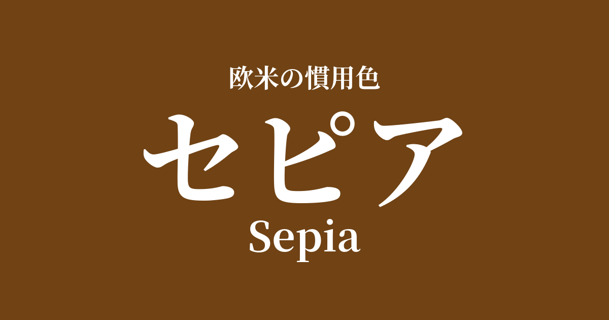
| Original English name | Sepia |
|---|---|
| Japanese notation | sepia |
| HEX | #704214 |
| RGB | 112, 66, 20 |
What is sepia? Origin and etymology
The word Sepia originates from the Greek word "sēpía," which means cuttlefish.
As the name suggests, this color is based on the history of using dark brown ink extracted from the ink sac of cuttlefish as a pigment since ancient Greek and Roman times. This natural ink is called "sepia ink," and its rich hue and excellent durability have made it a favorite among many artists.
During the Renaissance in particular, masters such as Leonardo da Vinci and Rembrandt are said to have favored using sepia ink for their drawings and sketches. The term "sepia" as we understand it today has become established to refer to this historical ink color, namely a reddish, warm, dark brown.
The historical background and culture of sepia
The widespread recognition of the sepia color is deeply connected to the development of photographic technology, which was invented in the 19th century.
Early black and white photographs were prone to fading and discoloration over time, posing a challenge to their preservation. To solve this problem, a technique called "sepia toning" was devised. This is a chemical treatment that changes the silver particles that make up the photographic image into more chemically stable silver sulfide.
This process dramatically improved the durability of the photographs and simultaneously transformed the entire print into a distinctive brownish tone. As a result, "sepia" became a color that symbolized old photographs themselves, deeply imprinting itself on people's hearts as a special color that evokes feelings of the past, fond memories, and nostalgia.
Even today, in the world of digital photography and videography, sepia filters are intentionally used to create scenes that evoke nostalgia or a retro atmosphere.
Sepia in design and art
Due to its historical background, sepia has a unique presence in the fields of art and design. In the world of painting, it is used in classical drawings and watercolors to express depth and shadow, giving the work a sense of temporal depth.
In the world of fashion, sepia is a popular, sophisticated earth tone. Especially in autumn/winter collections, it's used in trench coats, wool sweaters, and leather goods, creating a classic and intellectual impression. Its warm yet not overly sweet hue blends well with a mature, understated style.
In interior design, incorporating sepia tones into wallpaper and fabrics brings warmth and tranquility to a space. It pairs exceptionally well with antique wooden furniture and brass lighting fixtures, helping to create a cozy, vintage-inspired room.
Color scheme preview
This is to check the readability of the text when this color is used as the background.
Sepia color scheme suggestion
Old Rose (#C08081)
The combination of sepia's muted brown and old rose's muted pink creates an elegant and romantic atmosphere with a vintage feel. It's recommended for antique designs and feminine fashion.
Olive Green (#556B2F)
Sepia and olive green are both earth tones found in nature, making them a very compatible combination. They create a calm, relaxed, and organic atmosphere, making them perfect for interior design and natural-style fashion.
Slate Gray (#708090)
Combining warm sepia with cool, urban slate gray creates a sophisticated and modern impression. The colors complement each other, giving off an intelligent and calm atmosphere, making it suitable for business settings and minimalist designs.
Practical Scenes
Incorporating sepia into your interior design adds depth and tranquility to the space. Using it on a large area, such as one wall, a sofa, or curtains, will envelop the entire room in a warm atmosphere. Combining it with ivory or beige creates a soft impression, while pairing it with dark brown wooden furniture creates a dignified and classic space.
In fashion, sepia is a color that can stand alone as the main focus. Sepia-colored coats and dresses give off an elegant and intellectual impression. Furthermore, incorporating sepia into accessories such as bags, shoes, and belts can add a warm accent to an outfit. It also pairs exceptionally well with gold accessories.
In web and graphic design, sepia is effective when you want to convey reliability, history, or tradition. By using it as a background color or applying a sepia filter to photographs, you can create a consistent, nostalgic atmosphere throughout the entire site.