
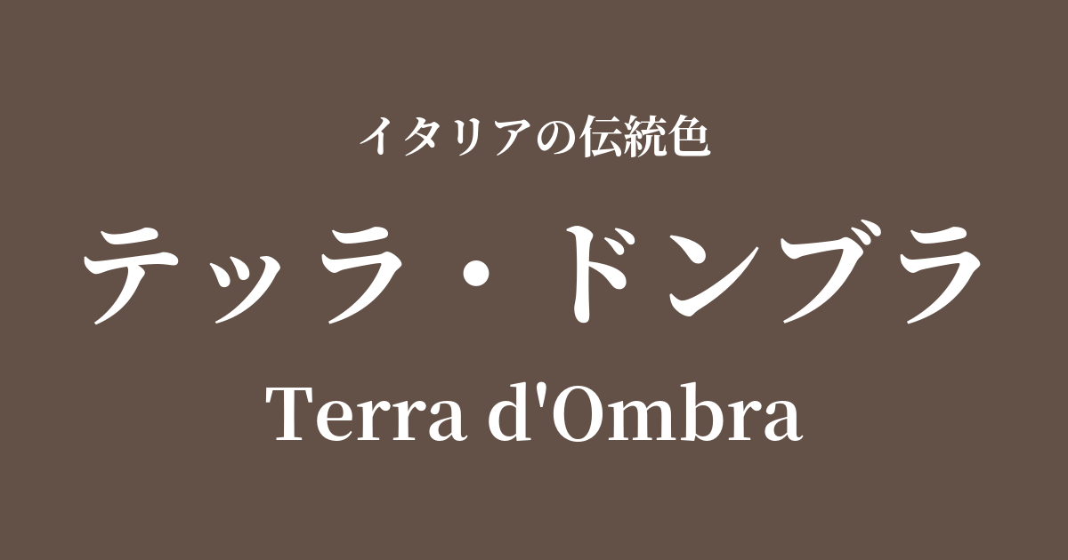
| Italian original name | Terra d'Ombra |
|---|---|
| Japanese notation | Terra Dombra |
| HEX | #635147 |
| RGB | 99, 81, 71 |
What is Terra Dombra? Origin and Etymology
Terra d'Ombra is a deep, dark brown color, meaning "shadow earth" in Italian. As the name suggests, "Terra" refers to soil or earth, and "Ombra" refers to shadow.
The most widely accepted theory is that the name of this color originates from Umbria, a region in central Italy that was a major producer of pigments. It is also said that the name of this region comes from the Latin word "umbra," meaning shadow, thus the color name and the place name are deeply intertwined.
Terra dombra is a pigment made from natural clay containing iron oxide and high concentrations of manganese oxide. The presence of manganese oxide creates a unique coolness and depth of color that is not found in other earth pigments (such as ochre or siena). When mined, it is called "raw umber," and when burned, it becomes a reddish "burnt umber."
Historical background of Terra Dombra
The history of the Terra Dombra is ancient, and its origins are said to date back to prehistoric cave paintings. In ancient Rome, similar pigments were used in frescoes such as those in Pompeii to depict the shadows of buildings and the hair of figures.
This pigment gained particular prominence in the history of art during the Renaissance. As painters skillfully manipulated light and shadow to pursue three-dimensional depth and realism, terra dombra became an indispensable color as the ideal color for depicting light and shadow.
In Leonardo da Vinci's sfumato (blurring technique) and in the dramatic chiaroscuro (high-light-and-dark contrast) of Baroque painting exemplified by Caravaggio, this color was frequently used to depict profound darkness and subtle shading, supporting the creation of numerous masterpieces.
Terra Dombra in Italian Culture and Art
Terra dombra has been a beloved pigment for artists for centuries, serving as one of the most fundamental pigments in Western painting. It was widely used, especially in oil, tempera, and fresco painting, as an underpainting for shaded areas or mixed with other colors to darken tones.
You can find many examples of the effective use of this color in masterpieces from the Renaissance to the Baroque period, such as the soft shading of the background and figures in Leonardo da Vinci's "Mona Lisa," and the figures emerging from the pitch-black darkness in Caravaggio's works.
Beyond painting, its subdued hues have also been used in traditional furniture coloring, ceramic glazes, and building materials. Even today, its natural and deep colors are gaining popularity in the world of fashion and interior design as sophisticated earth tones.
The color called ombra is a perfect color, more oily than any other earth. And on its own, it is the perfect color for depicting greenery, buildings, and things in the air, such as clouds and water.
Color scheme preview
This is to check the readability of the text when this color is used as the background.
Terra Dombra color scheme proposal
Giallo Napoli (#FADA5E)
The deep, shadowy colors of Terra Dombra and the bright, light-like yellows of Giallo Napoli create a beautiful contrast. This combination is perfect for creating a dignified and warm space reminiscent of classical paintings.
Verde Veronese (#40826D)
The earthy color Terra Dombra and the plant-like Verde Veronese create a natural and calming harmony. The combination of earth tones gives a peaceful, profound, and intellectual impression.
Rosso Pompeiano (#D4442E)
The reddish hue of Rosso Pompeiano, reminiscent of terracotta, complements the depth of Terra Dombra, creating a passionate and profound atmosphere. It's a dramatic color scheme that evokes a sense of historical weight and vitality.
Practical Scenes
In interior design, the terra dombra brings a sense of calm and gravitas to a space. Incorporating it into a single wall, an accent wall, or large areas of fabric such as sofas or curtains creates a sophisticated atmosphere. It pairs exceptionally well with natural materials such as wood, leather, and brass, contributing to the creation of a luxurious space.
In the world of fashion, this color conveys a classic and sophisticated impression. Incorporating it into wool coats, leather jackets, bags, shoes, and other accessories will tighten up the overall look and add depth. It will be particularly useful as a base color in autumn and winter styling.
In web and graphic design, using black as a background color enhances the content and conveys a sense of reliability and tradition. As a text color, it offers a softer, more elegant impression than black.