
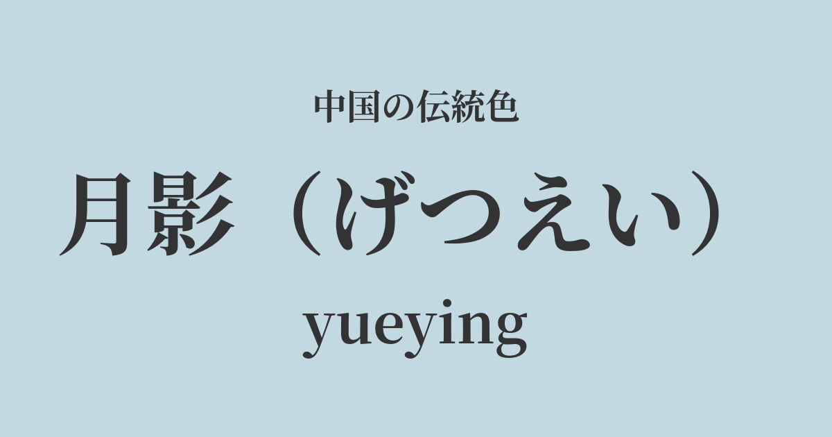
| Color name | moon shadow |
|---|---|
| reading | Getsuei |
| pinyin | yueying |
| HEX | #C3D9E2 |
| RGB | 195, 217, 226 |
What is "Tsukikage"? Origin and etymology
"Getsuei" (月影), as the name suggests, refers to the light of the moon or the reflection of the moon on the water's surface. In traditional Chinese color theory, Getsuei is a poetic color that captures the hues of the moonlight that quietly illuminates the earth in the clear air of midnight, and the soft shadows it creates.
It's not just a simple gray, but has a subtle bluish tint, evoking the stillness and purity of night, as well as a somewhat ephemeral beauty. It reflects the aesthetic sensibilities of the ancient Chinese people who captured natural scenes with delicate sensitivity and named them accordingly.
Historical background of the moonlight
The word "moonlight" itself has appeared in literary works such as Chinese poetry since ancient times and has been loved by many poets. In particular, during the Tang and Song dynasties, when culture was at its peak, many masterpieces were created that featured the moon as their theme.
The exact time when this color became established as a specific color name is uncertain, but it can be said that it is a color that was nurtured within the shared aesthetic sensibilities of writers. They immersed themselves in contemplation in the silence of the night and loved the ethereal world created by moonlight. Moonlight is a refined color with a background of such introspective and intellectual culture.
Moonlight in Chinese Art and Crafts
The color of the moonlight is deeply connected to the worldview of Chinese art, especially ink painting. In ink painting, light, air, and even stillness are expressed through the skillful use of varying shades and blurs of ink, as well as negative space. When depicting landscapes illuminated by moonlight or misty lakeside scenes, this pale ink color, reminiscent of the moonlight, creates an ethereal atmosphere.
Furthermore, the color of the celadon porcelain, which flourished during the Song Dynasty, is reminiscent of moonlight. This porcelain, also known as Yingqing, gets its name from the fact that patterns are visible through the glaze, and its clear, bluish-white color is so beautiful that it truly looks as if moonlight has taken hold in the vessel.
In the realm of fashion, it is said that these understated and elegant colors were favored among writers and intellectuals who did not like ostentatious decorations.
Niwashita Nyoki Sui Soraaki, Suizamo Sokoyoko, Futatake Kashiwa Kageya.
Color scheme preview
This is to check the readability of the text when this color is used as the background.
Moonlight Color Scheme Proposal
Black (#333333)
By combining the pale bluish-gray of moonlight with the deep ink black, a quiet and refined world reminiscent of ink painting can be expressed. The contrast is beautiful and gives an intellectual impression.
Dark blue (#E6D8D4)
The coolness of the moonlight, combined with the skin-like warmth of the lotus flower color, creates a gentle and calm impression. It is recommended when you want to create an elegant and feminine atmosphere.
Ryu Aoi Murasaki (#5B3A5A)
By combining the moonlight, representing a tranquil night sky, with the noble and mystical dragon hollyhock purple, a fantastical color scheme that evokes a sense of narrative is created. It gains depth and dimension, leaving a captivating impression on the viewer.
Practical Scenes
In interior design, the moonlight motif is believed to have a calming effect, making it ideal for spaces where you want to relax, such as bedrooms, studies, and living rooms. Using it on large areas like wallpaper or curtains brings tranquility and elegance to the entire room. Combining it with light wood or pale gray furniture creates a sophisticated, minimalist space.
In fashion, this color is used to create an intelligent and clean impression. When incorporated into high-quality materials such as silk blouses or linen shirts, its delicate beauty is further enhanced. Pairing it with silver accessories creates a cool and modern look.
In web design, using it as a background color creates a clean and trustworthy impression. Because it doesn't interfere with text, photos, or other content, but rather elegantly enhances them, it's suitable for minimalist designs and websites that aim to convey a sense of luxury.