
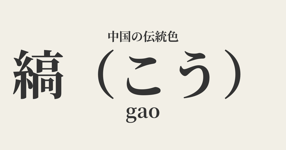
| Color name | 縞 |
|---|---|
| reading | like this |
| pinyin | gao |
| HEX | #F2EFE6 |
| RGB | 242, 239, 230 |
What is a 缟? Origin and etymology
"Kō" refers to the color of raw silk fabric that has not undergone scouring or dyeing. Therefore, it is not pure white, but a warm white with a slight yellowish tint, a color close to what is commonly known as off-white.
The name of this color originates from the kanji character "缟," which combines the radical for "thread" (糸), meaning silk thread, with the character "高," meaning high or original. The ancient dictionary "Shuowen Jiezi" also states "缟, vivid color," where "vivid color" refers to an unadulterated white color. It is a color that evokes a simple and pure beauty, as if it were born from nature.
Historical background of the rifling
The color of the silk garments is deeply connected to Chinese history, particularly to Confucian rituals. From the Zhou dynasty onward, undyed white silk garments called "kōi" and crowns called "kōkan" were primarily used as mourning attire.
Classical texts such as the "Book of Rites" describe the custom of wearing plain, simple clothing when a relative dies. The simple colors, avoiding extravagant decorations and dyes, were considered to express sorrow for the deceased and a modest attitude befitting a time of grief.
Furthermore, beyond its significance as mourning attire, this color was also favored by literati who valued simple living and by hermits who distanced themselves from worldly affairs. The color of this woven fabric symbolized inner richness and noble spirit, the opposite of ostentation.
In Chinese art and crafts
In terms of clothing culture, tie was one of the basic colors of Hanfu. In particular, its role as mourning attire, as mentioned earlier, was important, but the Book of Songs also describes beautiful women wearing tie garments, suggesting that it was also used as everyday clothing.
In the world of ceramics, the ivory color of white porcelain produced at the Ding ware kilns during the Song dynasty shares a similar hue and aesthetic sensibility with the porcelain's distinctive pattern. Not pure white, but a warm, soft white, it exudes elegance and tranquility, and was beloved by many.
Furthermore, in ink painting, not only the subject being depicted, but also the blank spaces are of great significance. The color of the paper or silk used for these blank spaces is precisely the color of the woven pattern itself. This quiet hue resonates with the shades of ink, giving the entire painting depth and a poetic sensibility.
Striped robe, member of the league.
Color scheme preview
This is to check the readability of the text when this color is used as the background.
Color scheme proposal for the pattern
Black (#3C3C3C)
The combination of the soft white of the lattice and the deep ink black evokes the quiet and dignified impression of ink painting and calligraphy. It is ideal for minimalist and sophisticated spaces and designs.
Willow green (#A9D490)
The combination of an off-white, ribbed color and a willow green reminiscent of young leaves creates a calm and natural atmosphere that evokes the breath of spring. It gives a comfortable and relaxed impression.
Hot oil (#D94666)
The subtle and elegant colors of the woven fabric, accented with a vibrant rouge, create a color scheme that is both graceful and striking. It is also recommended for celebratory occasions.
Practical Scenes
In interior design, using woven patterns on large areas such as walls, curtains, and sofas fills the entire space with a bright and calming atmosphere. They pair exceptionally well with wood materials and houseplants, creating a natural and warm space. They harmonize well with Japanese modern, Scandinavian, and minimalist styles.
In fashion, incorporating this color into clothing made from natural materials such as linen, cotton, and silk creates an effortless and elegant impression. As a timeless base color, combining it with earth tones and pale tones results in a sophisticated look.
When used as a background color in web design, it is easier on the eyes than pure white, and conveys a warm and trustworthy impression without compromising content readability. It is suitable for lifestyle brands and websites showcasing traditional crafts.