| English name | Pastel Purple |
|---|---|
| Katakana | Pastel purple |
| HEX | #DCD0FF |
| RGB | 220, 208, 255 |
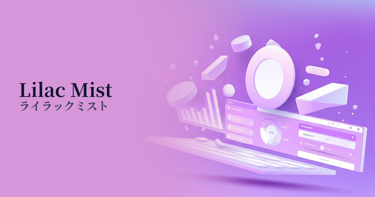
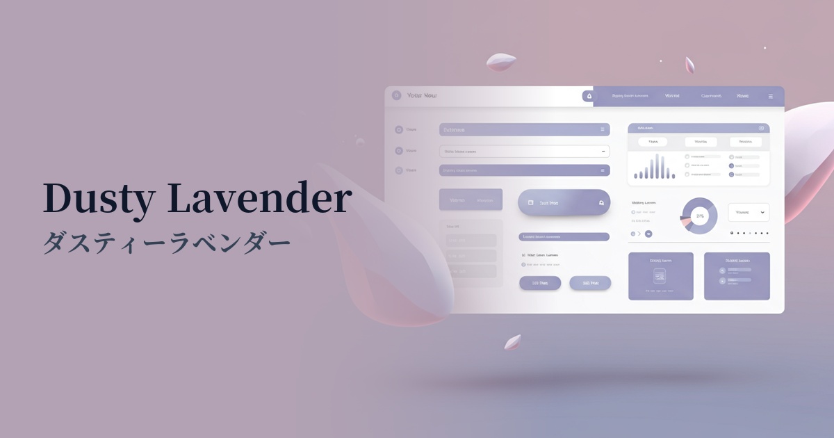
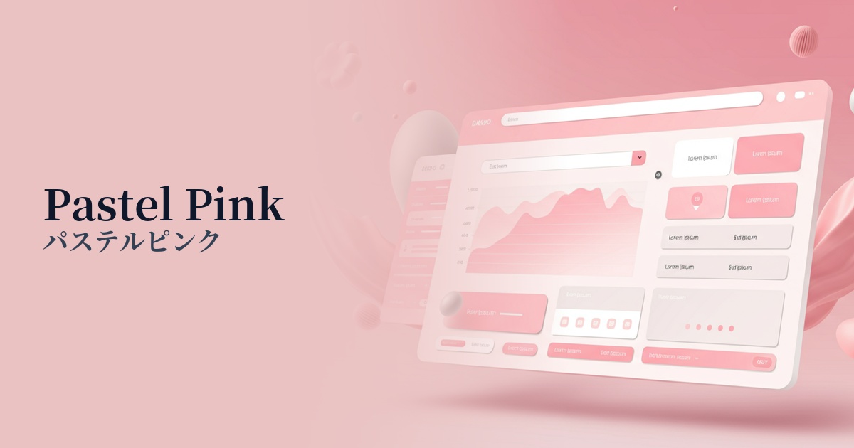
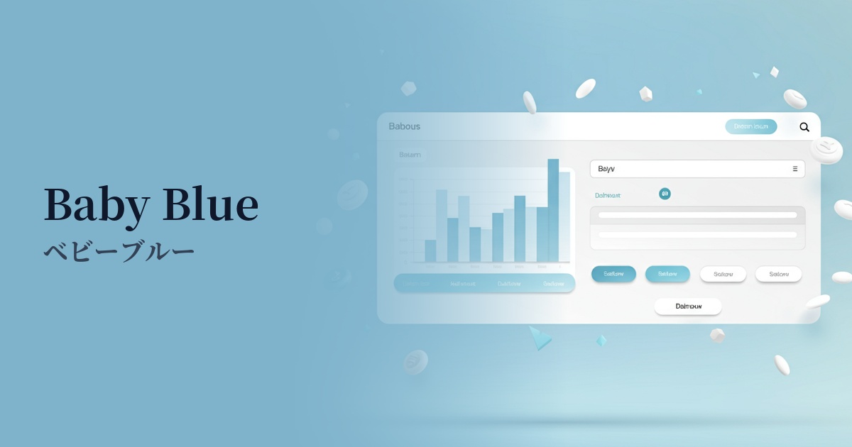
| Design Theme | Pastel & Macaron Colors |
Why is it a trend? (Background and reasons)
In recent years, web design has seen a growing demand for visually pleasing and calming designs that soothe users' digital fatigue. Pastel purple, with its soothing lavender-like hue, has a high relaxation effect and is gaining attention as a trending color because it can provide a comfortable user experience even during long screen times.
Another major factor is the resurgence of Y2K (2000s) fashion and culture, particularly among Generation Z. Among the pastel colors frequently used at the time, purple is especially favored by services and e-commerce sites targeting young people because it expresses both nostalgia and a modern sensibility.
Furthermore, this color has an affinity with advanced technology. By transforming the mystical and futuristic image of purple into a pastel tone, new technologies such as AI and the metaverse can be presented to users in a more approachable and positive light. It is also effective for branding SaaS companies.
The psychological effects of design and UX
Pastel purple evokes feelings of gentleness, calmness, and healing. It is expected to alleviate users' psychological tension and allow them to immerse themselves in content in a relaxed state. It is useful in wellness apps and information-heavy websites to reduce the cognitive load on users.
Purple has long been associated with artistry and creativity. Using soft pastel tones stimulates a lighter, more free-spirited inspiration. Adopting it for creator portfolio sites or the UI of design tools can enhance users' creative drive.
Because it's neither as feminine as pink nor as masculine as blue, it's easy to create gender-neutral, inclusive designs. It matches the modern brand image that values diversity and is a color that is likely to be accepted by a wide range of target audiences.
The soft, delicate colors create an elegant and sophisticated atmosphere. When used on cosmetics, fashion, and lifestyle brand websites, they convey a high-quality and meticulous worldview, fostering user trust and admiration.
Visibility testing (UI component example)
Practical usage (best practices)
Using this color as the background for your entire site can create an immersive and gentle atmosphere. However, careful attention must be paid to the contrast ratio to ensure text readability. Combine it with dark gray or navy text colors and always check the contrast with a contrast checker.
In minimalist designs based on white or light gray, it's effective to use it as an accent color for buttons, links, and icons. It naturally guides the user's eye, prompts important actions, and adds a friendly touch to the entire site.
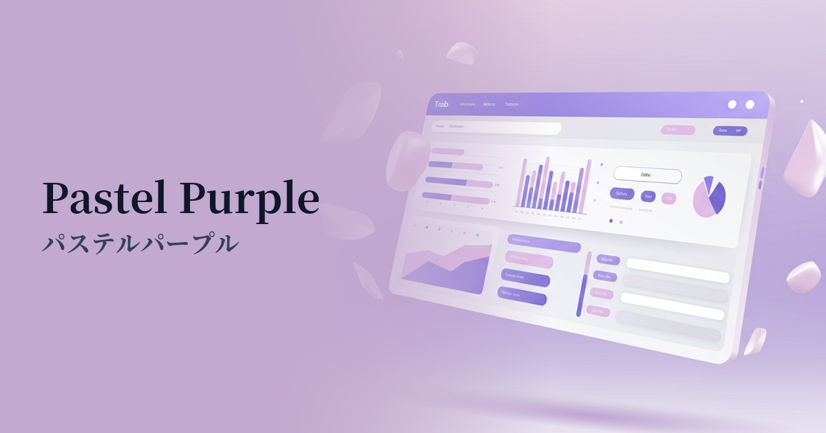
It's also recommended for use in SaaS dashboards and management screens for graphs, tags, and status displays. It visually categorizes information in a soft way, making even complex data easy to understand intuitively. It's particularly well-suited for the UI of creative tools and wellness apps.
Using pastel purple for CTA buttons on landing pages (LPs) gently encourages user action without feeling pushy. It instills a sense of security at conversion points such as "registration" or "purchase," which can lead to an increase in click-through rates.
Recommended color scheme suggestions
Cream (#FFFDD0)
The gentle pastel purple, combined with the warmth of cream, creates a very calm and natural impression. It has a high relaxing effect and is ideal for wellness and lifestyle websites, creating a reassuring and comfortable atmosphere.
Mint Green (#98FF98)
These colors are almost complementary, creating a fresh and refreshing combination that enhances each other's beauty. It evokes a sense of spring and youthfulness, making it perfect for creative and playful designs. It leaves a bright and positive impression on the user.
Slate Gray (#708090)
Slate gray adds a sophisticated touch, toning down the sweetness of pastel purple and creating a refined, modern atmosphere. This color scheme is recommended for SaaS UIs and minimalist portfolio websites where you want to convey both trustworthiness and elegance.