
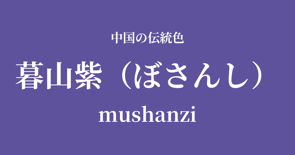
| Color name | Kureyama Murasaki |
|---|---|
| reading | Bosanshi |
| pinyin | mushanzi |
| HEX | #5F529D |
| RGB | 95, 82, 157 |
What is Kureyama Murasaki? Origin and etymology
Bosanshi, as its name suggests, is a poetic color that captures the scene of mountains being dyed purple as the sun sets. "Bo" means twilight and "san" means mountains, and it captures the moment when the last rays of the setting sun reflect off the air, illuminating distant mountain ranges in an ethereal purple.
These colors, more than merely a physical phenomenon, deeply reflect traditional Chinese aesthetics, encompassing the tranquility that comes at the end of the day, a certain melancholic beauty, and a profound appreciation for nature. Many writers and painters have been captivated by this fleeting yet beautiful landscape, using it as the subject of their works.
Etymologically, it's a highly evocative name that directly translates a natural landscape into words. The calm, bluish-gray hue, distinct from a vibrant purple, seems to express the hazy outlines of distant mountains and even the very atmosphere surrounding them. It's a name that beautifully blends nature and poetry, full of rich sensibility.
Historical background of Murasaki Kureyama
In ancient China, purple was considered an extremely noble color. Because the gromwell plant used to make the dye was rare and the dyeing process required advanced techniques, it was a forbidden color that only emperors, royalty, and a select few high-ranking officials were permitted to wear. From this background, purple came to be seen as a symbol of authority and nobility.
It's difficult to pinpoint the exact time when the specific color name "Kureyama-murasaki" (moon-dark purple) became established, but the aesthetic sensibilities associated with this color are deeply rooted in the poetry and painting culture of the Tang and Song dynasties. For example, poets used words to describe the subtle changes in the colors of the sky and mountains in their poems about twilight scenes.
In particular, in landscape painting which flourished during the Song dynasty, while the basic technique revolved around varying shades of ink, a subtle addition of blue or purple hues was used to depict distant mountains, conveying a sense of distance and the humidity of the air. This resonates with the artistic theory that "distant mountains have no color," yet within this "colorless color," viewers found a profound and ethereal hue, like the purple of a twilight mountain. This color also symbolized the introspective and nature-loving spirit of the literati, distinct from the extravagant court culture.
Purple Mountains in Chinese Art and Crafts
The hues of the twilight mountains resonate deeply with the world of Chinese landscape painting, particularly the works of Southern Song court painters Ma Yuan and Xia Gui. They excelled at a composition known as "remaining mountains and remaining water," where elements of the scenery were concentrated in a portion of the canvas, leaving vast empty spaces. Within these empty spaces, the distant mountains, depicted in soft ink and colors, truly embody the tranquility and profound beauty inherent in the twilight mountains.
In the field of ceramics, there is a connection to the purple "kiln transformation" seen in works from the Jun ware, one of the five great kilns of the Song Dynasty. The reddish-purple and bluish-purple mottled patterns in the glaze, created by chance due to the fluctuations of the flames inside the kiln, share an aesthetic with the colors of a mountain at dusk, in that they represent the unpredictable beauty created by nature. These mystical hues captivated the people of that time.
In fashion culture, purple has consistently been revered, as evidenced by its designation as the official color for high-ranking officials during the Tang Dynasty. A subdued purple, such as that of Kureyama-murasaki, was likely favored by literati and intellectuals who disliked gaudiness, as a color that conveyed inner richness and dignity. Combined with the luster of silk fabrics, its deep hue must have exuded a subtle yet undeniable presence.
Kureyama purple, Hiroshiyama blue
Color scheme preview
This is to check the readability of the text when this color is used as the background.
Color scheme proposal by Murasaki Kureyama
Dark blue (#E4D2D8)
The tranquility of the twilight purple and the soft warmth of the lotus flower color harmonize to create an elegant and refined impression. It evokes a poetic atmosphere, like the interplay of light and shadow at dusk.
Moon White (#D9E4E8)
The deep hue of Kureyama-murasaki, combined with the clear brightness of Tsukishiro, creates a color scheme that evokes a quiet and mystical scene, like the moon floating in the night sky and distant mountains.
Female yellow (#FFC90C)
The combination of purple and yellow, which are close to complementary colors, vividly enhances each other's beauty. The calmness of the twilight purple and the brilliance of the yellow create an impression that is both dignified and gorgeous.
Practical Scenes
In interior design, Kureyama purple brings tranquility and depth to a space. Using it as an accent wall in quiet, focused areas such as bedrooms, studies, or meditation spaces creates a peaceful atmosphere. Incorporating it into textiles like cushions, curtains, and rugs results in an elegant and sophisticated space.
In the world of fashion, Kureyama purple can be used as a color that symbolizes intelligence and elegance. Choosing this color for dresses and coats made of high-quality materials such as silk and cashmere will give them a subtle yet strong presence. It can also be used as an accent color in accessories such as scarves, bags, and jewelry to add sophistication to the entire outfit.
In web and graphic design, this color is effective when you want to convey a sense of luxury or trustworthiness. When used as the background for websites showcasing traditional culture, art, or luxury brands, it enhances the quality of the content. Pairing it with light white or pale gold text colors creates a beautiful contrast while maintaining readability.