| English name | Shell Pink |
|---|---|
| Katakana | Shell Pink |
| HEX | #FCEAE8 |
| RGB | 252, 234, 232 |
| Design Theme | Pastel & Macaron Colors |
Why is it a trend? (Background and reasons)
In recent years, web design has emphasized not only the transmission of information but also providing users with a pleasant experience. Soft and gentle colors like shell pink bring warmth and humanity to the digital space, reducing the psychological burden on users. This non-aggressive and approachable color has spread from the wellness and lifestyle sectors and is now used on many websites to foster a sense of security and trust.
The trend of "soft UI," which uses color to create emotional connections as an evolution of minimalism, is also boosting the popularity of shell pink. Using this color instead of a pure white background softens the cold impression and creates a visual effect that gently envelops the content. This allows users to read information in a relaxed manner, contributing to increased dwell time and engagement throughout the site.
The psychological effects of design and UX
Shell pink psychologically evokes feelings of "comfort," "gentleness," and "care." Using it in user interfaces can unconsciously convey a service or brand's commitment to its users. In particular, it's expected to alleviate the apprehension of first-time users and create a sense of security.
Low-saturation, muted tones reduce visual stimulation and strain on the eyes. This is useful in web services and dashboards that handle large amounts of information, where prolonged use is expected, helping to maintain user concentration and create a comfortable user experience (UX) that minimizes stress.
This color also conveys elegance and sophistication. Especially when combined with ample white space, high-quality typography, and excellent photographs, it creates a modern and elegant aesthetic that avoids any cheapness. It's ideal for expressing a unique aesthetic in beauty brands' or creators' portfolios.
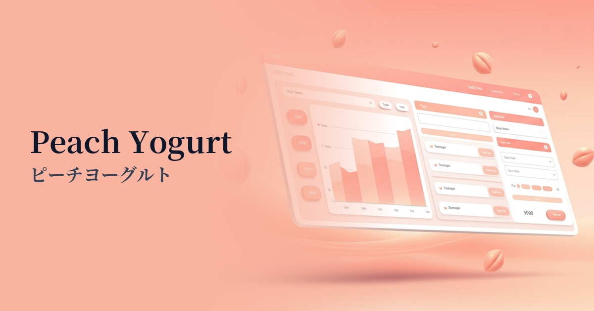
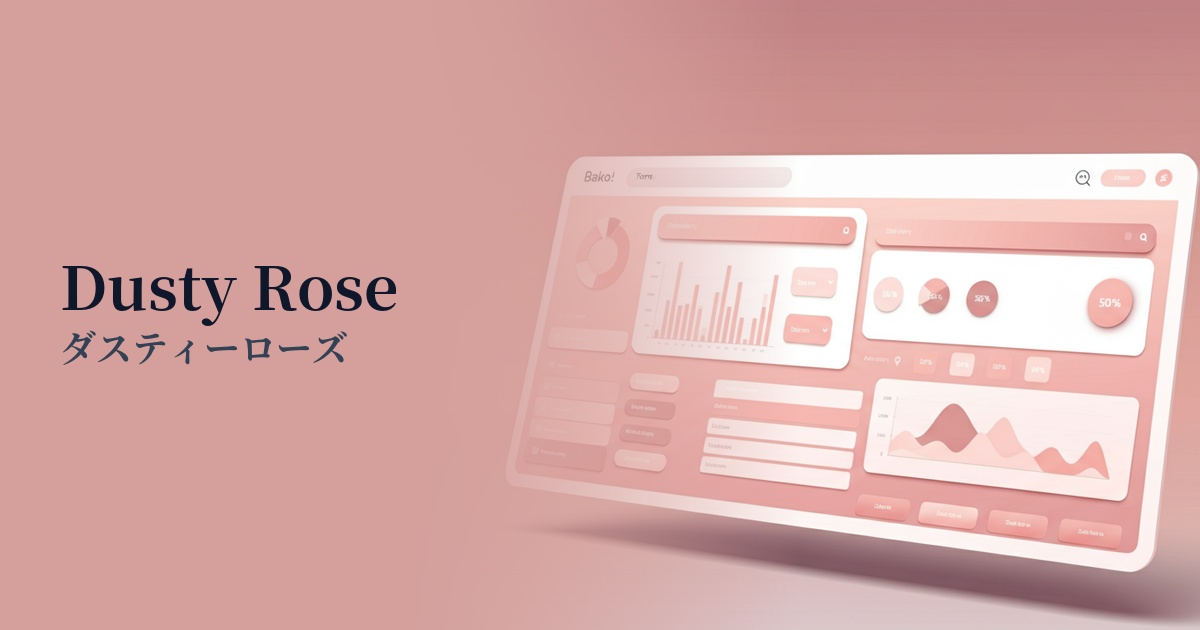
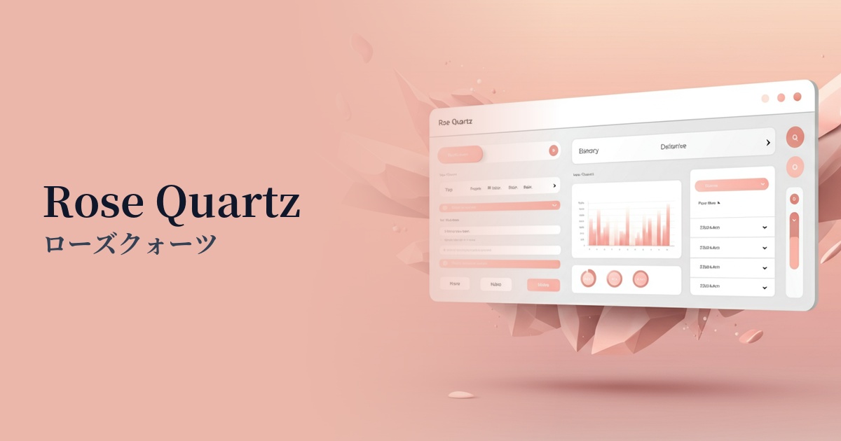
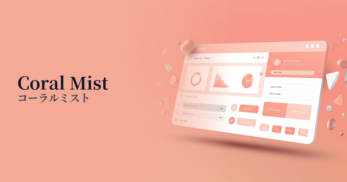
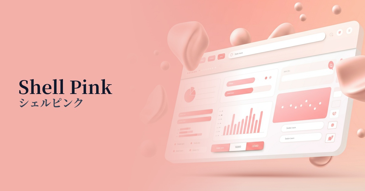
Visibility testing (UI component example)
Practical usage (best practices)
Using this as the main background color for your page will bring a soft and unified feel to your entire site. It's warmer than a pure white background, allowing your content to stand out while maintaining a gentle impression. It's especially recommended for blogs and media sites with a lot of text content.
It's also effective to use accent colors in areas like button hover effects, active navigation links, and the background color of tags and categories. Without using strong colors, it gently attracts the user's attention and intuitively supports their operation.
When used as the background color for product cards on an e-commerce site's product listing page, it enhances product photos and creates a sophisticated impression. It is particularly effective when it matches the brand's aesthetic, such as in cosmetics, fashion, sweets, and baby products.
It's also a good idea to limit its use to specific UI components, such as form input fields or notification message backgrounds. This allows you to keep the overall site design clean while adding warmth only to the parts where users interact, resulting in a more user-friendly experience.
Recommended color scheme suggestions
Slate Gray (#708090)
By combining it with a calm slate gray, the sweetness of shell pink is toned down, creating a sophisticated and modern impression. This color scheme is recommended for SaaS UIs and corporate websites where reliability and elegance are desired.
Sage Green (#B2AC88)
Adding sage green, an earthy color, creates a natural and organic atmosphere. It's perfect for expressing a calming worldview in wellness-related services, natural cosmetics e-commerce sites, and more.
Terracotta (#E2725B)
Adding warm terracotta accents creates a friendly and lively atmosphere. It can give a positive and warm impression to lifestyle blogs and creator portfolio websites.