| English name | Salmon Mousse |
|---|---|
| Katakana | Salmon mousse |
| HEX | #FFD8C1 |
| RGB | 255, 216, 193 |
| Design Theme | Pastel & Macaron Colors |
Why is it a trend? (Background and reasons)
In recent years, web design has seen a demand for colors that reduce visual fatigue from digital devices and provide a sense of comfort. Warm pastel colors, such as salmon mousse, are easy on the eyes and give users a calm impression, making them a popular choice as a reaction against the trends of dark modes and vivid colors.
The growing interest in wellness and self-care is also contributing to the popularity of this color. For brands and services that focus on physical and mental health and well-being, the warm and comforting feel of salmon mousse makes it an ideal color for visually conveying their concept.
Furthermore, it functions as an accent that adds a sense of humanity and approachability to designs based on minimalism and neutral colors. By adding a touch of warmth to a screen that can easily become impersonal, it can be expected to have the effect of shortening the psychological distance between the user and the design.
The psychological effects of design and UX
Salmon mousse evokes positive emotions such as gentleness, warmth, and friendliness. Its natural tone, close to skin tone, gives users an unconscious sense of security and helps to lower their guard.
From a UI/UX perspective, this color creates an environment that helps users relax and focus on the content. In particular, using it on onboarding screens for websites or apps visited for the first time can help build trust in the brand.
Because it can attract attention without creating a strong sense of pressure, it is also effective when used as a CTA (call to action) button. It is more suitable for softer prompts such as "Learn More" or "Try It" rather than strong actions such as "Purchase." However, because of its high brightness, it is essential to ensure a good contrast ratio with the text and take care not to impair readability.
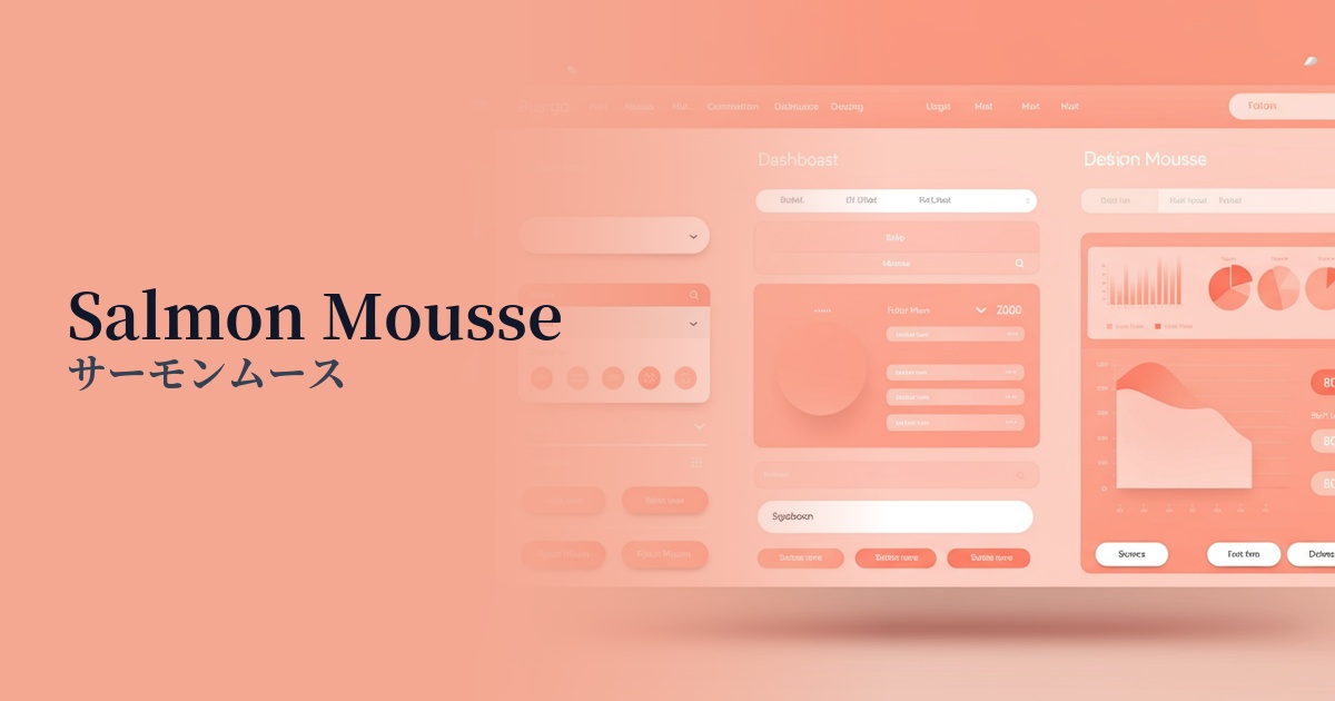
Visibility testing (UI component example)
Practical usage (best practices)
Using it as the background color for the entire website creates a sense of warmth and openness in the space. In particular, when combined with a minimalist layout that makes good use of white space, it can create a sophisticated yet comfortable atmosphere.
When used as an accent color for buttons, icons, and link text, it adds a soft rhythm to the overall design and gently guides the user's gaze. It works particularly well in designs based on white or light gray.
This design is ideal for product pages and card designs on e-commerce sites that want to convey a friendly and natural aesthetic, such as cosmetics, baby products, lifestyle goods, and organic foods. It enhances the appeal of the products while strengthening the brand image.
It's also recommended to use this color as a key color for brand illustrations and infographics. Even complex information can be made more accessible to users and conveyed in a friendly and approachable way by using this color.
Recommended color scheme suggestions
Sage Green (#9DC183)
The combination with sage green, reminiscent of nature, creates an organic and comforting atmosphere. It's ideal for brands with wellness and sustainability themes, providing users with a sense of security and tranquility.
Navy Blue (#000080)
The lightness of the salmon mousse is complemented by the sophisticated, deep navy blue, creating a modern and trustworthy impression. This is effective when you want to balance refinement and approachability, such as in SaaS dashboards or corporate websites.
Slate Gray (#708090)
The warm salmon mousse and the cool, calming slate gray are a perfect match. This color scheme is not overly sweet, creating a sophisticated and urban atmosphere, making it ideal for fashion and interior design e-commerce sites, portfolio websites, and more.