| English name | Aqua Mist |
|---|---|
| Katakana | Aqua Mist |
| HEX | #E3F6F5 |
| RGB | 227, 246, 245 |
| Design Theme | Pastel & Macaron Colors |
Why is it a trend? (Background and reasons)
In recent years, web design has emphasized the concept of "digital wellness," which aims to provide users with a sense of security and comfort. Gentle and clean colors like aqua mist are being adopted in many interfaces because they reduce stress in the digital space and provide users with a calm and peaceful experience.
This color pairs perfectly with minimalism and clean designs. Using Aqua Mist instead of a pure white background adds softness and subtle individuality to your design while maintaining a sophisticated impression without compromising content readability.
Aqua Mist, reminiscent of clear water and morning mist found in nature, brings a sense of peace to the user's mind. As part of "biophilic design," which incorporates natural elements into digital design, using this color can give products and services an organic and trustworthy image.
The psychological effects of design and UX
Aqua Mist has a calming and relaxing psychological effect on those who see it. In UI/UX design, it is expected to alleviate user anxiety and improve concentration, making it suitable for dashboards that handle complex information and reservation systems that require calm operation.
The transparency and brightness of this color symbolize "cleanliness," "integrity," and "trustworthiness." Using it, especially in fields such as healthcare, finance, and SaaS, helps to instill a sense of security in users and build trust in the brand.
Pale blue-green conveys a sense of newness, freshness, and even a futuristic feel. Its approachable tone, rather than being too cold, makes it an effective color for companies dealing with cutting-edge technology to demonstrate a user-friendly approach.
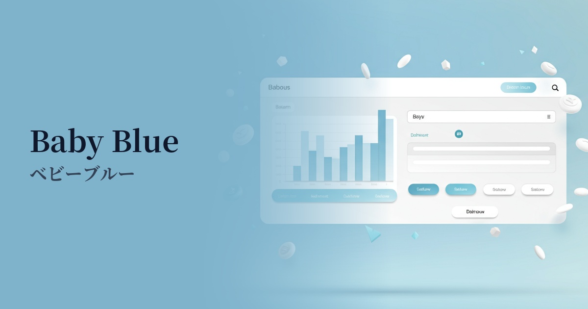
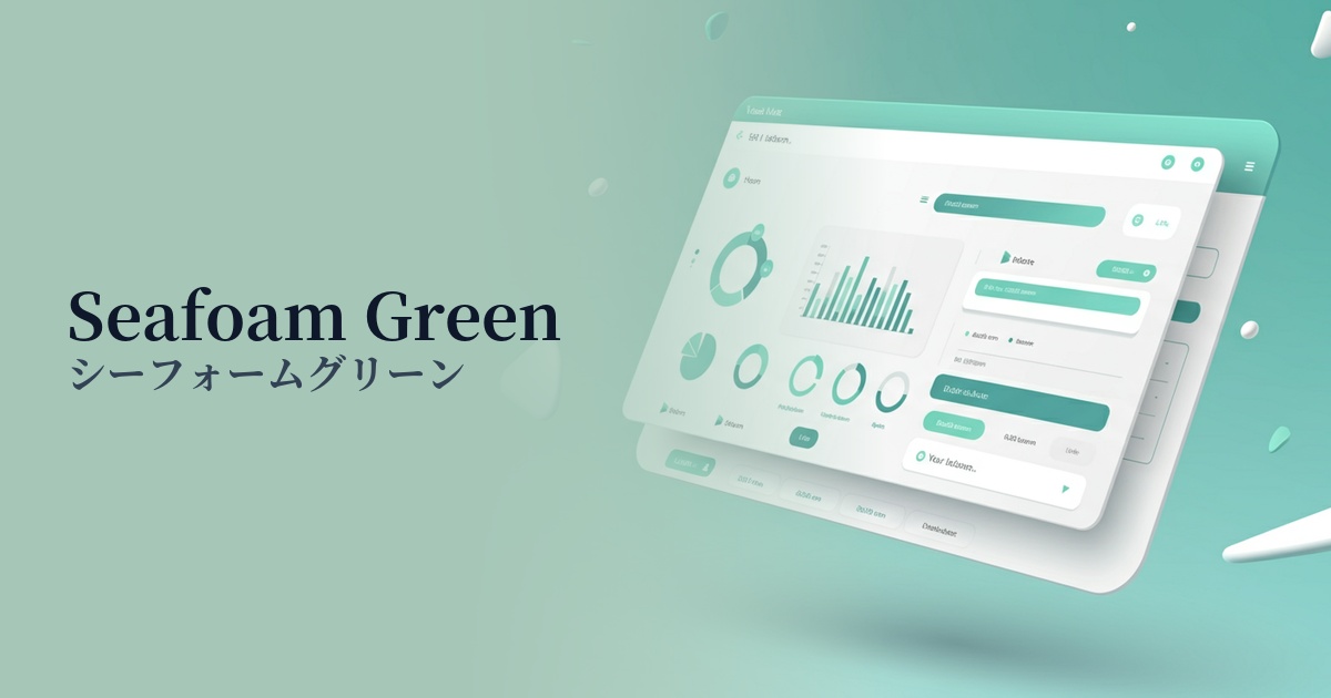
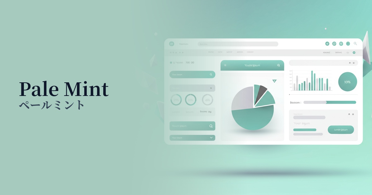
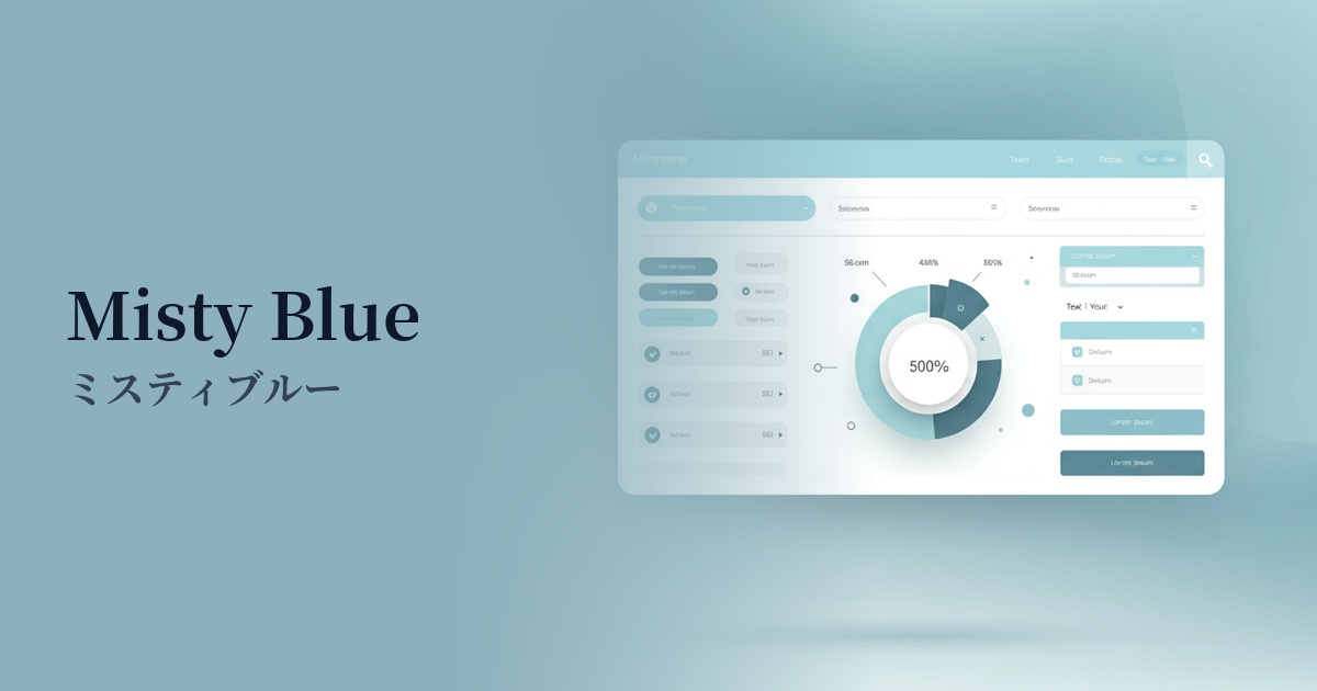
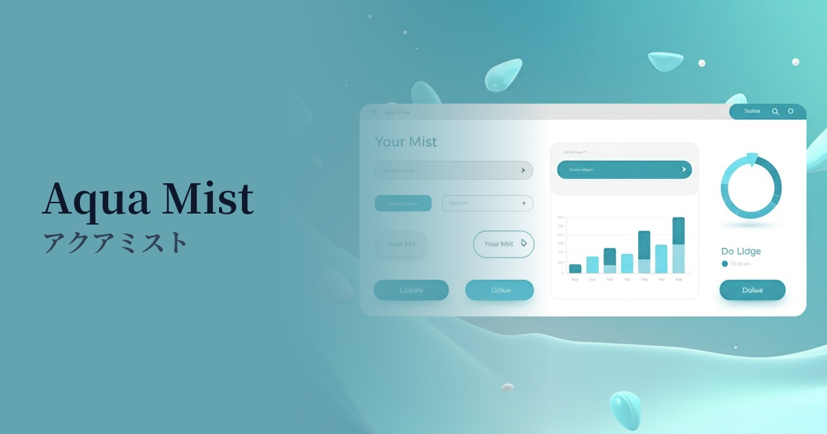
Visibility testing (UI component example)
Practical usage (best practices)
Using it as the main background color for a page brings a unified and calm atmosphere to the entire site. Simply using it instead of white or light gray will result in a memorable design that is unlike the ordinary.
In minimalist UIs, using accent colors subtly can be very effective. Applying them to active navigation links, secondary buttons, and icon backgrounds gently guides the user's gaze and improves usability.
Using this color as the background for information cards or container elements makes it visually easier to understand the grouping of content. Combining it with a layout that makes good use of white space further enhances the clean and organized impression.
It is especially well-suited for wellness, beauty, and eco-related products and services. It allows you to intuitively communicate your brand's concepts of "healing," "nature," and "health" to users through color.
Recommended color scheme suggestions
Slate Gray (#708090)
By combining it with a calming slate gray, the lightness of Aqua Mist gains depth and a sense of reliability. It gives an intelligent and sophisticated impression and functions as a highly readable text color, making it ideal for SaaS and business websites.
Salmon (#FA8072)
Adding a touch of warmth with salmon creates a friendly and positive atmosphere. It's effective when used on buttons that gently encourage user action or on elements you want to draw attention to, making it perfect for lifestyle services.
Sage Green (#B2AC88)
By combining it with earthy sage green, a natural and organic aesthetic is created. This calming and relaxed impression further enhances the image of wellness-related brands and websites showcasing sustainable products.