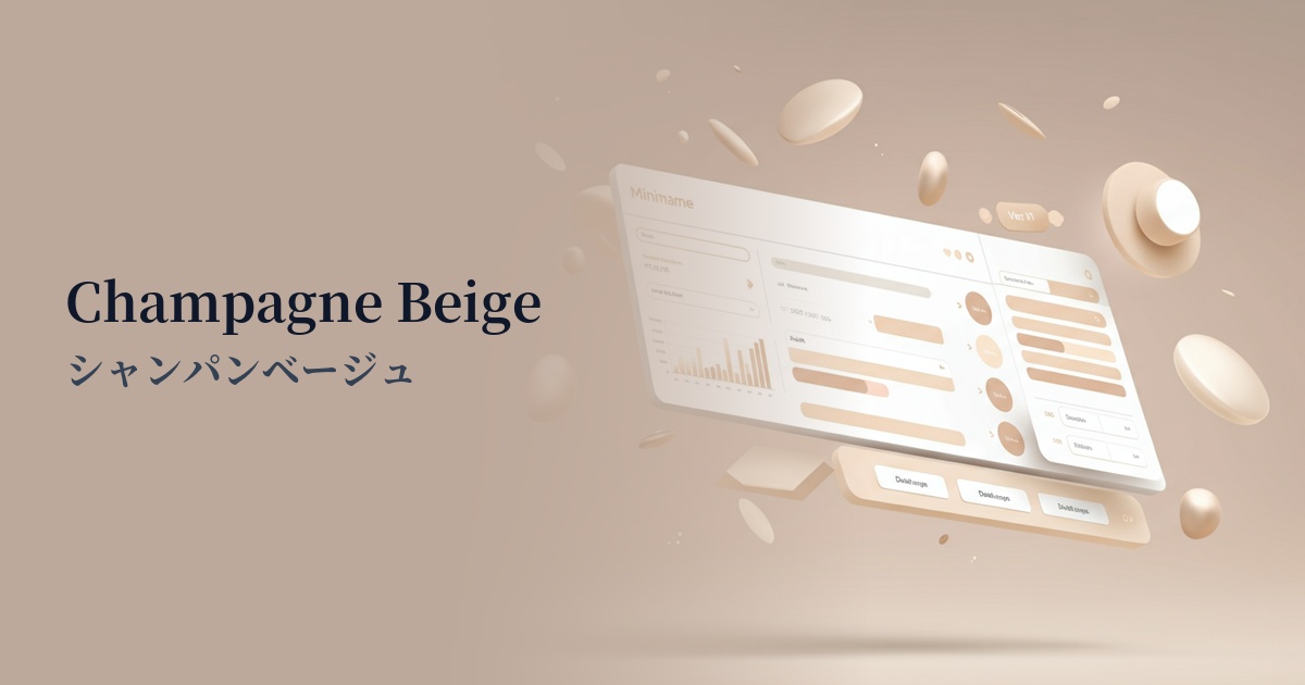
| English name | Champagne Beige |
|---|---|
| Katakana | Champagne Beige |
| HEX | #F7E7CE |
| RGB | 247, 231, 206 |
| Design Theme | Neutral & Minimal Background Colors |
Why is it a trend? (Background and reasons)
In recent years, there has been a growing interest in minimalism and sustainability in web design. Champagne beige is the perfect color to express an organic and natural feel that aligns with this trend. It resonates with the brand's philosophy of eliminating ostentatious decorations and conveying essential values, and has been adopted in many designs.
In the information-saturated digital world, users unconsciously seek "quietness" and "comfort." The calm and warm hue of champagne beige reduces visual noise and provides users with a sense of security. It plays an important role in enhancing immersion in content and creating an interface that is less tiring even when used for extended periods.
This color is highly versatile and easily harmonizes with other colors, which is another reason for its trend. It functions as a background color that highlights vibrant accent colors, while maintaining an elegant impression without becoming too heavy in dark mode UIs. It's a modern color that easily adapts to a variety of devices and viewing environments.
The psychological effects of design and UX
Champagne beige, as its name suggests, evokes the image of "champagne," conveying elegance, sophistication, and a subtle sense of luxury to the user. Because it is not overly assertive, it has the effect of subtly highlighting the high quality of the product or service.
Psychologically, beige tones evoke feelings of security, stability, and calmness. The warmth of this color helps to alleviate user tension and facilitates a relaxed state of information reception. It is particularly effective for corporate and service websites where trustworthiness is paramount.
From a UI/UX perspective, it serves as an excellent "background color." Using it as a background color allows users to focus on the content without hindering the visibility of important elements such as text and CTA buttons. It naturally creates a visual hierarchy, helping users understand information smoothly.
Visibility testing (UI component example)
Practical usage (best practices)
One of the most effective uses is as the background color for the entire website. Especially when combined with a minimalist layout that uses plenty of white space, it creates a sophisticated and clean aesthetic. Using white for the content area and champagne beige for the background creates a subtle sense of depth.
Use it as a base color to highlight key colors on landing pages and important sections. For example, when using deep green or warm terracotta as accents, laying champagne beige as the background will make the accent colors stand out more while maintaining overall harmony.
It's also recommended to use it as the background color for components when you want to organize and display information in blocks, such as in a card-style UI or a price plan comparison table. The slight color difference between it and a plain white background makes it easier for users to intuitively recognize each element as belonging to a different group.
This is ideal for e-commerce sites that want to convey the world view and quality of their products, such as luxury fashion brands, organic cosmetics, interior design, and wedding-related items. It brings a unified and elegant atmosphere to the entire site without detracting from the appeal of the products.
Recommended color scheme suggestions
Slate Gray (#708090)
This combination gives an intelligent and calm impression. The warmth of champagne beige is combined with the coolness of slate gray, creating a modern and trustworthy atmosphere. Recommended for business websites and portfolios.
Terracotta (#E2725B)
The combination of warm, earthy tones creates a natural and organic impression. Champagne beige gently complements the vibrancy of terracotta, making it ideal for lifestyle brands and wellness-related websites.
Forest Green (#228B22)
The forest green, reminiscent of a deep forest, complements the elegance of the champagne beige, achieving a balance of luxury and tranquility. It's perfect for expressing the brand image of authenticity, such as sustainability and natural cosmetics.