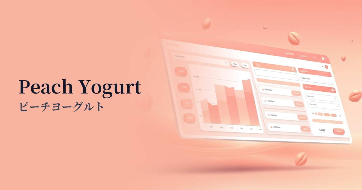
| English name | Peach Yogurt |
|---|---|
| Katakana | Peach Yogurt |
| HEX | #FFF0E9 |
| RGB | 255, 240, 233 |
| Design Theme | Neutral & Minimal Background Colors |
Why is it a trend? (Background and reasons)
In recent years, web design has seen a rise in popularity not only for pure white and gray, but also for neutral colors that evoke a sense of warmth. Peach yogurt is a color that can be seen as an evolution of this minimalism. A major reason behind this trend is the increasing demand for organic and humane designs that are less visually tiring and more comfortable for users, as they spend more time interacting with digital devices.
The growing interest in themes such as wellness and self-care is particularly driving the popularity of this color. The calm and gentle atmosphere of peach yogurt is highly compatible with the brand's worldview, which focuses on mental and physical health. The filtered, soft, and unified aesthetic seen on social media is also influencing color trends in web design.
The technical aspects are also noteworthy. With the widespread adoption of high-resolution displays, these delicate and subtle color nuances can now be beautifully rendered. Furthermore, as dark mode becomes a standard feature in many operating systems and apps, peach yogurt, which is easy on the eyes and gives a sophisticated impression, is a very practical choice for designers as a background color in light mode.
The psychological effects of design and UX
Peach Yogurt, as its name suggests, combines the approachable quality of ripe peaches with the creamy, smooth texture of yogurt. This color is expected to give users a sense of security and calmness, and to alleviate any psychological apprehension. Even on a site visited for the first time, it welcomes users with a nostalgic and gentle atmosphere, creating a pleasant first impression.
Subtle, understated colors also have the effect of encouraging focus on the content itself. Rather than attracting attention with flashiness, they enhance the overall dignity of the site and help build a careful and high-quality brand image. These colors are ideal when you want to convey "quality" and "sincerity" rather than luxury.
The subtle inclusion of warm tones unconsciously evokes positive and optimistic feelings. It adds warmth to minimalist designs that can often appear cold, and can also be a catalyst for increased user engagement. This "gentleness" ultimately leads to trust and affection for the brand.
Visibility testing (UI component example)
Practical usage (best practices)
The most effective way to use this color is to adopt it as the background color for the entire website. Using this color extensively creates a sense of unity throughout the page and produces a soft, enveloping atmosphere. It is especially effective for brand websites in lifestyle, cosmetics, wellness, and baby products.
For pages with a large amount of information, it's also recommended to use it as the background color for card-style UIs. By combining it with other neutral colors such as white or light gray, you can visually divide blocks of content gently and organize the information structure in an easy-to-understand way.
It's excellent not only as a main color, but also as a supporting color to enhance accent colors. For example, when using vibrant coral pink or mint green for a CTA button, using peach yogurt as the background makes the accent color stand out more while keeping the overall tone soft.
It's also effective to use it for hover effects on buttons and links. Normally, the background is transparent or white, but when the mouse hovers over it, the animation subtly changes to peach yogurt, providing users with interactive feedback and enhancing the enjoyment of the interaction.
Recommended color scheme suggestions
Sage Green (#B2AC88)
The warmth of peach yogurt harmonizes with the calming, natural hues of sage green, creating an organic and comforting atmosphere. This combination is ideal for enhancing a sense of security and trustworthiness on wellness and natural cosmetics brand websites.
Slate Gray (#708090)
The combination of soft peach yogurt and intelligent, calming slate gray creates a modern and sophisticated impression. It also functions as a highly readable text color, making it suitable for minimalist portfolios and SaaS UIs.
Rosy Brown (#BC8F8F)
Combining peach yogurt with rosy brown, a similar shade, creates a unified, gentle, and feminine gradient. This is recommended for fashion and beauty-related websites where you want to achieve both elegance and approachability.