| English name | Veil Pink |
|---|---|
| Katakana | Veil Pink |
| HEX | #FDECF2 |
| RGB | 253, 236, 242 |
| Design Theme | Pastel & Macaron Colors |
Why is it a trend? (Background and reasons)
The trends of minimalism and soft UI are boosting the popularity of pale colors like veil pink. As designs increasingly eliminate excessive ornamentation and focus on content, soft, understated colors are highly valued as backgrounds and accent colors. Veil pink, with its delicate nature, maintains a clean impression while adding a warmth that achromatic colors lack.
This trend is partly driven by the growing "gender-neutral" values among Gen Z and Millennials. Moving away from the traditional "feminine" image of pink, it's now being embraced in the worlds of fashion, cosmetics, and web design as a color that evokes comfort and sophistication regardless of gender.
The user psychology of seeking relief from digital fatigue also plays a role. Pastel colors, which are gentle on the eyes and less stimulating, provide users with a sense of security and relaxation. Light colors like veil pink are suitable for creating a UI that is less tiring even during prolonged screen use.
The psychological effects of design and UX
Veil Pink, as its name suggests, evokes a sense of transience and delicacy, like being veiled, giving off an impression of gentleness, purity, and romance. It is particularly well-suited for beauty, wellness, and bridal-related websites where the goal is to instill a sense of security and calmness in the user.
From a UI/UX perspective, this color evokes a sense of "calmness" and "cleanliness." When used in designs that utilize white space, it can convey a sophisticated and luxurious feel. Furthermore, its understated nature allows it to complement other elements, naturally guiding the viewer's eye to the main content or product.
Because it is a subtle color, it does not convey aggression or urgency. Therefore, using it as the background color for user registration forms, settings screens, and other screens where users need to be cautious can alleviate psychological pressure and encourage smoother operation.
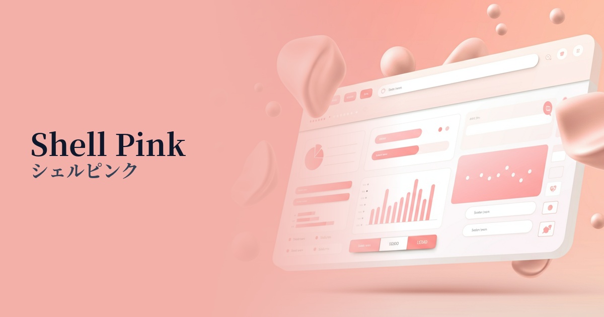
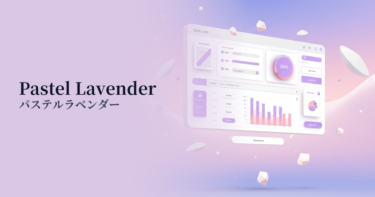
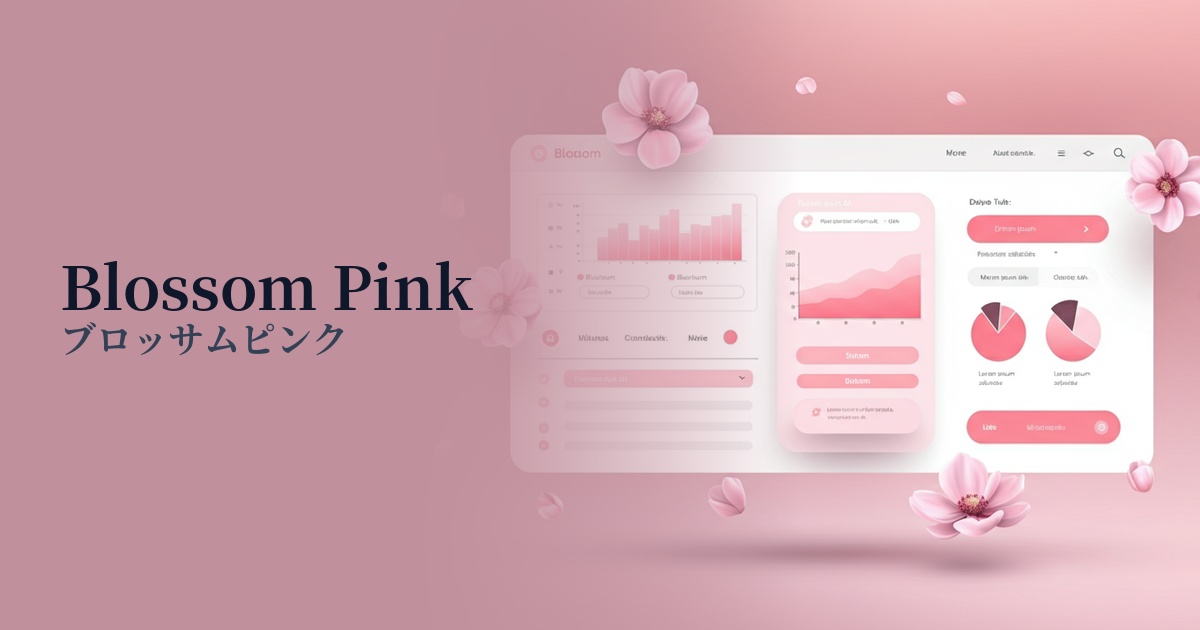
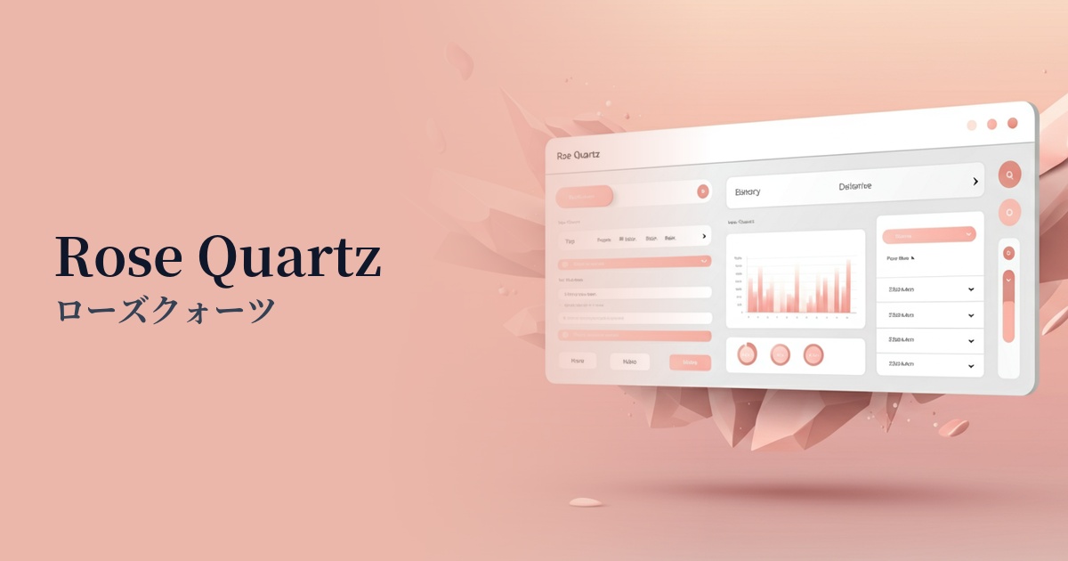
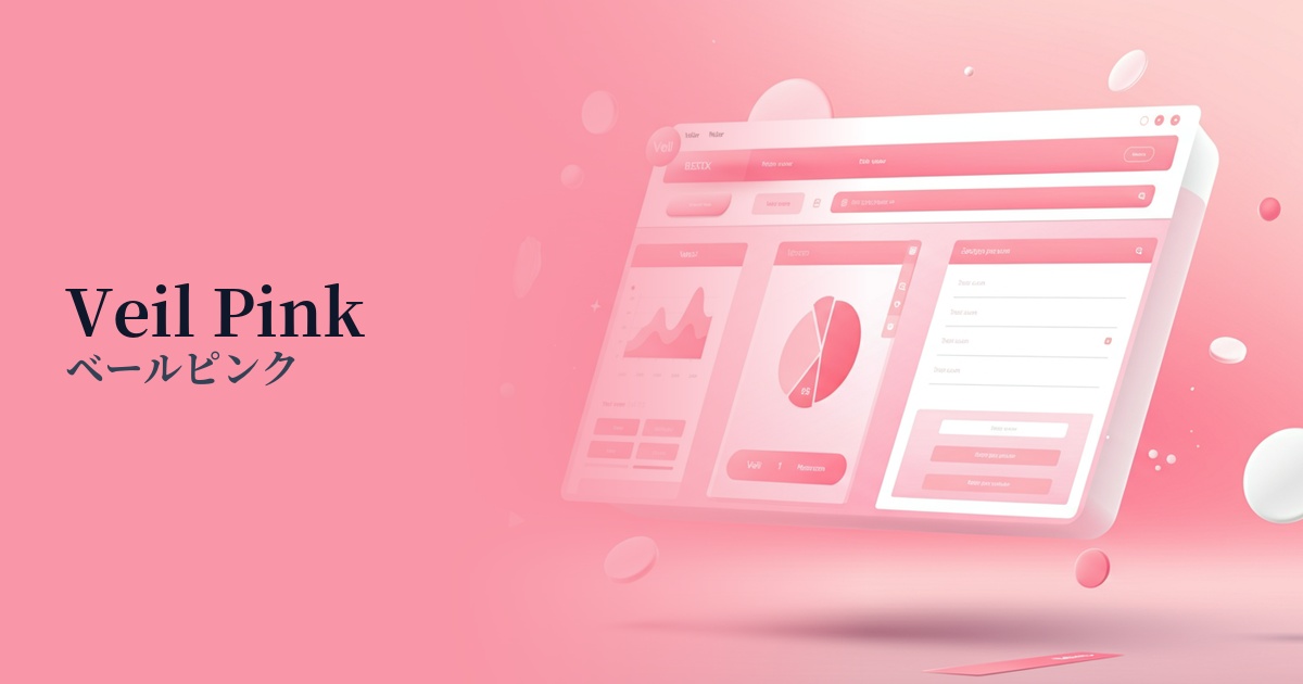
Visibility testing (UI component example)
Practical usage (best practices)
It is most effective when used as a background color for a wide range of content. Especially when used on minimalist portfolio websites or e-commerce sites for cosmetic brands, it brings a unified and elegant feel to the entire content. Simply using it instead of a white background creates a much more sophisticated impression.
It's also effective as a background color for card-type UIs or for separating sections. When combined with other light colors, it gently distinguishes information blocks and creates a visual rhythm. However, when overlaying text, ensuring a sufficient contrast ratio is crucial for accessibility.
When using it as an accent color, it's recommended to combine it with darker colors. For example, combining it with dark gray or navy text, or using it as a hover effect for a dark pink button, will create subtle variations and improve the user experience.
Recommended color scheme suggestions
Dove Grey (#B9B4B1)
By combining soft veil pink with calming dove gray, you can create a modern and sophisticated atmosphere with a restrained sweetness. This color scheme is recommended for minimalist designs and genderless service websites.
Antique White (#FAEBD7)
Veil pink and warm antique white are a very compatible combination. The overall tone gently envelops the space, creating an elegant and comfortable atmosphere. It's perfect for wedding and baby product websites.
Slate Blue (#6A5ACD)
The sweetness of pink is balanced by the sophisticated and calming slate blue, creating an elegant and trustworthy impression. It is particularly effective when used as an accent color in SaaS dashboards or education-related services.