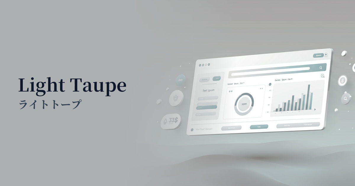
| English name | Light Taupe |
|---|---|
| Katakana | Light Taupe |
| HEX | #E8E1D9 |
| RGB | 232, 225, 217 |
| Design Theme | Neutral & Minimal Background Colors |
Why is it a trend? (Background and reasons)
In recent years, a major trend in web design has emerged as a reaction against the information-overloaded digital environment, emphasizing quiet and calming "minimalism" and "quiet luxury." Light taupe is a color that perfectly embodies this trend. Its exquisite hue, neither as strong as pure white nor as cold as gray, provides users with a calm and pleasant visual experience.
Furthermore, the growing interest in sustainability and wellness is also boosting the popularity of light taupe. This color, reminiscent of natural materials such as soil, stone, and dry linen, is highly compatible with the worldview of organic products and ethical brands. It helps to build an honest and natural brand image throughout the entire site.
From a UX design perspective, light taupe is attracting attention. A pure white background (#FFFFFF) can strain the user's eyes, especially during prolonged viewing. Off-white colors like light taupe can reduce screen glare and alleviate eye strain without compromising text readability, making them a popular choice for content-centric websites.
The psychological effects of design and UX
Light taupe is a neutral color that combines the warmth of beige with the calmness of gray. This intermediate characteristic brings about psychological effects such as a sense of security, stability, and harmony in the user. It provides a gentle foundation for focusing on content without overstimulating emotions.
The understated, understated color palette conveys an impression of sophistication, elegance, and intelligence. While creating a sense of luxury, it never becomes ostentatious, making it highly effective for building the image of B2B services where reliability is crucial, or for brand websites with a minimalist aesthetic.
In UI/UX design, light taupe is the perfect "supporting color" to enhance other colors. Its harmonious blending with any color allows it to stand out accent colors and maximize the appeal of photos and illustrations. It unifies the overall tone, resulting in a clean and cohesive interface.
Visibility testing (UI component example)
Practical usage (best practices)
Its most effective use is as the background color for the entire website. It's particularly effective on text-heavy blogs, portfolios, and company "About" pages, creating a calm atmosphere that encourages users to carefully read the content.
This background color is ideal for e-commerce sites that require a minimalist design, especially those dealing with apparel, cosmetics, and interior goods. It doesn't interfere with the colors or textures of the products; rather, it elegantly enhances their appeal, providing a sophisticated shopping experience.
It is also effective as a background color for card-based UIs in SaaS dashboards and information websites. It softens the boundaries between cards, organizes information, and reduces visual noise. It helps users access the information they need smoothly.
Treat light taupe not as the main color, but as a base color, and place a contrasting accent color on interactive elements such as CTA buttons and links. The light taupe background makes it clear what action the user should take next.
Recommended color scheme suggestions
Slate Gray (#708090)
The warmth of light taupe and the coolness of slate gray blend exquisitely, creating an intelligent and modern impression. This color scheme is recommended for business websites and portfolios where you want to convey both trustworthiness and sophistication.
Terracotta (#E2725B)
The combination of earth tones creates a natural, warm, and organic atmosphere. It adds warmth and approachability to websites related to wellness services and handcrafted products.
Hunter Green (#355E3B)
Adding Hunter Green, reminiscent of a deep forest, as an accent creates a sense of calm, sophistication, and vitality. It's ideal for brands that focus on sustainability or designs that seek a refined atmosphere.