| English name | Dark Info |
|---|---|
| Katakana | Discount Information |
| HEX | #1D4ED8 |
| RGB | 29, 78, 216 |
| Design Theme | UI System & Alert Colors |
Why is it a trend? (Background and reasons)
In recent years, web design, particularly in SaaS and financial platforms, has become extremely important not only for presenting information but also for visually conveying its "reliability" and "stability." Dark info, with its depth and calmness compared to traditional bright blue, is increasingly being adopted in the UI of these digital products as a color that instills a sense of security in users.
Furthermore, the widespread adoption of dark mode is a major contributing factor. Dark info maintains excellent visibility even against dark backgrounds, is easy on the eyes, and creates a modern, sophisticated impression. Because it can effectively convey the importance of information while minimizing light stimulation, it is highly compatible with dark mode.
Furthermore, the growing awareness of accessibility (a11y) is also a driving force behind this trend. This color is particularly effective at ensuring sufficient contrast against white or light gray backgrounds, making it a strong choice for achieving designs that meet WCAG standards. It is valued as a color that supports inclusive design, ensuring that information is clearly communicated to all users.
The psychological effects of design and UX
The deep blue color of dark info is traditionally associated with psychological effects such as "trust," "integrity," and "intelligence." Users unconsciously perceive a sense of stability and expertise from this color, making them more likely to trust the information and services displayed. It is particularly effective on dashboards handling important data and on corporate websites where a company wants to convey its credibility.
From a UI/UX perspective, this color excels at "quietly asserting" itself, accurately pointing out important elements without overly attracting the user's attention. Because it doesn't distract like flashy colors, users can concentrate more easily on their tasks. It's ideal for subtly highlighting information the user needs to recognize, such as the active state, selected items, and important notifications.
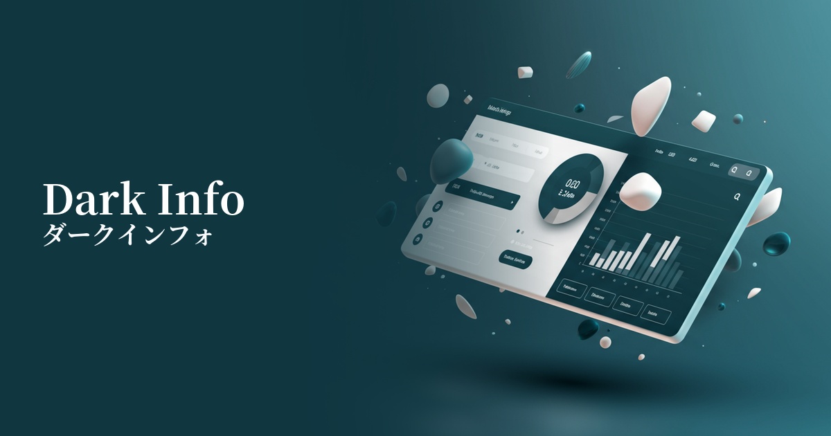
Visibility testing (UI component example)
Practical usage (best practices)
Dark information is essential in dashboards for SaaS products and analytics tools. By using it in active navigation menus, key data series in graphs, and numerical values that indicate important metrics, the hierarchical structure of information can be communicated to users intuitively and clearly.
It is also highly effective to use it as the main CTA (Call to Action) button on corporate websites and service landing pages (LPs). Using it for buttons such as "Request Information" or "Start Free Trial" can give users a sense of security and lower the psychological barrier to clicking.
It's ideal for link text within content and as an icon color to indicate features. Its calmer and more refined tone compared to standard link blue elevates the overall tone of the site, giving it a more professional feel. It clearly indicates that an element is clickable, contributing to improved usability.
Using bold colors as the background color for headers, footers, or sections can create a consistent brand image and a sense of trustworthiness throughout the entire site. In this case, using white or light gray for the text ensures high readability and creates a sophisticated contrast.
Recommended color scheme suggestions
Gainsboro (#DCDCDC)
This classic combination creates a clean and modern impression. It adds lightness and sophistication without compromising the credibility of dark info. It's ideal for UI backgrounds and card elements, and maintains high readability.
Marigold (#EAA221)
This energetic color scheme uses colors that are close to complementary, enhancing each other's beauty. The calm impression of Dark Info is combined with the vibrancy and attention-grabbing effect of Marigold, making it effective for areas where you want to strongly attract the user's attention.
Celadon Green (#ACE1AF)
This calm and harmonious color scheme evokes analogies to the natural world. The solidity of Dark Info is combined with the calming and growing image of Celadon Green, giving users a sense of security and a positive impression.