| English name | Pale Lavender |
|---|---|
| Katakana | Pale Lavender |
| HEX | #E6E6FA |
| RGB | 230, 230, 250 |
| Design Theme | Neutral & Minimal Background Colors |
Why is it a trend? (Background and reasons)
In recent years, minimalism and soft UI have become mainstream in web design. Within this context, pale lavender is gaining attention as a more emotional and warm neutral color, replacing traditional white and light gray. Its soft hue, rather than being simply achromatic, allows for a clean yet humane design.
Another major factor is the growing interest in digital wellness. The calm and soothing atmosphere of pale lavender reduces the psychological burden on users and provides an experience that is less tiring even when looking at screens for long periods of time. In this age of information overload, there is a demand for such "eye-friendly" colors.
It's also worth noting that it has a strong affinity with aesthetics popular in the fashion and interior design worlds, such as the Y2K revival and pastel core. While evoking a sense of nostalgia, it gives off a modern and sophisticated impression in the digital space, giving it the potential to appeal to a wide range of generations.
The psychological effects of design and UX
Pale lavender evokes feelings of calmness, healing, and tranquility in the viewer. In UI/UX design, it can provide users with an unconscious sense of security and a psychological effect that allows them to concentrate on the content in a relaxed state. It is particularly effective for services that handle complex information or in situations where users should behave calmly.
This color symbolizes elegance, sophistication, and creativity. Pale purple has a long history as a noble color, and it helps build a refined and delicate brand image. Using it on beauty-related e-commerce sites or creator portfolio sites can effectively convey the brand's worldview.
One of its distinguishing features is its strong gender-neutral impression compared to pink or blue. In today's world, where diversity is highly valued, it can be said that it is a color that is easily accepted by a wide range of target groups regardless of gender. It is one of the easiest options to use when aiming for inclusive design.
Visibility testing (UI component example)
Practical usage (best practices)
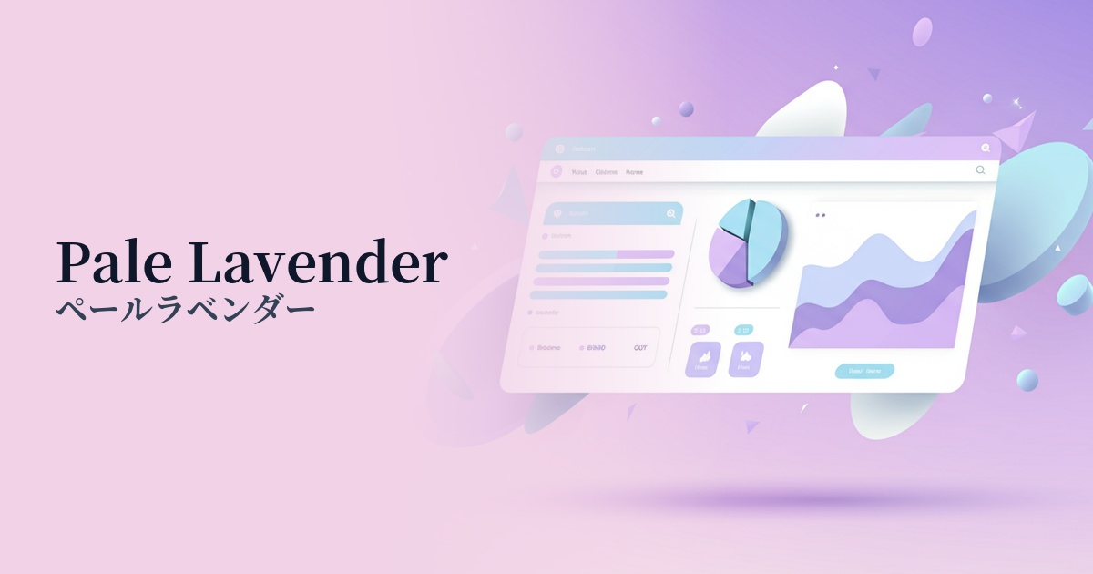
Its most effective use is as a background color. Using pale lavender as the overall background of a website or app creates a unified and calming atmosphere. It works particularly well with minimalist layouts that make good use of white space, and effectively enhances the content itself.
To visually organize information hierarchies, it's also recommended to use pale lavender as the background color for card UIs or specific sections. For example, placing pale lavender cards against a white background naturally guides the user's eye and clearly communicates the grouping of information.
It's ideal for interfaces that users interact with for extended periods, such as SaaS dashboards and wellness apps. By reducing eye strain and providing a calming user experience, it contributes to improved user engagement. Using it in notifications and graphs allows you to highlight information while maintaining a pleasant atmosphere.
While its low saturation makes it unsuitable for main CTA buttons, using it as an accent for UI elements such as tags, badges, icons, or auxiliary buttons adds a refined rhythm and depth to the design. The key is to use it as a supporting element that enhances the main focus.
Recommended color scheme suggestions
Slate Gray (#708090)
The softness of pale lavender, combined with the intelligent and calm impression of slate gray, creates a modern and sophisticated atmosphere. This combination is ideal for corporate websites and SaaS UIs that aim to balance trustworthiness with a contemporary sensibility.
Sage Green (#9DC183)
By combining it with sage green, which evokes nature, you can create a very calm, relaxed, and organic atmosphere. It's perfect for expressing the worldview of brands that focus on wellness, lifestyle, and natural cosmetics.
Coral (#FF7F50)
Adding a vibrant and energetic coral accent brings life and fun to the tranquil impression of pale lavender. This is recommended for creative portfolios and landing pages for youth-oriented services where you want to make your personality stand out.