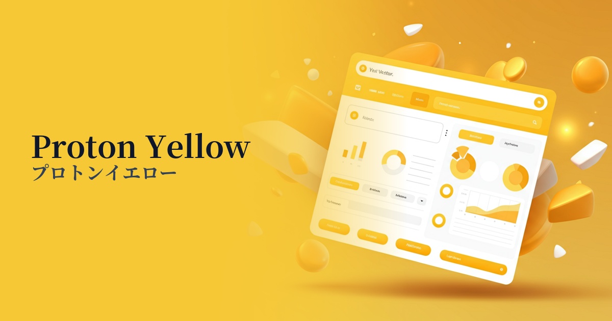
| English name | Pron Yellow |
|---|---|
| Katakana | Proton Yellow |
| HEX | #FFF80A |
| RGB | 255, 248, 10 |
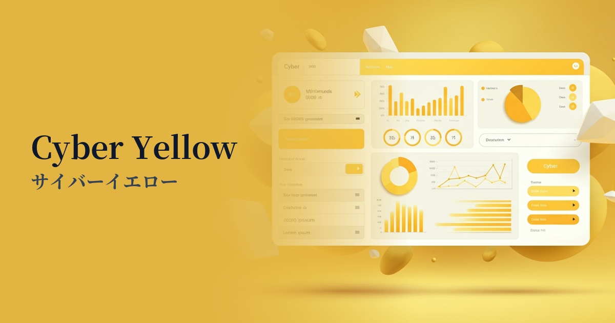
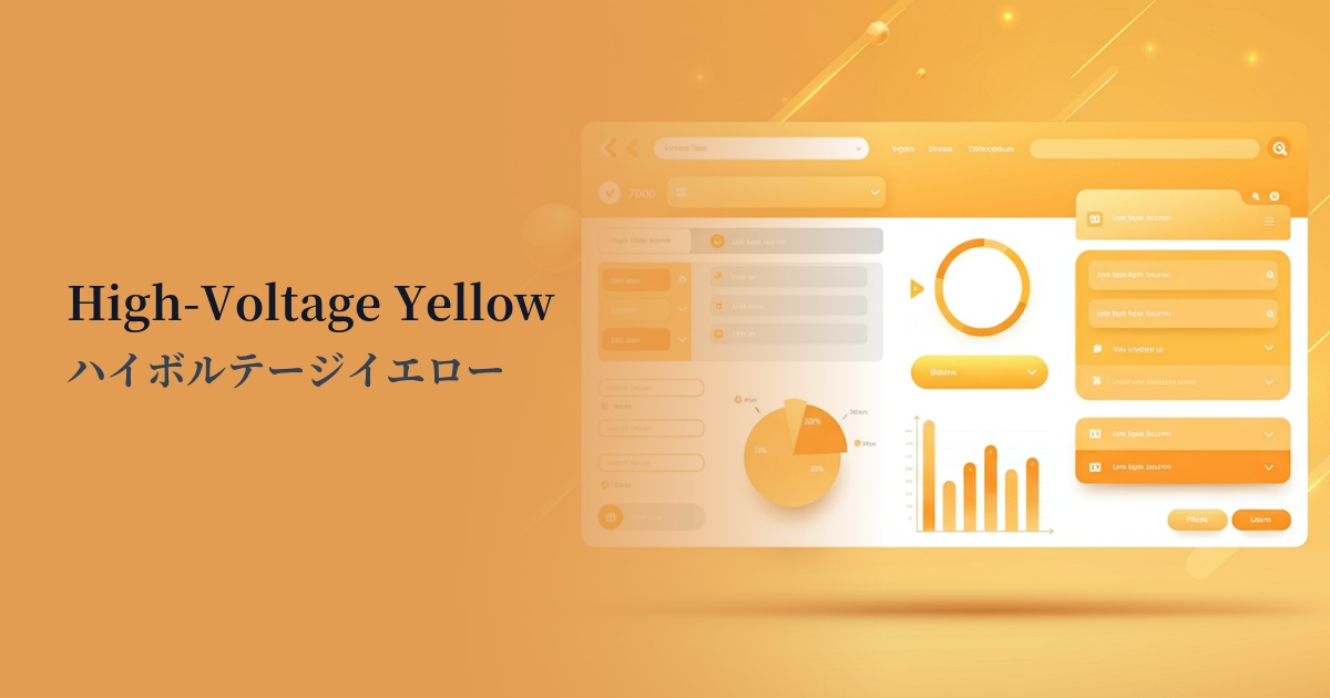
| Design Theme | Neon & Cyberpunk Colors |
Why is it a trend? (Background and reasons)
The rise of proton yellow is driven by technological advancements and a growing interest in future-oriented design. The cyberpunk and retro-futuristic aesthetics of the 80s and 90s are experiencing a revival, and there is a renewed demand for surreal and exciting digital expressions.
Furthermore, the proliferation of new digital experiences such as the metaverse and VR/AR is also driving this color trend. Unnatural neon colors like proton yellow are highly effective in creating immersive experiences in virtual spaces and striking visuals that stand apart from reality.
Furthermore, in the information-saturated world of social media and digital advertising, visual impact is crucial for instantly capturing a user's attention. Proton yellow's overwhelming visibility and energy make it a powerful tool for leaving a strong impression without getting lost in other content.
The psychological effects of design and UX
Proton Yellow conveys a positive and active impression of energy, vitality, advanced technology, and innovation. It evokes a sense of futurism and technological anticipation in users, psychologically communicating that the product or service is cutting-edge.
Because of its extremely high visibility, it also functions as a sign to draw attention or warn. In UI/UX design, it can be expected to strongly attract the user's attention to a specific element, preventing them from missing important information.
On the other hand, its intense visual stimulation can cause visual fatigue and stress to users if used excessively. In particular, using it over a large area as a background significantly reduces readability, so careful consideration is required regarding the area and frequency of use.
Visibility testing (UI component example)
Practical usage (best practices)
The most effective use is as an accent color. By limiting its use to key elements that you want to encourage user action, such as CTA buttons, form submission buttons, and active navigation links, you can expect to improve conversion rates.
By partially incorporating it into the hero area or key visuals, you can create a strong first impression on your site. In particular, combining it with a dark background can effectively express the brand's innovative and energetic worldview.
It's also ideal for UIs that incorporate gamification. Using it for achievement unlock notifications, highlights in rankings, and level-up effects visually enhances the user's sense of accomplishment and promotes engagement.
While it should be avoided when used as the entire background color, it can create visual depth and dynamic movement when used as part of a gradient or layered over a dark background as a geometric pattern.
Recommended color scheme suggestions
Midnight Blue (#191970)
The proton yellow stands out vividly against the dark background, creating a combination that most strongly expresses a cyberpunk or futuristic worldview. Its high visibility makes it ideal for highlighting important elements.
Deep Pink (#FF1493)
This vivid combination enhances the vibrancy of each other's colors, creating a pop and energetic impression reminiscent of 80s synthwave. It's ideal for expressing playfulness in event and entertainment-related designs.
Gainsboro (#DCDCDC)
Combining it with a light gray softens the intense vibrancy of proton yellow, resulting in a modern and sophisticated impression. It's effective when you want to add a touch of personality and vibrancy to a minimalist design.