| English name | Angel Pink |
|---|---|
| Katakana | Angel Pink |
| HEX | #FFD1DC |
| RGB | 255, 209, 220 |
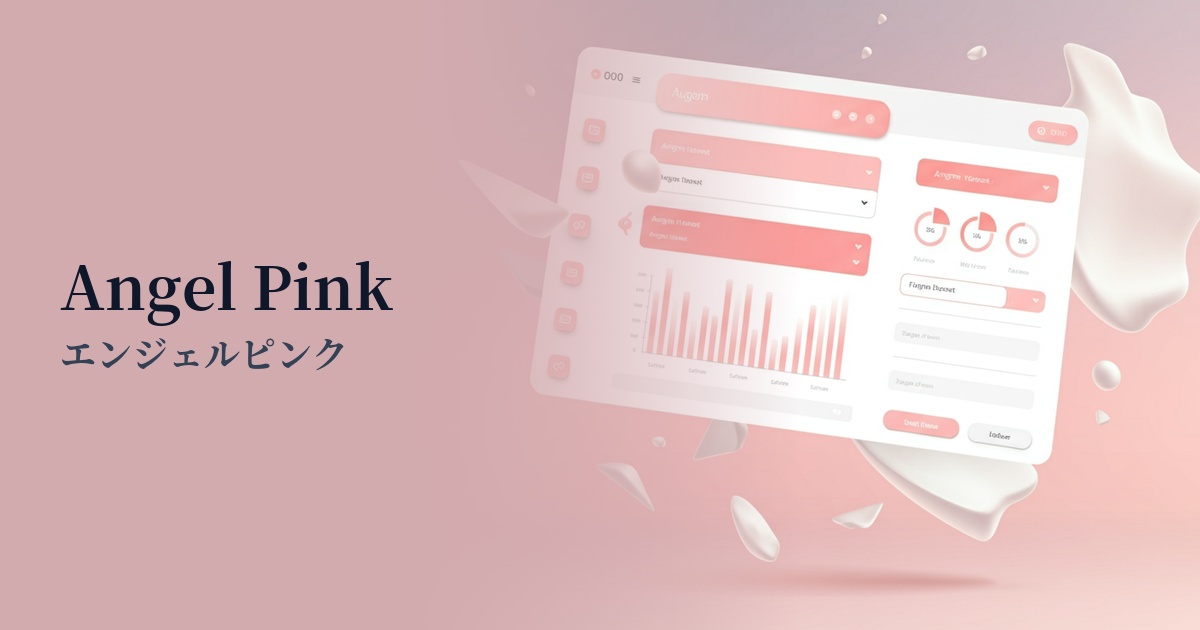
| Design Theme | Pastel & Macaron Colors |
Why is it a trend? (Background and reasons)
The reason Angel Pink is gaining attention is the growing demand for "comfort" and "tranquility" in the digital space. In today's information-overloaded and stimulating world, users unconsciously seek gentle and calming designs that soothe their minds. This color gives viewers a sense of security and has the effect of relieving digital fatigue, which is why it is being adopted by many websites.
Furthermore, the revival of Y2K fashion and the popular "soft feminine" aesthetic on social media are also boosting the trend. While pink was once considered a color for a specific target group, softer tones like angel pink have become more widely accepted regardless of gender. Its applications are expanding significantly, from adding a human warmth to minimalist designs to making tech services more approachable.
This color is more than just decorative; it also plays a role in visually conveying the brand's values of "empathy" and "compassion." In today's branding strategies, which emphasize emotional connection with users, the positive and gentle image of Angel Pink is highly effective.
The psychological effects of design and UX
Angel Pink psychologically evokes positive emotions such as "gentleness," "love," "happiness," and "youthfulness." In UI/UX design, it helps to alleviate user tension and allow them to use the service in a relaxed state.
Using this color can give brands and services an impression of being "approachable," "reassuring," and "caring." It is particularly effective in the healthcare sector, where alleviating user anxiety is crucial, and in building a brand image that values careful communication with customers.
However, due to its high brightness and low saturation, it is unsuitable for warnings or urgent notifications. Rather, its psychological effect is maximized when used for positive feedback (e.g., "Registration complete") or welcoming messages for users.
Visibility testing (UI component example)
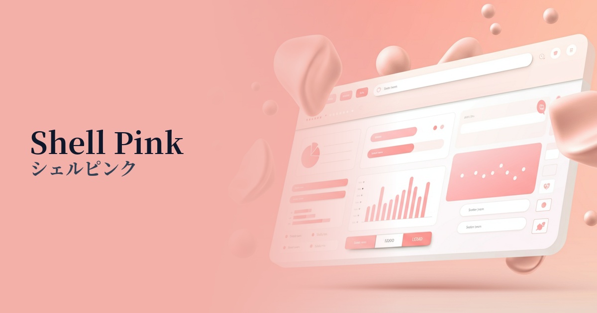
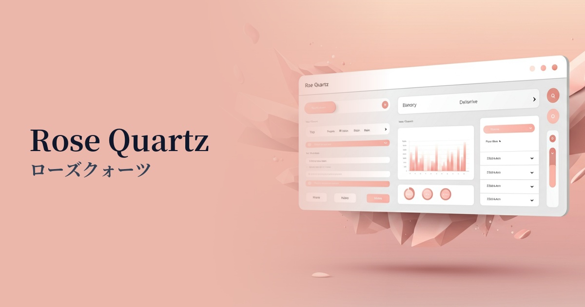
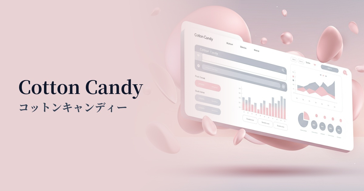
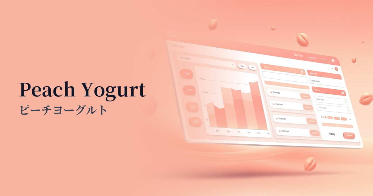
Practical usage (best practices)
Using it as a background color across a wide area brings a soft and open feel to the entire site. In this case, it is very important from an accessibility standpoint to choose a dark color for the text, such as dark gray (e.g., #333333) or charcoal gray, to ensure a sufficient contrast ratio.
In a minimalist design using white or light gray as the main color, this color is effective when used as an accent color for CTA buttons, icons, and link text. It gently guides the user's eye while adding warmth and individuality to the design.
The gradient, when combined with other pastel colors, is perfect for hero areas and card-style UI backgrounds. It creates a dreamy and fantastical world, and is particularly appealing in cosmetics, fashion, and lifestyle media.
Angel Pink is also an excellent key color for illustrations. Incorporating angel pink into characters and objects adds emotional depth and tenderness to the story, making it easier to evoke empathy from the user.
Recommended color scheme suggestions
Slate Gray (#708090)
The sweetness of Angel Pink is balanced by the sophisticated and calming Slate Gray. The exquisite balance—neither too sweet nor too cool—creates a refined and modern impression. Recommended for SaaS admin panels and portfolio websites.
Mint Green (#98FF98)
The fresh and invigorating mint green creates a bright and optimistic spring-like atmosphere. It's perfect for youthful and playful designs, and ideal for children's services and creative blogs.
Navajo White (#FFDEAD)
The warm, off-white Navajo White naturally complements the gentleness of Angel Pink. The overall effect is soft, natural, and inviting, creating a comfortable space that harmonizes well with wellness and lifestyle-themed websites.