
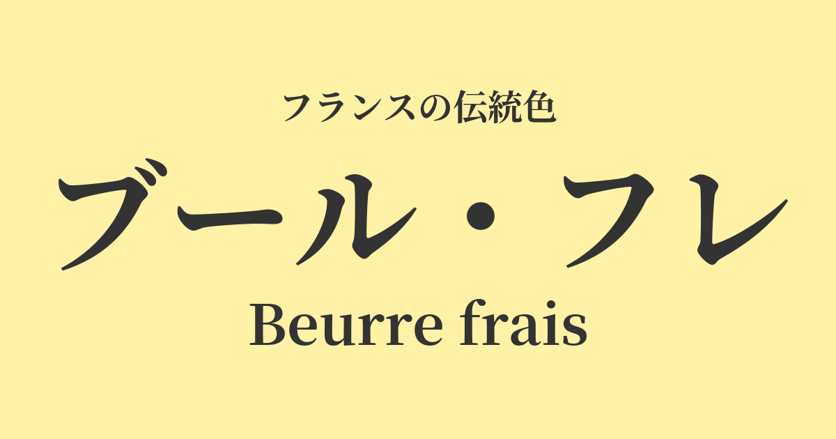
| French | Beurre frais |
|---|---|
| Katakana | Bourg Flé |
| HEX | #fff2a7 |
| RGB | 255, 242, 167 |
What is a boule fraîche? Origin and etymology
"Beurre frais" is a French word meaning "fresh butter." As the name suggests, it's a very beautiful color name that describes the creamy, pale yellow of freshly made butter.
France, particularly the Normandy and Brittany regions, is world-renowned for its high-quality dairy products. Butter made from the milk of cows raised on these fertile pastures possesses an exceptional flavor and beautiful color, forming the backbone of French culinary culture. Beurre flais is a color that truly symbolizes this bountiful land and the joy of the dining table.
This shade is not simply yellow; it carries nuances that evoke vitality and warmth. It is deeply rooted in the lives of the French people as a color that reminds them of the warmth of home, the tenderness of handmade items, and the peaceful happiness of everyday life.
Historical background of Bourg-Flé
The color name "bourg fraîche" is not directly linked to any particular royalty, nobility, or historical event. Rather, its origins can be found in the French countryside and the peaceful lives of ordinary people.
Going back in time to the 18th-century Rococo era, Marie Antoinette enjoyed a rustic lifestyle in "Amaux de la Reine," a small village built on the grounds of the Palace of Versailles. The aristocratic society of that time had a longing for natural and simple beauty. The gentle, natural colors of Bourg Flé harmonize well with the atmosphere of that era.
In the modern era, Impressionist painters ventured outdoors to try and depict light itself. Claude Monet's depictions of sun-drenched haystacks and Pierre-Auguste Renoir's dappled sunlight illuminating people's skin effectively utilize a warm, radiant yellow reminiscent of this bourg flares. It was truly the "color of light," capturing the beautiful light and landscapes of France.
Bourg Fleurs in the world of art and fashion
The colors of Bourg-Flé have added vibrancy to various aspects of French culture, including art, fashion, and textiles.
In the world of art, in addition to the Impressionist painters mentioned earlier, this nuance of color can also be found in the depictions of peasant life and rural landscapes by Barbizon School painters, exemplified by Jean-François Millet. This warm yellow gives a vibrant glow of life to simple motifs such as soil, straw, and harvested crops.
In fashion, it's an essential color for blouses and skirts in the "Provence style," which reflects the lifestyle of southern France. Along with ecru, off-white, and lavender, it creates a natural and relaxed look that evokes the feeling of sunlight.
Furthermore, cream yellow, like boule fraîche, is often used as the base color for Toile de Jouy, a traditional French printed fabric. This color gently enhances the elegant designs depicting pastoral landscapes and mythological scenes, creating a classic yet approachable atmosphere.
Color scheme preview
This is to check the readability of the text when this color is used as the background.
Boulle's color scheme proposal
Vert Empire (#005949)
This natural and calming color scheme evokes the French countryside. The gentleness of the bourg flares and the deep green harmonize to create a comfortable sense of peace and a classic, intellectual impression.
Rose Pompadour (#ED82A2)
This sweet and elegant color scheme evokes the Rococo style. The creamy shade of Beurre Frais gently envelops the splendor of rose, creating a feminine and romantic impression.
Blue Lavande (#9682C1)
This refreshing and pleasant color scheme evokes the landscapes of Provence in southern France. The butter yellow and lavender purple complement each other, creating a bright and sophisticated impression.
Practical Scenes
Boulle Flé, with its warm and approachable characteristics, can be used in a variety of situations.
When incorporated into interior design, it brightens the entire space and creates a calm atmosphere. Choosing it for wallpaper in the living room or bedroom will evoke a warm, sunlit feeling. It also looks lovely incorporated into fabrics such as cushions, curtains, and tablecloths. It pairs particularly well with natural wooden furniture, such as oak.
In fashion, it adds lightness and softness to spring and summer outfits. Incorporating it into linen or cotton shirts and dresses creates an elegant and relaxed atmosphere. Pairing it with darker colors like navy or charcoal gray completes a sophisticated adult casual style.
In web and graphic design, using it as a background color softens the content and gives viewers a sense of comfort. It's an ideal color for brands that want to convey warmth and friendliness, such as organic foods, handmade goods, cafes, and bakeries.