
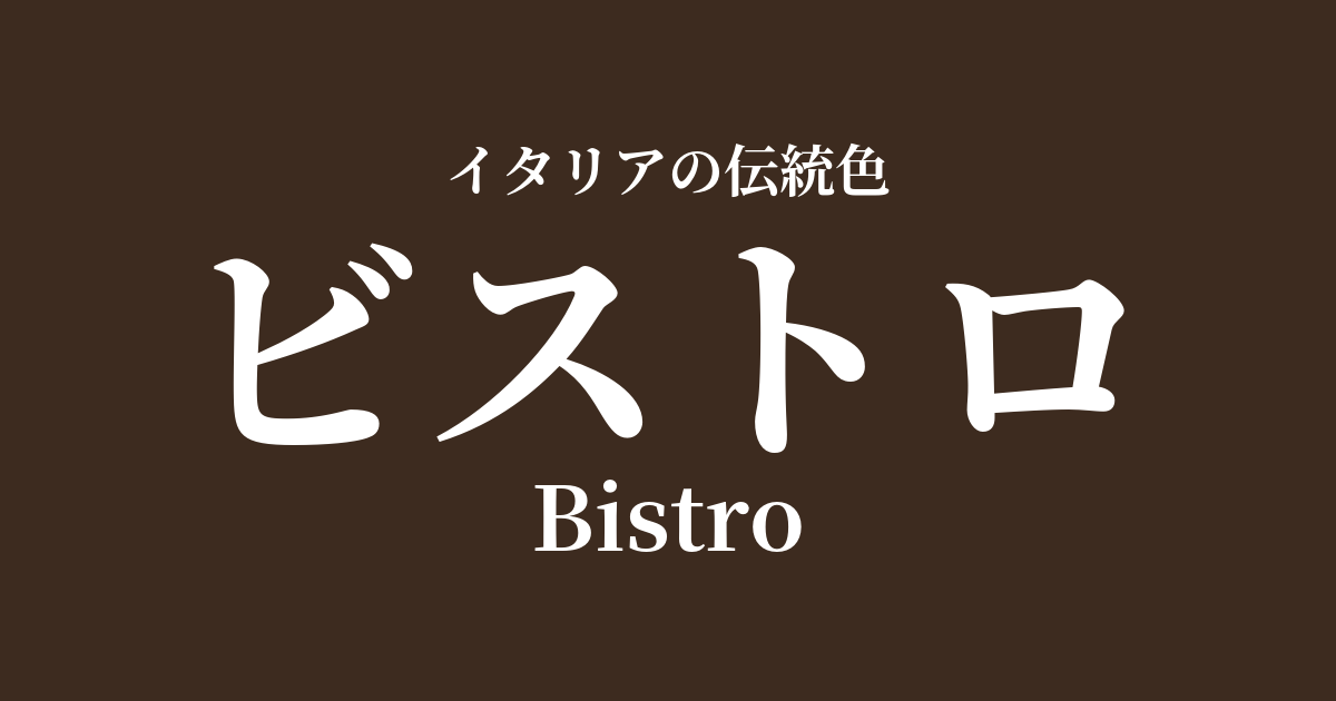
| Italian original name | Bistro |
|---|---|
| Japanese notation | bistro |
| HEX | #3D2B1F |
| RGB | 61, 43, 31 |
What is a bistro? Origin and etymology
Bistro is a very dark, deep brown color, reminiscent of espresso coffee or dark chocolate. Its name comes directly from the French word "bistro," which means a small cafe or casual eatery.
There's an interesting anecdote about the origin of this word. It's widely believed that in the early 19th century, after the Napoleonic Wars, Russian soldiers stationed in Paris would shout "Bystro!" in Russian, meaning "quickly, quickly!" in the mess hall, and from there, restaurants that served meals quickly came to be called bistros.
This color was named "Bistro" because it symbolizes the atmosphere of such establishments. The well-worn, glossy dark wooden furniture and counters, as well as the hues of the coffee and red wine served there, evoke this warm yet calming dark brown tone. In Italy, too, it was embraced as a color that expresses the homey and intimate atmosphere of similar establishments such as "Trattorias" and "Osterias."
The historical background of bistros
The name "bistro" is of French origin and relatively new, but this dark brown color itself has played an important role in Italian history for a long time.
In ancient Rome, people used this color, symbolizing the earth and trees, in murals and mosaics. In particular, "amber," a natural soil pigment mined in the Umbria region, was very close to this shade. Burnt umber, created by firing this pigment to deepen its hue, became a deep, rich brown, much like that of a bistro, and was a favorite of many artists.
From the Renaissance to the Baroque period, masters such as Leonardo da Vinci and Caravaggio frequently used this color in a technique called "chiaroscuro," which expressed a dramatic contrast between light and shadow. In their works, dark browns like those found in bistros were indispensable for creating the effect of figures and subjects emerging from a dark background.
In modern times, as French culture's influence grew stronger, the term "bistro" and its associated cultural image were introduced to Italy. In particular, in northern Italian cities such as Milan and Turin, social venues similar to Parisian café culture emerged, and the sophisticated yet approachable atmosphere of these establishments became popular.
Bistros in Italian Culture and Art
The color of bistros can be found in various aspects of Italian art and culture. Beyond its use in shading in Renaissance and Baroque paintings, this color is particularly effective in Caravaggio's works, where light dramatically illuminates figures as it emerges from darkness.
In the world of crafts, traditional Italian wooden furniture embodies this color. Heavy furniture made from walnut (Noce) or chestnut (Castagno) in particular possesses a bistro-like depth and beautiful grain. Furthermore, the furniture of the Tuscan style known as "Arte Povera" (poor art) also features this simple, warm, deep brown.
In architecture, the deep brown terracotta, created by the composition of the clay and firing temperature, adorns the floors and roofs of historic Italian buildings. This color gives the buildings a sense of warmth and solid stability.
And Italian food culture is inextricably linked to this color. The deep color of espresso, an essential part of daily life; the glossy dark brown of aged balsamic vinegar; the fragrant dark chocolate—many gourmet foods evoke the colors of the bistro in us.
Color scheme preview
This is to check the readability of the text when this color is used as the background.
Bistro color scheme proposals
Giallo Napoli (#FADA5E)
The combination of deep brown and bright yellow creates a beautiful contrast, giving a classic yet vibrant impression. It evokes light and shadow, earth and sun, creating a warm and inviting space.
ヴェルデ・オリーヴァ (#5A6332)
The combination of earthy bistro colors and green reminiscent of olive trees creates a very natural and calming atmosphere. It gives off a gentle and pleasant impression, like the Italian countryside.
ロッソ・ポンペイ (#9B3D36)
The combination of deep brown and reddish-brown creates a sophisticated and warm feel. It gives an elegant impression, making it ideal for spaces where tranquility and refinement are desired, such as studies and living rooms.
Practical Scenes
In interior design, bistro is a color that brings a sense of calm and gravitas to a space. When used on one wall, flooring, or doors, it tightens the overall look of the room and creates a refined atmosphere. It pairs exceptionally well with dark-colored wooden furniture such as walnut and mahogany, as well as leather sofas. Combining it with lighter colors such as white or off-white allows you to enjoy a modern and sophisticated contrast.
In the world of fashion, bistro is a classic and sophisticated color. Incorporating it into items such as wool coats, leather jackets, boots, and bags adds depth and stability to an outfit. It is especially useful as a base color in autumn and winter styling, and when combined with colors such as beige, camel, and burgundy, it creates an elegant and warm look.
In web and graphic design, bistros are effective when you want to convey a sense of luxury and reliability. Using it as a background color can give content weight and persuasiveness. Combining it with gold or cream-colored text and elements helps build a luxurious and traditional brand image.