
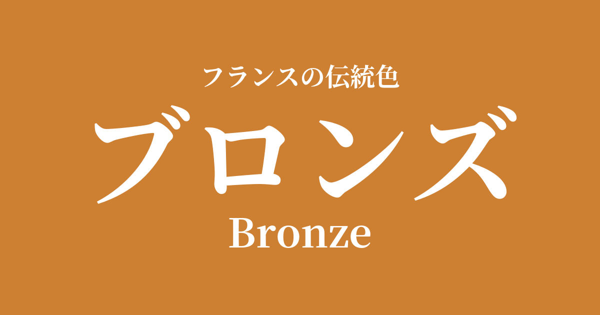
| French | Bronze |
|---|---|
| Katakana | bronze |
| HEX | #cd7f32 |
| RGB | 205, 127, 50 |
What is bronze? Origin and etymology
Bronze, as the name suggests, is a color name derived from the metal "bronze." Bronze is an alloy of copper and tin, and has been used since ancient times in human history. Its importance can be seen from the fact that its name is recorded in the "Bronze Age," which predates the Iron Age.
The most widely accepted etymology is that it derives from "Brundisium," the Latin word for the Italian port town of Brindisi. This port is known for its great prosperity in ancient times due to the bronze trade.
The deep, reddish-brown sheen of this color symbolizes strength, permanence, and the depth of history. Furthermore, the unique texture that develops over time as verdigris (patina) forms on the surface is also considered part of the beauty of bronze.
Historical background of bronze
In French history, bronze has played an important role as a symbol of authority and wealth since the time of ancient Gallic and Roman times. Armor, ornaments, coins, and statues of gods were all made of bronze, and its brilliance was a part of people's lives.
In the Middle Ages, bronze was primarily used as a sacred material for churches. Huge doors and candelabra adorning cathedrals, as well as bells that produced majestic tones, were cast using the finest techniques of the time.
From the Renaissance onward, bronze sculpture flourished again as a branch of art. Especially during the reign of Louis XIV, numerous bronze statues were created to adorn the magnificent gardens of the Palace of Versailles, showcasing the power and prestige of absolute monarchy to the world.
The Industrial Revolution of the 19th century made bronze more accessible. From monuments to heroes erected in public squares to ornaments and lamps adorning the mansions of wealthy citizens, bronze continued to be cherished as a material that reflected the spirit of its time.
Bronze in the world of art and fashion
When discussing bronze in the field of art, it is essential to mention Auguste Rodin, the father of modern sculpture. Many of his masterpieces, such as "The Thinker" and "The Gates of Hell," are cast in bronze. Through the heavy texture and delicate expressiveness of light and shadow inherent in bronze, Rodin powerfully depicted the inner suffering of humanity and the dynamism of life.
Bronze played a crucial role in the Art Nouveau style that swept across Europe from the late 19th to the early 20th century. Organic, flowing curves inspired by plants and insects were used in lamp stands, furniture decorations, and door handles, harmonizing with the bronze's subtle sheen to create a unique artistic world.
In the world of fashion, bronze is a color that combines luxury and sophistication, and is particularly favored in autumn and winter collections. When paired with lustrous fabrics such as silk and velvet, it creates an elegant and profound style. It also works well as an accent color, adding a subtle touch of luxury to an outfit, such as in accessories and bag hardware.
Color scheme preview
This is to check the readability of the text when this color is used as the background.
Bronze color scheme proposal
Blue Roi (#002d6f)
By combining it with the deep blue that is the color of royalty, it gives a dignified and classical impression reminiscent of the Palace of Versailles. The warmth of bronze enhances the calmness of the blue, creating a color scheme that brings depth to both colors.
Vert Bouteille (#093a2b)
The bottle green color scheme, reminiscent of deep forests and old books, creates an intellectual and calming atmosphere. The metallic texture of bronze adds an accent, resulting in a combination that is both peaceful and sophisticated.
Rose Pompadour (#ed82a1)
By combining it with the elegant pink that symbolizes the Rococo era, the heaviness of the bronze is softened, and a refined sweetness is added. It is unexpected yet elegantly put together, giving a feminine and warm impression.
Practical Scenes
In interior design, bronze is a color that brings warmth and a sense of luxury to a space. Simply using it on metal fixtures such as light fixtures, doorknobs, and faucets tightens the overall look of the space and gives it a refined impression. It also pairs exceptionally well with deep woods such as walnut, as well as natural materials such as marble and leather, and can be used in a wide range of styles, from antique to modern.
In fashion, bronze-colored items can be the focal point or an accent in an outfit. A glossy satin dress makes a statement at a party, while incorporating bronze into bags, shoes, or accessories adds a touch of elegant glamour to everyday wear. It blends better with the skin than gold and gives a more subdued impression.
In web and graphic design, it's effective when you want to convey trustworthiness, history, and craftsmanship. Using it in headings, logos, buttons, etc., can create visual weight and a sense of luxury, enhancing your brand image.