| English name | Light Teal |
|---|---|
| Katakana | Light Teal |
| HEX | #CCFBF1 |
| RGB | 204, 251, 241 |
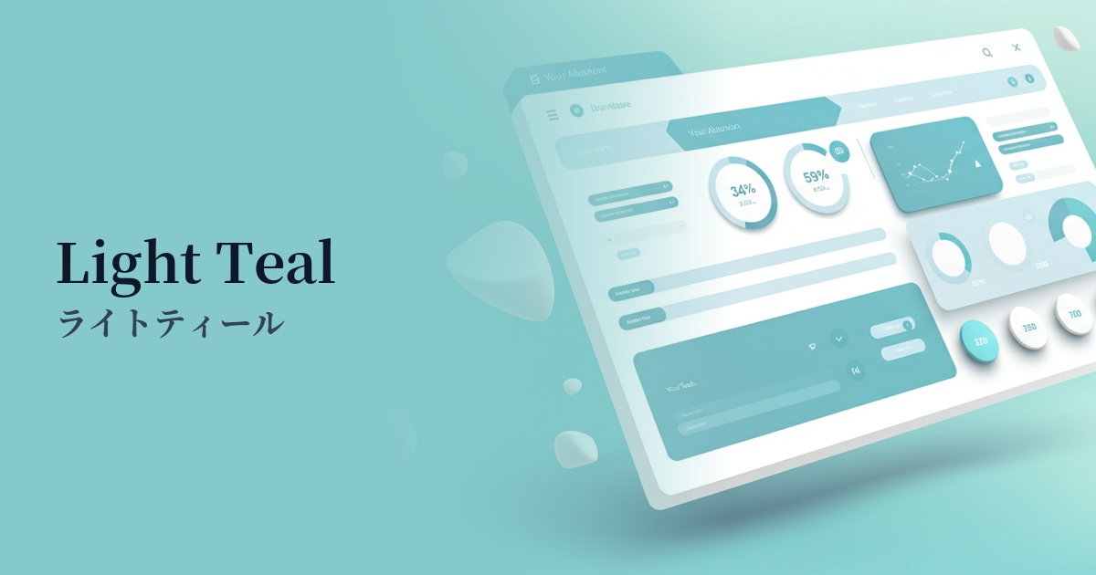
| Design Theme | UI System & Alert Colors |
Why is it a trend? (Background and reasons)
The reason light teal is gaining attention is the recent design trend towards "clean and minimalist" aesthetics. In a simple layout based on white, this color functions as an effective accent without compromising the sense of cleanliness and modernity.
Furthermore, this color is a brighter and lighter version of teal, which is an intermediate color between "blue," symbolizing technology, and "green," symbolizing nature and tranquility. Therefore, it blends well with the designs of services that embrace modern themes such as sustainability and wellness, as well as technology companies that want to be both innovative and approachable.
From a UI design perspective, this color scheme is ideal for conveying information to users without causing excessive stress. In particular, using it as a "success color" to indicate successful actions or as a background color for information notifications allows for gentle yet clear communication of positive feedback.
The psychological effects of design and UX
Light teal evokes images of clear, shallow seas and tropical skies, giving users positive impressions such as "openness," "cleanliness," and "freshness." This visual comfort fosters a sense of security and trust in the service among users.
It combines the psychological effects of blue, which evokes "intelligence" and "trust," with those of green, which evokes "safety" and "harmony." By using a bright tone, it eliminates any sense of formality and expresses "approachable innovation." This is expected to have the effect of attracting interest in new technologies and services without making users feel any psychological barriers.
In UI/UX, this color is extremely effective as feedback to indicate that a user's action was successful. For example, using this color in a message such as "Registration complete" allows users to intuitively and comfortably recognize that their actions were performed correctly.
Visibility testing (UI component example)
Practical usage (best practices)
In SaaS products and management interface UIs, using it as the background color for success notification banners and alerts, or for tabs and buttons indicating active status, brings a consistent positive tone to the entire user interface.
In a cleanly designed landing page (LP), using light teal for the main CTA (Call To Action) button can naturally guide the user's eye and encourage clicks without disrupting other elements.
In minimalist designs that use monochrome or neutral colors throughout, using accent colors on small elements such as icons, underlines for link text, and tags can easily add a sophisticated and modern touch.
Using a light shade as the background color for the hero section or specific content blocks can give the page depth and a refreshing feel. However, accessibility considerations are essential, such as choosing a dark color (e.g., dark gray or navy) with sufficient contrast for the text placed on top.
Recommended color scheme suggestions
Navy Blue (#000080)
The deep navy blue complements the lightness of the light teal, bringing a sense of reliability and stability to the overall design. This combination is ideal for situations where a balance between solidity and modernity is desired, such as in the financial sector or B2B SaaS.
Coral (#FF7F50)
Adding coral, a color that is close to its complementary color, as an accent enhances each other's hues, creating a vibrant and energetic impression. It adds a fresh touch to services aimed at young people and creative websites.
Sandy Brown (#F4A460)
The combination with sandy brown, reminiscent of beaches and wood, creates a natural and organic atmosphere. It's ideal for wellness and lifestyle brands, providing users with a sense of comfort and reassurance.