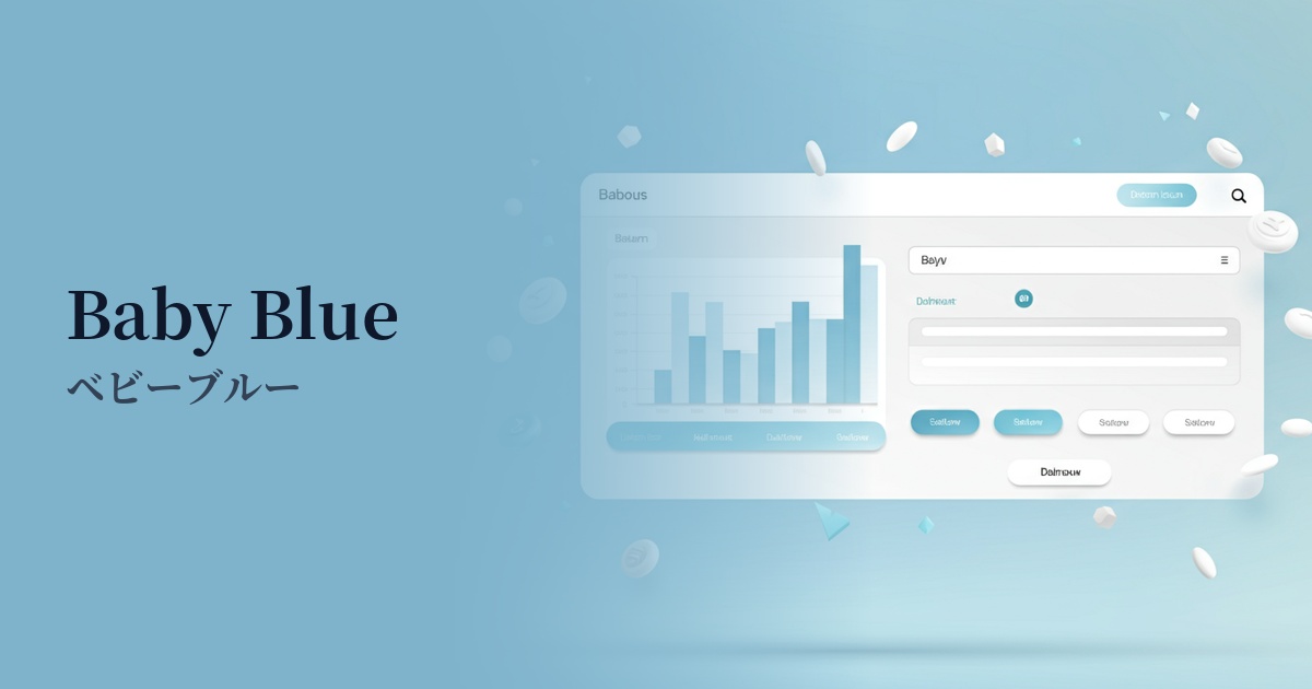
| English name | Light Info |
|---|---|
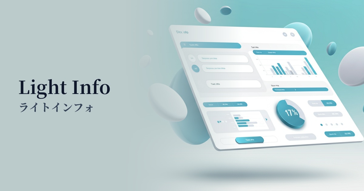
| Katakana | Light Info |
| HEX | #DBEAFE |
| RGB | 219, 234, 254 |
| Design Theme | UI System & Alert Colors |
Why is it a trend? (Background and reasons)
In recent years, web design has emphasized clean and easy-to-understand UI. Within this context, bright and gentle blue tones, such as those found in LightInfo, are gaining attention as background colors that provide users with a sense of security without distracting from the information. They play a particularly important role in reducing user cognitive load in SaaS dashboards and information-heavy websites.
The growing concern for accessibility is one reason why this color is gaining popularity. Light Info has the advantage of reducing screen glare compared to a pure white background while maintaining text readability. It also works well with dark mode, and adopting it as the base color for light mode makes it easier to build a flexible design system that allows users to choose their preferred display environment.
Furthermore, as a variation of "blue," which symbolizes technology and reliability, its softer and more approachable impression makes it a good fit for modern services. It sets itself apart from traditional, rigid corporate blue, helping to shorten the psychological distance with users and contribute to building a positive brand image.
The psychological effects of design and UX
Light Info is a gentle blue color reminiscent of the sky and water, providing users with psychological effects such as a sense of security, trust, and calmness. This makes it easier for users to relax and concentrate on the content.
Bright and light tones create a sense of cleanliness and openness. In UI design, they give the impression of well-organized information and can reduce the feeling of being overwhelmed, even in complex interfaces.
As a UI alert color, it's ideal for conveying supplementary messages such as "information" or "hints," without being as assertive as "Success" or "Warning." It plays a role in subtly presenting useful information without interrupting the user's actions.
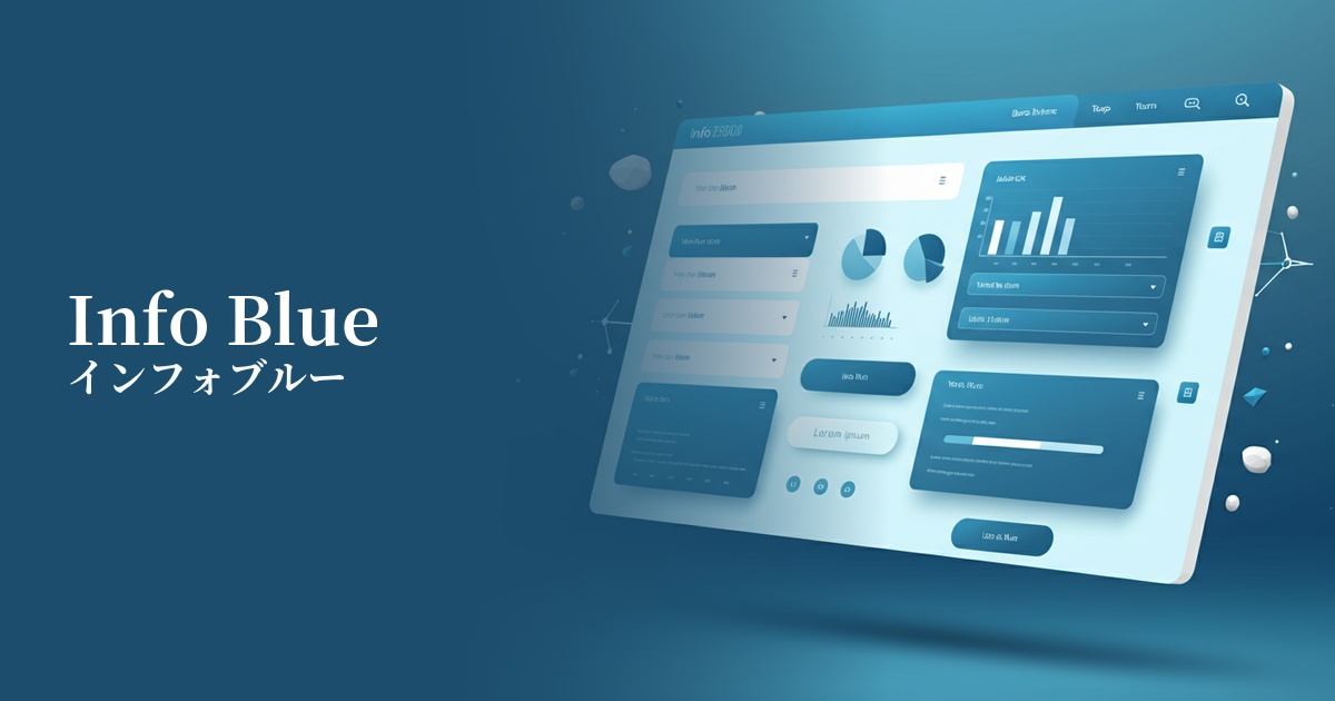
Visibility testing (UI component example)
Practical usage (best practices)
When used as the background color for information boxes and notification areas in SaaS applications and management dashboards, it can gently highlight important information.
By using this as the background color for sections on landing pages (LPs) and throughout your website, you can create a visual rhythm and make content divisions clearer. It's especially ideal for supplementary information sections such as "Frequently Asked Questions" and "Customer Testimonials."
Using this color for the background of form elements when they are focused, or for tooltip backgrounds, provides gentle feedback to user actions and improves usability.
The key is to use it in a supporting role, not as an accent color. Use a more saturated color for the main CTA button, and use light info to organize the information hierarchy; this will tighten up the overall design.
Recommended color scheme suggestions
Navy Blue (#000080)
Using a deep navy blue for text and headings adds a sense of stability and reliability to the lightness of LightInfo. It clearly indicates the importance of information while conveying an intelligent and calm impression, making it suitable for business websites and SaaS UIs.
Charcoal (#36454F)
Combining it with a softer charcoal than pure black creates a modern and sophisticated impression. The low contrast is easy on the eyes, resulting in a user-friendly design that reduces fatigue even during prolonged use.
Coral (#FF7F50)
Adding a warm coral accent creates a friendly and positive atmosphere. It adds vibrancy to the calm impression of LightInfo and is effective when used for notifications or tags that you want to attract the user's attention.