
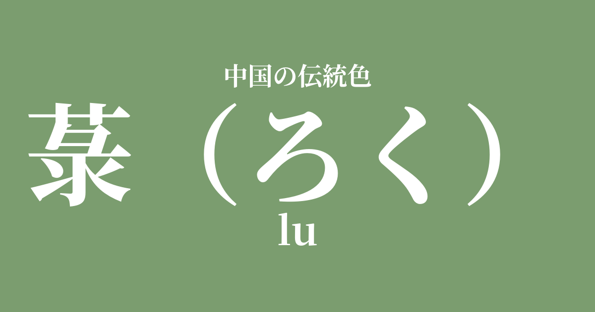
| Color name | 菉 |
|---|---|
| reading | roku |
| pinyin | lu |
| HEX | #7B9D6F |
| RGB | 123, 157, 111 |
What is a mitsubaki? Origin and etymology
"Roku" is a gentle, slightly yellowish-green color that represents the vibrant green of young plants sprouting in the spring fields.
The name of this color originally comes from the kanji character "菉," which refers to specific plants such as "gnaphalium affine" and "Cayratia japonica." The ancient Chinese dictionary "Erya" states that "菉 is Wangsu," and since Wangsu refers to gnaphalium affine, it is thought that the vibrant green color of its leaves became established as a color name.
This color, not overly vibrant yet full of life, evokes the very breath of nature and has brought peace to people's hearts.
Historical background of the mulberry tree
The naturally occurring green color of plants like the reed has always been a part of people's lives throughout China's long history. In the Five Elements philosophy, green possesses the virtue of "wood" and is considered a color that symbolizes the season "spring" and the direction "east." For this reason, it has been cherished as a color with positive connotations such as growth, development, and vitality.
During the Tang Dynasty, there was a system called "pinse yi" (clothing colors) that indicated the rank of officials by the color of their attire, and green was designated as the color worn by officials of relatively lower ranks. However, this was a regulation for official settings, and in private life, it was favored by literati who loved nature and used in the world of poetry and painting.
Especially from the Song dynasty onward, as a trend emerged that valued natural and simple beauty over extravagant ornamentation, the calm green color of reeds became deeply associated with the aesthetic sensibilities of intellectuals and artists.
The sausage in Chinese art and crafts
The gentle hues of the rosary have inspired various fields of Chinese art.
In the world of ink painting, this color is thought to have been used to depict spring mountains and newly budding trees when applying light coloring to landscapes. It is not flashy, but it was an important color that brought a sense of life and the changing seasons to the painting.
Furthermore, in the field of ceramics, it shares similarities with the deep, subdued green glaze found in the celadon ware of the Longquan kilns produced during the Song Dynasty. The soft green hue, known as "fenqing," seems to embody the natural and elegant beauty of the mulberry tree.
In clothing culture, it was used in the dyeing of Hanfu (traditional Chinese clothing), and was particularly favored for spring attire and the clothing of scholars who quietly contemplated in nature. Combined with the luster of silk, it is said to have given an elegant and intellectual impression.
Utsuppun Fuku Sosao, He Isshu Takeo Takamura.
Color scheme preview
This is to check the readability of the text when this color is used as the background.
A suggestion for a color scheme for irises.
赭 (#9C5442)
By combining it with ochre, the color of the earth, it creates a calm color scheme reminiscent of natural landscapes. Using earth tones together gives a gentle and reassuring impression.
Dried color (#EAE4D3)
The soft, creamy color of the base color complements the gentle green of the iris, creating an elegant and sophisticated impression. It's perfect for creating a clean, gentle, and natural atmosphere.
酡顔 (#F3BFB3)
By combining the fresh, vibrant color of young leaves with the delicate pink of a flower petal, this color scheme evokes the arrival of spring, creating a fresh and lively impression. It gives a bright and lovely impression.
Practical Scenes
With its calming hues, the color of the iris is easy to incorporate into modern life.
In interior design, using it for wallpaper, curtains, and cushions in living rooms and studies can create a visually soothing and relaxing space. It pairs particularly well with houseplants and wooden furniture, bringing a natural and tranquil atmosphere to the room.
In fashion, incorporating this color into shirts, blouses, and skirts creates an elegant and sophisticated impression. Pairing it with basic colors like white, beige, and gray results in a refined look. It's especially recommended as a color to add a refreshing touch to spring and summer outfits.
In web and graphic design, it is suitable as the main or accent color for websites with themes such as health, the environment, and organic products. It is expected to have the effect of giving users a sense of security and trust.