
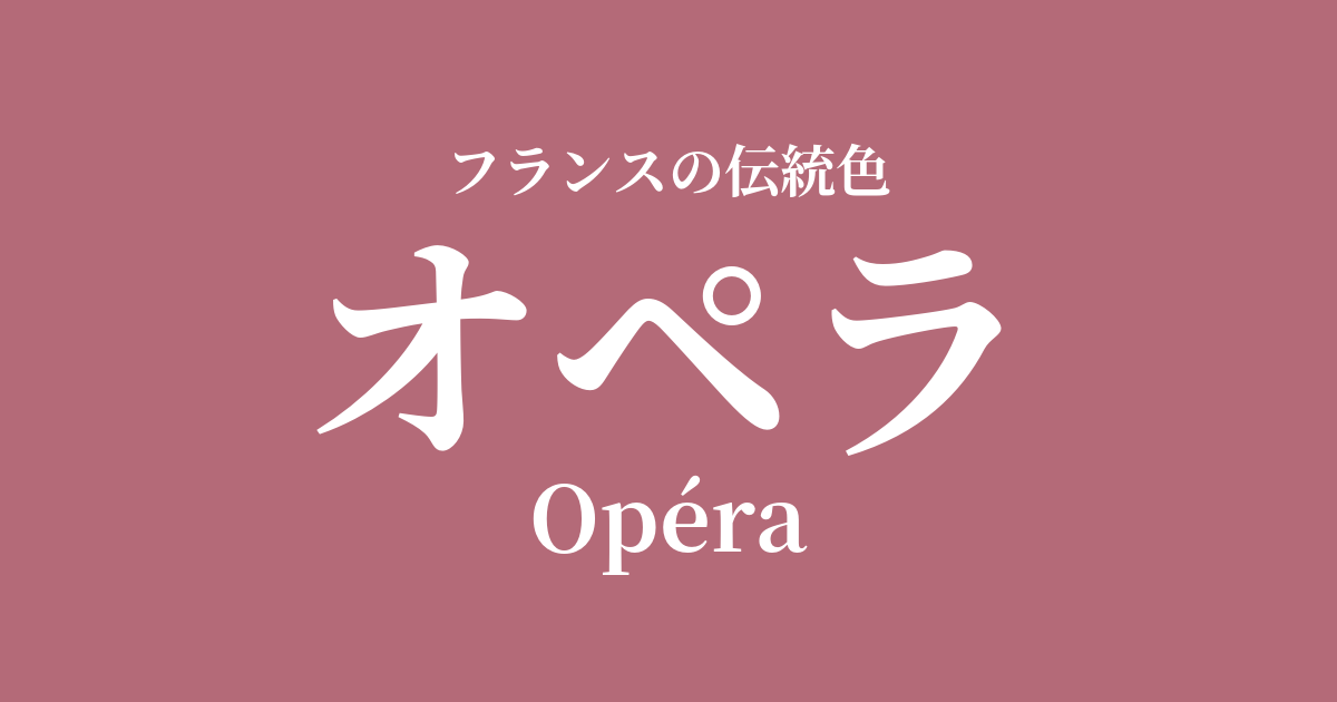
| French | Praéra |
|---|---|
| Katakana | Opera |
| HEX | #B46A78 |
| RGB | 180, 106, 120 |
What is opera? Origin and etymology
As the name suggests, Opéra is a color derived from the magnificent opera houses in Paris, particularly the Palais Garnier, which was completed in 1875.
This color refers to the deep, reddish-pink hue used in the velvet-covered seats adorning the opera house's auditorium, the heavy curtains decorating the stage, and the opulent wall decorations. It is a color that combines splendor and elegance, instantly transporting those who step into the theater to an otherworldly, dreamlike realm.
Historical background of opera
The late 19th century, when the Opéra Garnier was built, was a turbulent period in France as it transitioned from the Second Empire to the Third Republic. Started as part of Napoleon III's grand plan to redevelop Paris, the building, completed after overcoming difficulties such as the Franco-Prussian War and the Paris Commune, became a symbol of the dawn of a new era.
This era, later known as the "Belle Époque" (the beautiful era), was a glamorous period when bourgeois culture flourished and the arts blossomed. The opera house was not merely a place to watch plays, but an important social hub for the bourgeoisie. The color "Opera" can be said to be a color that truly symbolizes the Belle Époque, reflecting the richness of that era, the passion for art, and the exhilaration of the people.
Opera in the world of art and fashion
In the world of art, the Impressionist painter Edgar Degas left behind numerous works set in the Paris Opera. In the costumes and ribbons of the ballerinas he depicted, and the murmur of the audience, one can find a sparkle of color that is reminiscent of "opera."
This color is also beloved in the world of haute couture, and has been highly valued as the color for evening dresses that adorn special nights. Innovative designers like Paul Poiret have also incorporated this deep rose hue into their luxurious collections. In terms of materials, the dramatic charm of the color Opera is best brought out in lustrous silk or heavy velvet.
Color scheme preview
This is to check the readability of the text when this color is used as the background.
Opera color scheme proposals
Jaune d'Or (#E8B327)
This combination is reminiscent of the gold leaf decorations of the Paris Opera House. The colors complement each other, creating a classic and opulent impression. It's perfect for creating a special atmosphere or a festive design.
Gris de Tourturelle (#B9B5AD)
The calming gray gently complements the glamour of opera, creating a modern and sophisticated impression. This color scheme expresses a refined elegance without being overly sweet, making it easy to incorporate into fashion and interior design.
Rose Pompadour (#ED87A3)
By using varying shades of the same color family, you can create a unified, elegant, and romantic atmosphere. This style is recommended for wedding-related designs and cosmetic packaging, where you want to express feminine softness and grace.
Practical Scenes
In interior design, incorporating opera into fabrics such as cushions, curtains, and rugs adds warmth and a touch of luxury to the space. Using this color as an accent wall is also effective for creating a dramatic atmosphere. It pairs exceptionally well with materials like gold, brass, and marble.
In fashion, using it in key items like dresses and blouses instantly creates a glamorous impression. Also, using it as an accent color in accessories like bags, shoes, and scarves adds a refined touch to the entire outfit. In makeup, using it on lips and cheeks gives the complexion a healthy glow and a touch of allure.
In web and graphic design, it's useful for expressing a brand's worldview on luxury brands, beauty websites, and bridal-related sites. Using it as an accent color for buttons, headings, etc., rather than as the main color, can attract attention while maintaining a sophisticated impression.