
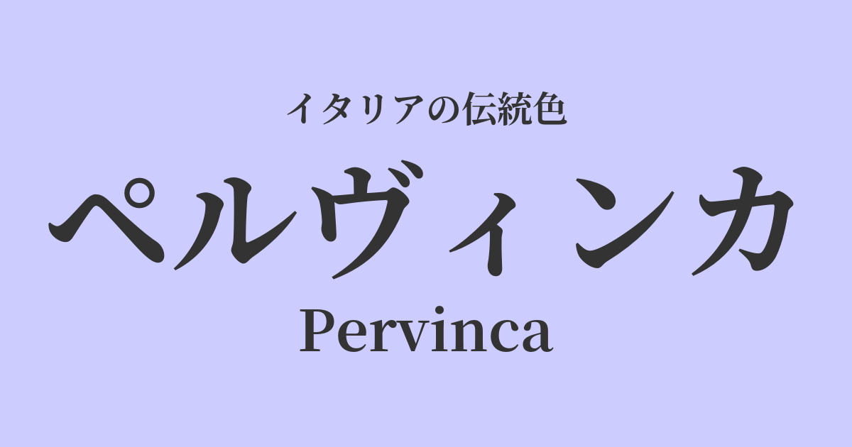
| Italian original name | Pervinca |
|---|---|
| Japanese notation | Pervinka |
| HEX | #CCCCFF |
| RGB | 204, 204, 255 |
What is Pervinka? Origin and etymology
Pervinca is an Italian word referring to the plant "periwinkle." The color name comes from the color of this plant, which blooms with delicate bluish-purple flowers that cover the ground as spring arrives.
The name is said to originate from the Latin word "pervincire" (to wrap around, to bind). This represents the way the periwinkle vine grows vigorously, and it has been considered a symbol of vitality since ancient times.
This flower symbolizes "lifelong friendship" and "sweet memories," and its delicate, somewhat nostalgic colors gently resonate with people's hearts.
The colors of the Pervinka flowers, shining in the spring sunlight, seem to reflect a complex and beautiful range of emotions, such as new beginnings, hope, and memories of days gone by.
Historical background of Pervinka
The history of the pervinca plant is ancient, dating back to the Roman era. Descriptions of this plant can be found in the writings of the naturalist Pliny, and it is said to have been used as a medicinal herb. At that time, the flowers were also apparently picked and used as a dye.
In medieval Europe, blue and purple were considered sacred colors in Christian art. The pale, pure hues of Pervinka paintings are thought to have been used in decorative illustrations of manuscripts to represent the purity of the Virgin Mary and the heavenly world.
With the advent of the Renaissance, artists began to seek a wider range of color expression. Unlike ultramarine, which was made from expensive lapis lazuli, colors like pervinka, made by mixing more readily available pigments, were highly valued for depicting the gradations of the sky in frescoes and the soft shading of angels' garments.
Since the 19th century, advancements in synthetic dye technology have made it possible to consistently reproduce these delicate hues, leading to their widespread popularity in the world of fashion and textiles. Particularly during the Art Nouveau era, the elegant curves and the organic tones of Pervinka fabrics harmonized perfectly.
Pervinka in Italian Culture and Art
In Italian art, color palettes reminiscent of Pervinka can be found particularly in early Renaissance religious paintings. The clear skies in the frescoes painted by Giotto and Fra Angelico, and the pale bluish-purple used in the robes of the saints, simultaneously express both sanctity and human tenderness.
These colors were created by mixing white with mineral pigments such as azurite, resulting in an effect that evokes the feeling of celestial light.
Even in contemporary Italian culture, peruvinca holds a special place. In the world of fashion, in particular, it's a beloved staple color that graces spring and summer collections. When used in silk blouses or cotton dresses, it creates a light, sophisticated, and distinctly Italian elegance.
Furthermore, this elegant bluish-purple color often appears in traditional crafts such as Venetian glass and majolica pottery, adding vibrancy and delicacy to the artisans' handiwork.
Color scheme preview
This is to check the readability of the text when this color is used as the background.
Pervinka's color scheme proposal
Giallo Napoli (#FADA5E)
The near-complementary relationship between the two colors enhances each other, creating a bright and sophisticated contrast. The coolness of Pervinca and the warmth of Giallo Napoli give a cheerful and elegant impression, like the sunshine of spring.
Verde Oliva (#808000)
This combination is very natural and calming, reminiscent of the natural landscapes of Italy. The delicate colors of the Peruviana flowers harmonize with the deep green of the olive leaves, creating a gentle, relaxed, and pleasant atmosphere.
Rosa Antico (#C08081)
The blue tones of Pervinka and the muted red tones of pink harmonize beautifully in this romantic color scheme. It's not overly sweet, but rather nostalgic and sophisticated, giving off an elegant impression that evokes the refined femininity of a mature woman.
Practical Scenes
In interior design, Pervinka brings tranquility and peace to a space. Using it as wallpaper in bedrooms or studies can have a relaxing effect, allowing you to enjoy peaceful moments.
Combining it with neutral colors such as white, light gray, and off-white creates a clean and sophisticated space. Adding accents with cushions, curtains, or artwork is also a great idea.
In fashion, this color is especially perfect for spring and summer outfits. Pervinka dresses and shirts brighten the complexion and give an elegant and sophisticated impression. They pair well with basic colors such as navy, beige, and white, adding a refreshing touch to your outfit.
Furthermore, these dresses are popular as colored dresses and bridesmaid dresses for wedding scenes, creating a romantic and unforgettable day.
In web and graphic design, this color helps convey gentleness, trustworthiness, and creativity. Using it as a key color for beauty, wellness, and bridal brand websites, or for creative portfolio sites, can create a sophisticated and refined aesthetic.