
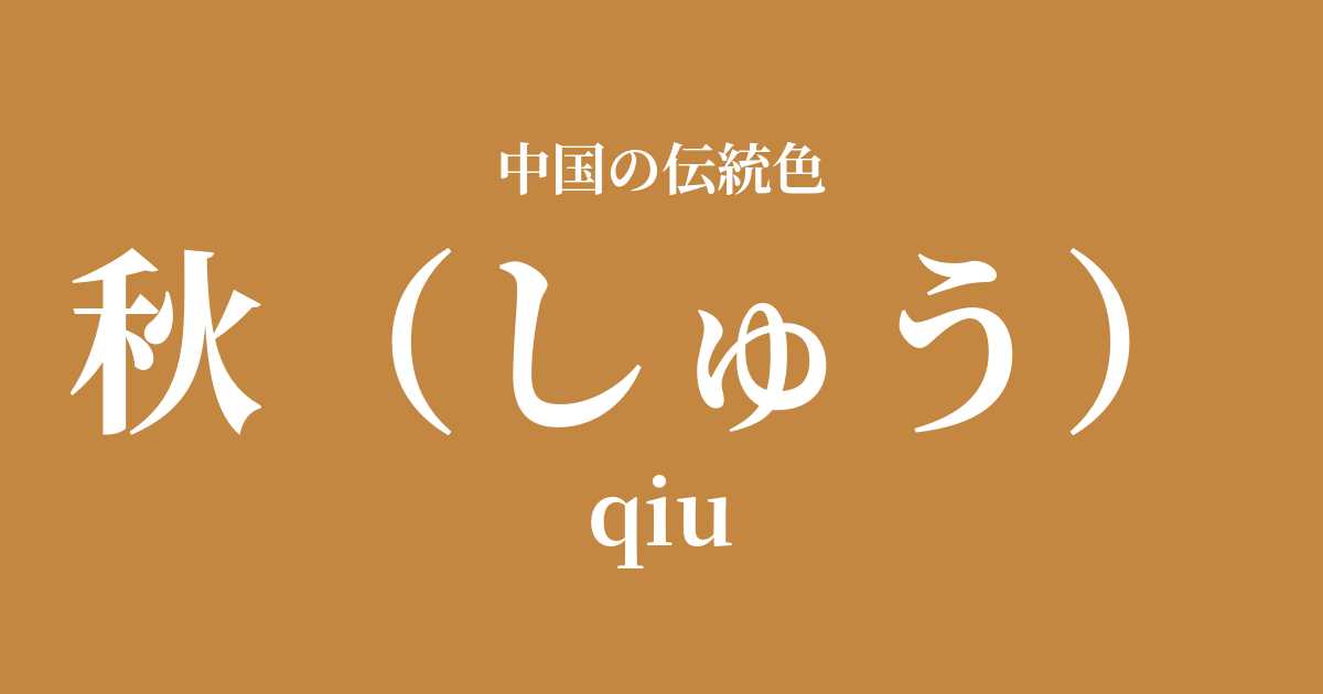
| Color name | 秋 |
|---|---|
| reading | Week |
| pinyin | qiu |
| HEX | #C38742 |
| RGB | 195, 135, 66 |
What is autumn? Origin and etymology
As its name suggests, "Autumn" is a color name derived from the rich colors that the autumn season brings. The golden rice stalks, colorful fallen leaves, and ripe fruits are the source of this color, symbolizing the season of harvest and maturity.
One theory suggests that the kanji character for "autumn" (秋) is composed of "grain" (禾) and "fire" (火), and is interpreted as representing the harvest season for grains or the way leaves change color as if on fire. This color holds deep meaning, evoking gratitude for nature's bounty and the cycle of life.
Historical background of autumn
In the Five Elements philosophy, which forms the foundation of ancient Chinese thought, autumn belongs to the element "metal," and its associated color is "white." This was called "white autumn," and it represented the color of autumn as a philosophical concept.
However, the autumn landscapes that people actually see are worlds painted in golden and brown hues. For this reason, in the world of art, such as poetry and painting, these warm colors have been expressed and cherished as "autumn colors" rooted in the real landscape, separate from the conceptual "white."
Poets, especially during the Tang and Song dynasties, skillfully incorporated the colors of autumn into their poems, using terms like "yellow leaves" and "frosted leaves" when describing the scenery and emotions associated with it. This conveyed both the joy of abundance and a touch of sadness and melancholy as the seasons shifted toward winter.
Autumn in Chinese Art and Crafts
In Chinese art, the color of "autumn" has played a particularly important role in landscape painting. In "Autumn Landscape Paintings," which depict mountains in autumn, this deep, calming yellow pigment is used to color the leaves of the trees, expressing the deepening of the season and a sense of tranquility.
In the world of ceramics, you can also find brown glazes similar to this color, such as persimmon glaze and amber glaze. The warm and rustic texture created by these glazes evokes the gentle sunlight of autumn and the richness of the earth, and has been a part of people's lives for a long time.
In the realm of fashion culture, these subdued shades, distinct from the vibrant "bright yellow" used by the emperor, are said to have been incorporated into the clothing of literati and autumn attire. When this color is expressed in silk fabric, the interplay of light and shadow creates a sense of depth and elegance.
I say that autumn days are better than spring mornings.
Color scheme preview
This is to check the readability of the text when this color is used as the background.
Autumn color scheme suggestions
Ai (#003371)
The combination of autumn's golden hues and deep indigo evokes the clear autumn night sky and deep water. The colors complement each other, creating a dignified and intellectual impression. Recommended for studies and formal designs.
Pilestone (#99341A)
By combining it with ochre, reminiscent of ripe fruit and autumn leaves, a warm and rich gradation is created, like an autumn landscape. This color scheme is perfect for creating a natural, calm, and comfortable space.
Moon white (#D9D6C3)
By combining it with a pale, moon-white color reminiscent of moonlight, the heaviness of autumnal colors is softened, creating a light and sophisticated impression. It creates an elegant and bright atmosphere and blends well with a variety of designs, both Japanese and Western.
Practical Scenes
In interior design, incorporating "autumn" elements into accent walls, curtains, cushions, and other fabrics brings warmth and tranquility to a space. It pairs particularly well with solid wood furniture and houseplants, creating a natural and comfortable atmosphere.
In fashion, incorporating this color into coats, knitwear, and leather goods creates an elegant and seasonal look. Pairing it with basic colors like navy and gray gives a sophisticated impression, while combining it with beige or ivory creates a soft and gentle impression.
In web and graphic design, using it as a background or accent color can convey a sense of reliability, tradition, and the warmth of handcrafted work. It is suitable for brand images themed around history, culture, or organic products.