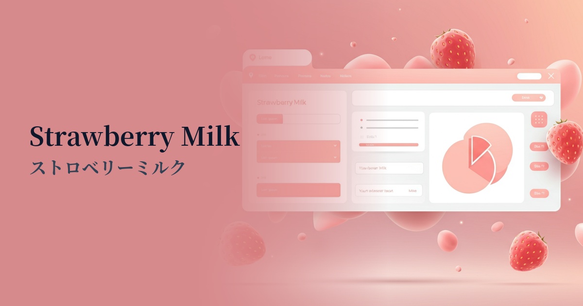
| English name | Strawberry Milk |
|---|---|
| Katakana | Strawberry Milk |
| HEX | #FFDFE9 |
| RGB | 255, 223, 233 |
| Design Theme | Pastel & Macaron Colors |
Why is it a trend? (Background and reasons)
The soft, gentle pink, reminiscent of strawberry milk, is strongly influenced by the recent Y2K fashion revival and the aesthetic sensibilities of Generation Z, particularly those centered around social media. While evoking a sense of nostalgia, its fusion with a modern cleanliness has garnered attention in the world of web design as a new form of expression.
This trend is partly due to a shift in interest from the long-running minimalist movement towards more emotional and humane designs. Beyond purely functional and impersonal designs, "emotional design" that provides users with a sense of security and comfort is gaining importance, and this color plays a crucial role in conveying warmth and approachability.
Furthermore, it's worth noting the diversification of the meanings associated with the color pink. While it once strongly evoked specific genders, it now symbolizes positive concepts such as "happiness," "self-affirmation," and "kindness," regardless of gender, and is used by a wide range of brands and services.
The psychological effects of design and UX
Strawberry Milk, as its name suggests, gives a sweet and gentle impression, bringing feelings of happiness and comfort to the user's heart. Its visually soft appearance helps to alleviate tension throughout the screen, creating a more approachable atmosphere.
From a UI/UX perspective, this color is less likely to intimidate users, making it particularly effective for onboarding screens for first-time users and lifestyle media where the goal is to create a relaxed and enjoyable atmosphere.
However, because of its very light color, it may not be suitable for elements that require attention or urgent action. Its appeal can be maximized by using it only in areas where you want to evoke positive emotions in the user or provide a pleasant experience.
Visibility testing (UI component example)
Practical usage (best practices)
By using it as a background color for the entire page or a section, you can softly envelop the content, creating an immersive and gentle atmosphere. In particular, when combined with layouts that use plenty of photos and white space, it creates a sophisticated impression.
It's also effective when used as an accent color in minimalist designs or dark mode UIs. For example, applying this color to selected navigation menus, tags, or icons adds color and enjoyment to what might otherwise be a monotonous screen, gently guiding the user's gaze.
By using it not as the main confirmation button, but as a secondary action button such as "Add to Favorites" or "Read Later," you can encourage positive actions without putting pressure on the user.
Incorporating strawberry milk into illustrations and infographics can make complex information and data more approachable and convey a softer impression. This can help users understand the content and reduce their resistance to it.
Recommended color scheme suggestions
Slate Gray (#708090)
The sweetness of strawberry milk is balanced by the sophisticated and calming slate gray. Because it combines trustworthiness with a modern feel, it's recommended for designs that want to convey a refined impression, such as SaaS dashboards and creator portfolio sites.
Pistachio (#93C572)
This natural and soothing color scheme is reminiscent of sweets. The fresh green of pistachio harmonizes with the gentleness of strawberry milk, creating an organic and healthy image. It's perfect for wellness and food-related websites.
Jonquil (#FADA5E)
By combining it with bright and cheerful jonquil (narcissus yellow), the entire design is imbued with an energetic and fun atmosphere. It's perfect for situations where you want to convey a positive and playful impression, such as landing pages for children's services or creative events.