
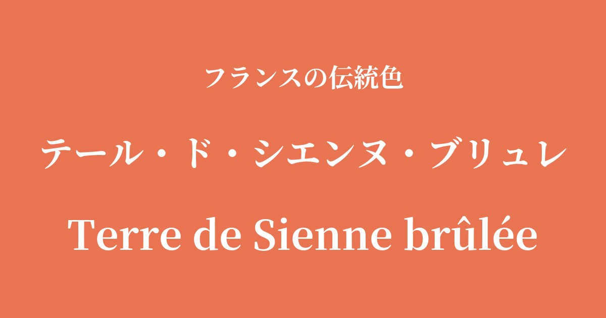
| French | Terre de Sienne brûlée |
|---|---|
| Katakana | Terre de Sienne Brûlée |
| HEX | #e97451 |
| RGB | 233, 116, 81 |
What is Terre de Chienne Brûlée? Origin and Etymology
"Terre de Sienne brûlée" is a warm, deep reddish-brown color, meaning "baked Sienese earth" in French. The name of this color derives from the origin and manufacturing process of the pigment used to create it.
The source of this pigment is clayey soil rich in iron hydroxide, mined near Siena, a city in the Tuscany region of Italy. When this soil is dried and used as a pigment, it is called "Terre de Sienne Naturel" (raw Sienese soil) and has a yellowish-brown color.
On the other hand, as the name "brûlée" (baked) suggests, heating this raw Sienese clay in a kiln causes the iron hydroxide it contains to undergo a chemical change into iron oxide. This removes moisture, and the color changes to a more reddish, deep, rich brown. This method has been known for a long time and is considered one of the earliest natural pigments used by humankind.
Widely known in English as "Burnt Sienna," it has been a beloved, timeless color, an essential basic in the palettes of artists worldwide. Its name is more than just a color name; it speaks of the warmth of the earth itself and the refined beauty that comes from human touch.
Historical background of Terre de Sienne Brûlée
The history of Terre de Sienne Brûlée is said to date back to ancient Roman times. However, its value particularly increased during the Renaissance in Italy. Many masters, including Sienese painters such as Giotto and Duccio, recognized the pigment's superior coloring power and stability, and used it extensively in frescoes and tempera paintings.
It is believed that this pigment was introduced to France during the process of the spread of Italian Renaissance art styles. During the 17th-century Baroque period, French painters such as Nicolas Poussin and Claude Lorrain used this color to give depth and realism to their mythological and landscape paintings. In particular, it was an essential color for depicting the shading of human skin, the reddish stones of ancient ruins, and the light of twilight.
In 18th-century Rococo art, artists such as Jean-Honoré Fragonard utilized it to create warmth and depth in elegant scenes. At the French Academy of Fine Arts, it played a crucial role as a fundamental color for drawing and in the classical oil painting technique of "underpainting," making it one of the colors that has fundamentally supported the development of French art.
Terre de Sienne Brûlée in the world of art and fashion
Due to its versatility, Terre de Chienne Brûlée has been valued in a wide range of fields, not just in any particular art style.
In Western art, earth tones were particularly important for 19th-century Barbizon School painters. Jean-François Millet and Camille Corot, among others, effectively used these earth tones to depict the natural world as it is, expressing the colors of the earth, tree trunks, and the sun-tanned skin of farmers. The simple yet powerful expression seen in their works is deeply connected to the warmth of this color.
In the world of fashion, this color is known by names such as "terracotta" or "brick red," and is particularly popular as a staple color for the autumn and winter seasons. When incorporated into coats, knitwear, and leather goods, it gives a warm, calm, and sophisticated impression. It also frequently appears in traditional French textiles, especially in printed fabrics from the Provence region of southern France, as a color that evokes the blessings of the sun and the earth.
Color scheme preview
This is to check the readability of the text when this color is used as the background.
Color scheme proposal for Terre de Chienne Brûlée
Blue Roi (#2959a3)
When combined with a vibrant and noble blue, the colors complement each other, creating a classic and dignified impression. The beautiful contrast between warm and cool colors creates an elegant atmosphere.
Vert Olive (#586224)
The combination of earth tones creates a natural and calming harmony. The gentle, organic impression, reminiscent of the rural landscapes of southern France, is ideal for creating a comfortable space.
Blanc Devoire (#f8f2e0)
The warm ivory color gently complements the deep hue of Terre de Sienne Brûlée. It's an elegant and sophisticated color scheme with a balanced blend of brightness and warmth.
Practical Scenes
Terre de Chienne Brûlée is a very practical color that can be used in a variety of situations due to its warmth and calming properties.
In interior design, incorporating it as an accent wall in a living room or study brings depth and a comforting warmth to the space. It pairs exceptionally well with natural materials such as wooden furniture, linen, and leather, creating a rustic yet sophisticated atmosphere. Even incorporating it through small items like cushions or rugs can give the entire room a refined look.
In fashion, it's the perfect color for creating a seasonal feel. In autumn, incorporate it into trench coats and knitwear, and in summer, use it in linen shirts and skirts for a sophisticated look. As it's an earth tone, it's also appealing because it pairs well with many basic colors such as navy, gray, khaki, and beige.
In web and graphic design, it's suitable for brands that want to convey a sense of reliability, tradition, and the warmth of handcrafted work. Using it as an accent color can attract the user's attention while giving the entire site a warm and approachable feel.