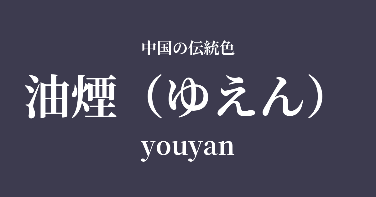
| Color name | oil smoke |
|---|---|
| reading | reason |
| pinyin | youyan |
| HEX | #3D3B4F |
| RGB | 61, 59, 79 |
What is oil smoke? Origin and etymology
As the name suggests, "oil soot" refers to a deep, purplish-gray color derived from the soot produced when vegetable oil is burned.
This soot was an important raw material for "ink," which is indispensable to Chinese calligraphy and painting culture. In contrast to "pine soot ink," which is made by burning pine wood, ink made from soot obtained by the incomplete combustion of tung oil or rapeseed oil is called "oil soot ink."
Oil soot ink is characterized by its extremely fine soot particles, which, when ground, produce a smooth, glossy, and beautiful black color. It's not just a simple black; its complex hue, which subtly reveals hints of purple and indigo depending on the light, has become established as the color name "oil soot."
Historical background of oil smoke
While ink production has been practiced since ancient times, the technology for oil-based ink developed significantly during the Tang and Song dynasties. The Song dynasty, in particular, was a time when literati culture flourished, and they deeply explored the expressive power of ink in calligraphy and painting.
The lustrous, deep black and beautiful bleeding of oil-based ink appealed to the refined aesthetic sensibilities of literati. It is said that they considered the time spent grinding their own ink a precious moment for mental concentration, and that they were particular about even the color and scent of the ink.
During the Ming Dynasty, excellent ink began to be produced in Huizhou, Anhui Province, and it became known as "Hui Mo." Legendary ink makers such as Cheng Junfang and Fang Yulu elevated the oil soot ink manufacturing technique to the realm of art, producing masterpieces that were even presented as gifts to the emperor. Thus, the color of oil soot is a dignified color that has walked hand in hand with the history of Chinese intellect and art.
Oil soot in Chinese art and crafts
The color of oil soot is, first and foremost, deeply connected to the worlds of calligraphy and ink painting. Lines drawn with oil soot ink are lustrous and powerful, and when lightly blurred, they beautifully reveal subtle gradations of light and shadow. Its deep black color was highly valued in artsmanship that required meticulous detail, such as in the painting of hair on a person's face.
In the field of ceramics, black-glazed Tenmoku tea bowls made during the Song Dynasty share a worldview that resonates with the jet-black beauty of oil smoke. Their hues, which conceal rich expression within a tranquil setting, combined with the Zen Buddhist philosophy of the time, captivated many people.
In clothing, black and dark gray were considered dignified colors worn by bureaucrats and literary figures. When dyeing silk fabrics, a deep black with a slight purplish tint, reminiscent of oil smoke, was likely valued as a more refined color than plain black.
Color scheme preview
This is to check the readability of the text when this color is used as the background.
Color scheme proposal for oil smoke
Tsukihaku (#EAF4FC)
The rich, deep hues of oil smoke are beautifully complemented by the pure, light-like white of moonlight. This color scheme evokes the beauty of negative space in ink paintings, creating a serene and intellectual impression.
赭石 (#A75347)
The cool impression of oil soot, combined with the warm reddish-brown of ochre, creates a color scheme that embodies both tranquility and vitality. It also evokes the color of ink used in calligraphy and painting, giving it a traditional and stable feel.
Akika (#D9B612)
The deep, smoky color is accented by the muted yellow of the autumn fragrance. This combination creates a sophisticated and elegant impression, as if a touch of glamour is lit amidst the darkness.
Practical Scenes
In interior design, incorporating it as an accent wall in a study or bedroom adds depth and tranquility to the space. Pairing it with off-white or cream-colored linens and light-colored wood furniture creates a modern and sophisticated atmosphere.
In fashion, using it as an alternative to black in coats and jackets creates a softer, more refined impression. Because it's a color that highlights the texture of materials, it pairs well with high-quality fabrics such as wool, cashmere, and silk. It also looks lovely when paired with accessories in shades of ochre or autumnal hues.
In web and graphic design, using white as a background color can convey a sense of luxury and trustworthiness. Choosing a color close to white for text allows you to create a chic and calm atmosphere while maintaining readability.