| English name | Pastel Pink |
|---|---|
| Katakana | Pastel pink |
| HEX | #FFDDE2 |
| RGB | 255, 221, 226 |
| Design Theme | Pastel & Macaron Colors |
Why is it a trend? (Background and reasons)
Recent web designs show a return to minimalism and clean interfaces. Pastel pink is very effective as a color that gently enhances content and adds color to a space without creating a visually overwhelming feeling, especially in designs that utilize ample white space.
The revival of "Y2K" fashion, particularly among Gen Z and Millennials, and the global spread of Japanese "Kawaii" culture are also boosting the popularity of pastel pink. By incorporating a sense of nostalgia while integrating it with a modern UI, it's possible to create a new yet familiar user experience.
As interest in wellness and self-care grows throughout society, there is a growing demand for color schemes in design that bring peace and tranquility to users' minds. Pastel pink, with its soft hue, is one of the best colors for relieving psychological tension and providing a pleasant digital experience.
The psychological effects of design and UX
Pastel pink evokes positive emotions such as gentleness, happiness, affection, and youthfulness. It is expected to give users a sense of security and foster a sense of familiarity with the brand and service.
From a UI/UX perspective, this color helps lower psychological barriers for users. For example, using it on a website you're visiting for the first time or on a form screen that requires you to enter personal information can alleviate user apprehension and encourage smoother operation.
Because it lacks aggression and possesses a neutral impression, it transcends its traditional image as being for women and is being adopted in a variety of services regardless of gender. It is also an important option when aiming for genderless design.
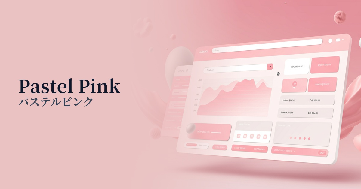
Visibility testing (UI component example)
Practical usage (best practices)
Using it boldly as the main background color brings a soft and open atmosphere to the entire site. It is especially effective for brand websites related to cosmetics, baby products, weddings, and sweets, as it can intuitively convey the brand's worldview.
Using dark colors as accent colors for CTA buttons or important links can gently attract the user's attention. However, because they tend to lack contrast against white or light-colored backgrounds, accessibility considerations are essential, such as choosing darker colors for text or adding dark borders to buttons.
It's also effective to use it as a key color in illustrations and icons. It serves as a visual element to convey complex information and service details in a friendly and easy-to-understand way.
In dark mode designs, using pastel pink as an accent color makes it stand out beautifully against a dark background, creating a modern and sophisticated impression. It adds a touch of vibrancy to the design while ensuring readability.
Recommended color scheme suggestions
Steel Blue (#4682B4)
This color adds a sophisticated and calming touch to pastel pink, which can often appear too sweet. It's ideal for creating a refined atmosphere in SaaS UIs where reliability is paramount, or in modern corporate websites.
Mint Green (#98FF98)
This combination evokes a refreshing, spring-like feeling and a sense of natural comfort. Organic products and wellness-related services can project a clean and healthy image to users.
Cream (#FFFDD0)
Combining it with a warm cream color creates an overall softer, more elegant, and sophisticated impression. It adds a touch of luxury and gentleness to luxury brand and wedding-related websites.